Last edited:

-
Smogon Premier League is here and the team collection is now available. Support your team!
-
Follow our Instagram!
-
The moderators of this forum can be found in the CAP forum staff directory.
-
Welcome to Smogon! Take a moment to read the Introduction to Smogon for a run-down on everything Smogon, and make sure you take some time to read the global rules.
-
Congrats to the winners of the 2025 Smog Awards!
You are using an out of date browser. It may not display this or other websites correctly.
You should upgrade or use an alternative browser.
You should upgrade or use an alternative browser.
CAP 22 CAP 22 - Art Submissions
- Thread starter HeaLnDeaL
- Start date
- Status
- Not open for further replies.

WIP 3
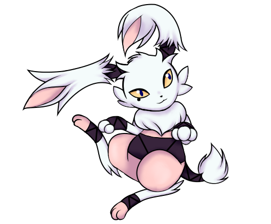
Here's a near-complete WIP of inaba hare; made a few corrections on the base lineart. Also shaded with lavender to bring out the eyes (which are now lightened) and make it feel softer. I did try shading with yellow, but it made my hare feel more like a fire/fighting/normal type than a fairy/fighting. I have been tempted to try other eye colors such as blue and red, but I prefer the yellow since it feels nice with the purples and pinks I picked out.
Also on the "beauty mark"/black eye... I'm not sure which is better: with or without. Here's a version without the mark on the eye. Open for critiques on anything else too~
Also here's some critique for pages 4 and 5:
Yilx - Love it~ Brings to mind a tengu due to the little pointy diamond on its head. Can't wait to see what colors you pick.
willow616 - Really nice design, but I feel your Egyptian cat is more of a psychic type than a fighting type (especially with that pink color).
FellFromtheSky - I'm in love with both versions of your riding hood wolf~ really unique set of colors for a fairy/fighting type. Your final fits the fairy/fighting type very well!
Canis Majoris - I'd personally go for the Hojojutsu cat and see what kind of improvements you can make from there with it.
Reigaheres - Unique concept, though I feel the little "box" thing your clown comes out of is too small (though keeping it that way would also fit the clown theme you got).
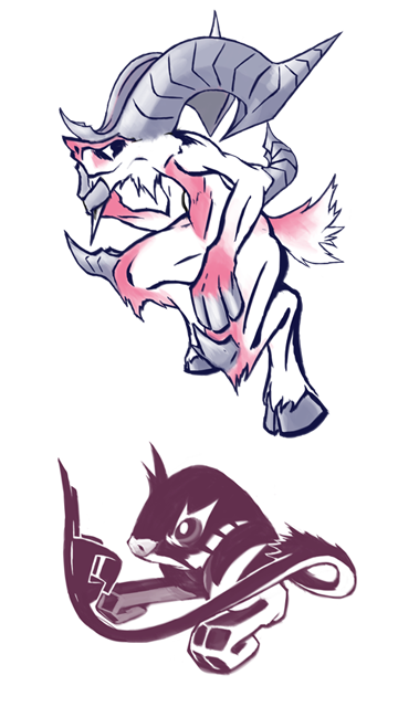
HeaLnDeaL - I feel like the little pink tuffs on your racoon/tanuki's tail don't work out well for the mask it wears; feels kinda unnecessary. Other than that, you got a nice color scheme going on. If I were you, I'd try to make the mask stand out and maybe make it part of your mon's tuffs on the sides (like kinda extend it out).
PixelMoniac_ - Your super racoon almost looks like it could be the partner to HeaLnDeaL's lol
The cape on it feels a little unnatural to me imo I'd merge it with your mon's fluff on its chest to give it the illusion of a cape.
As for colors I liked these 2 palettes the most
Falchion - Beautiful. I love it. I think the shoes should look a little more part of your mon though.
Golurkyourself - Really cute, it looks like it has a pillow on its chest :3 the fluff really brings it out imo
ethan06 - Interesting concept, but everything feels kinda tacked on than a part of your mon's body. Try merging the wings and tassels to the hand body so it looks more natural.
Modeling Clay - I like this design, very simple and brings out the type fairly well ^^

And here I am with yet another update.
WIP - Mark III

(Previous designs: WIP Mark I and WIP Mark II)
Here are the current potential color schemes, as suggested by the feedback received. Sunfished nailed it by saying that the brown version seemed more a regular kangaroo wearing clothes, and some users mentioned that the pink variant was the most Fairy-like, so I have kept the pink variant and the white variant as potential candidates. I'm currently leaning more toward the pink one, but I'm open to suggestions.
Now, I have tweaked the design once more and added a little touch: stylized, boomerang-shaped marks. The reasoning of that is the following:
1. It is related to the of the Pokémon itself, with kangaroos and boomerangs being essentially the symbol of Australia. There are even some boomerangs depicting kangaroos.
2. It vaguely reminds a crescent moon, furthering its connection to the Fairy-typing.
3. It symbolizes the Pokémon's role as a pivot. Just like a boomerang goes forward and returns, this Pokémon essentially attacks the target with Parting Shot (or another move) before returning.
All in all, the Pokémon itself is mostly done. I could polish it even further and could do some minor tweaks, but overall I'd say that it is nearing its final design.
Regarding the question why I didn't give to it a bag/pouch, it's mainly because I wanted a gender-neutral design. In fact, in real life, even female kickboxers wear pants. However, I could try to work on a female variant, if there is enough demand.
Finally, onto some feedback about the new entries and the updated designs.
WIP - Mark III
(Previous designs: WIP Mark I and WIP Mark II)
Here are the current potential color schemes, as suggested by the feedback received. Sunfished nailed it by saying that the brown version seemed more a regular kangaroo wearing clothes, and some users mentioned that the pink variant was the most Fairy-like, so I have kept the pink variant and the white variant as potential candidates. I'm currently leaning more toward the pink one, but I'm open to suggestions.
Now, I have tweaked the design once more and added a little touch: stylized, boomerang-shaped marks. The reasoning of that is the following:
1. It is related to the of the Pokémon itself, with kangaroos and boomerangs being essentially the symbol of Australia. There are even some boomerangs depicting kangaroos.
2. It vaguely reminds a crescent moon, furthering its connection to the Fairy-typing.
3. It symbolizes the Pokémon's role as a pivot. Just like a boomerang goes forward and returns, this Pokémon essentially attacks the target with Parting Shot (or another move) before returning.
All in all, the Pokémon itself is mostly done. I could polish it even further and could do some minor tweaks, but overall I'd say that it is nearing its final design.
Regarding the question why I didn't give to it a bag/pouch, it's mainly because I wanted a gender-neutral design. In fact, in real life, even female kickboxers wear pants. However, I could try to work on a female variant, if there is enough demand.
Finally, onto some feedback about the new entries and the updated designs.
Canis Majoris - I personally prefer the secondary design. I feel it is more "natural" and has a more Fairy-like vibe. You should definitely work on it.
ethan06 - You know, frankly speaking I preferred the previous design. That shade of green, in particular, is a bit jarring. Maybe you should consider choosing a lighter shade of green, so that even those purple symbols will become more noticeable.
Falchion - I personally find that hilarious. XD However, may I suggest you to give it a more monster-like/animal-like aspect? I think you should aim to make it a "cyclopes-like Pokémon" rather than a "Pokémon-like cyclopes", if you get what I mean.
Felis Licht - This looks simply adorable, and it also seems good at kicking butt. Nothing much to say, it's done well.
FellFromtheSky - Chibi Red Riding Hood Werewolf is definitely much better than the original design. Even the color is well balanced. So yes, I think that as is it works really well.
Golurkyourself - Aww, this armadillo is simply adorable. :3 However, I've got to agree with others that it doesn't seem particularly fast. Granted, we have things like Purugly and real life hippos that are faster than what they seem, but I think a slightly more slender design would definitely give it a faster and more aerodynamic vibe. Otherwise, what about taking a Typhlosion approach and make it go both on two legs and on four legs? That should allow it to become speedier, in a sense.
HeaLnDeaL - I'm not too convinced with those "tail fairy wings". Perhaps you could consider making them follow the direction of the tail, or you could fill the tail with wings. Also, regarding the mask... what about make the lower "wings" more like whiskers? That should help blend the mask even more and make it feel more a part of the Pokémon itself.
Jackii - Oh, yes. That lighter color is definitely better. Personal opinion, but I think it would have worked well even without fairy wings, but it is still good nevertheless.
Modeling Clay - Here comes the Star Prince! I find it cute, almost superhero-like. The color schemes are good as well, but I think the purple/pink one fits the Fairy-type better than the other two.
PixelMoniac_ - Yet another superhero-like creature, but this time it is a racoon. this is one of my favorite designs, as of now. The color scheme is good, but maybe you should saturate the colors a bit more. It currently look a bit pale, while superheroes tend to have very vibrant colors. You could work on that.
Reigaheres - Yes, that is definitely better. It seems to be more related to toys rather human clowns, and to me this is an improvement. However, it now has a bit of mobility issues, which is in contrast with the concept of CAP 22. Though, maybe you could try to use the spring to your advantage, in the sense that it could attack the opponent fast by literally "springing forward"?
Ssensenh - Ah, this looks really nice! Though, is that supposed to take inspiration from satyr, right? Then why not try to give it some more goat-like traits? Giving it a pair of ears should make it seem less a winged bug and more a satyr-like creature.
ThePsychoBear - Hmm... I feel like you exaggerated a bit with the amount moons and stars. It is actually better to have less but bigger shapes rather than a clutter of astronomical symbols. I suggest to you to reduce the amount of starts and moons and put them only on strategical positions. For example, you could put a lunar shape on the face, a big star on the chest and other tiny stars on the joints, like the elbows and the knees. That should make it less confusing.
useless trainer - Ah, it looks better with the colors. Though, that third eye irks me a bit. It makes it seem more a Psychic-type than a Fairy-type. Perhaps you could try to give it a gem or something?
Yilx - That last badass girl looks really adorable, though it seems to fit more a Fairy/Ghost typing than a Fairy/Fighting typing. So far, I still think that the goblin fits the concept better than the other designs.

Made a second concept in response to the flock of comments stating that the Satyr looked too dark-type based on a Kangaroo rat. Plan on fleshing it out more, but also included a lined/primitively colored version of the previous Satyr. Larger versions for all of the above pictures and an alt-horn design I was messing with for the Satyr can be found below.
Satyr Original
http://pre06.deviantart.net/6cf9/th/pre/i/2016/197/7/1/satry2_by_falgaia-daa7zup.png
Satyr Alt
http://pre02.deviantart.net/7734/th/pre/i/2016/197/d/f/satry1_by_falgaia-daa7zwi.png
Kangaroo Rat
http://pre07.deviantart.net/a772/th/pre/i/2016/197/5/a/kangarat_take_2_by_falgaia-daa7zwv.png
Will add comments about others' work soon.
EDIT: Removed the large images and turned them into Links because I was going off of Sunfished's advice on how to make thumbnails and it didn't work. Sunfished I blame you.
Last edited:
Not a lot has happened in the thread since I posted the first concept, so I'll just edit this post...

The design was fairly draconic, as pointed out... Looked more like a gargoyle. So I gave it some blatantly fairy-esque wings while keeping the idea that he has fists at the end of them. The idea being that the green "limbs" that are connected by the butterfly-like tissue are somewhat flexible and he flaps his wings to attack with those big fists. He keeps his one broken horn, lost in a brawl of course. I also thought he looked a bit heavy, so I added smaller wings to his ankles to assist with fluttering... I also kind of intended the wings to look like broken glass, perhaps glass that had been shattered by being struck, a subtle reference to his typing.
I'm rather happy with the design and would most appreciate feedback on the color scheme... Eggplant's are in the nightshade family. Since his design is based largely on an eggplant, I did a second color scheme based on another nightshade; tomatoes! Though the tomato colors make him look rather sinister... I think the purple with blue eyes in the eggplant version make him look mischievous, but not outright evil.
Last edited:
Illegal-Final Submission
https://drive.google.com/open?id=0BxYfyWsFO88xUUk2blJFNEkwODg
https://drive.google.com/open?id=0BxYfyWsFO88xUUk2blJFNEkwODg
Last edited by a moderator:

I absolutely love this design, but I'm not really getting much of a fairy vibe from it. It looks a bit more like a dragon to me. Maybe you could smooth out the wings a bit and give it some tufts of lighter-colored fur? That said, Goodra looks more like a fairy than a dragon, so a fairy looking like a dragon may not be that big of a problem.A bit late to the game I guess, but here goes. Also, I don't believe I've posted in years so... Hello again, haha...

This is definitely a very rough draft, and I didn't think about my lack of scanner before drawing it in colored pencil, so I apologize for the cruddy quality. I took a photo of it and had to put a few bandaids on it to make up for the lighting... The colors and lines are a little washed out but you get the idea. I didn't want to do a very complicated concept. I was just thinking of how different depictions of fairies often incorporate plants or natural things in them, like a mushroom or what have you... So this guy's look is based on an eggplant. I also rather liked the idea of fairy wings that formed a big fist at the end... So he punches with those, rather than his tiny purple arms. He also has one fully grown horn, and one that has been snapped off, given his habit of well... Fighting. I couldn't decide whether his face should read cuter or slightly menacing, so for now he has the glowing yellow eyes in hollow sockets. Was hoping for feedback on that. Any would be very appreciated, heh.


A veeeeeery early sketch.
He's a "King of the Fairies" meets "Gentleman Pugilist" type Pokemon, with billowy, patterned clouds covering his chest, and a flowing cape (either rainbow or just a simple color) that goes all the way to the ground, while he floats effortlessly with his fairy magic. His massive fists will also have some sort of Kingly decor, maybe a golden bracelet or something. His crown is modelled after those bulky boxing helmets.
What do you think?
Considering its signature move is Parting Shot, a cocky old boxer feels right.
His body shape can suggest defensive bulk or "float like a butterfly" fast.
A quick peek at the abilities section show me that a handful of abilities are being favored, mostly those that support his pivot role.
Imagine this cocky old man with Prankster. Can't you just imagine him enjoying himself, dancing around the ring? Or Unaware? Limber? Of course, a handful of other abilities are pretty neutral and can fit any design, such as Natural Cure or Regenerator. What I'm saying is, his design makes it so that these abilities still make sense.
EDIT: Also, can someone tell me the DEADLINE of the CAP art submissions? This is my first. (Well first good one anyway)

starboundhero updated because he was a bit too simple, at least for me
also settled with the purplish palette because i was told it fitted the typing best
5th Version~

After a couple of suggestions, I made the arms longer to make it look more flightless, while I changed the feather fans to look more like Kitana's war fans. As for the tail, it still looks a bit wonky, but it connects to the body better now, and I made it look more dynamic. What I'm thinking of adding now are body and feather patterns, since right now it looks rather plain. Palette might still change too. And I haven't bothered shading yet.
As for Parting Shot, well for one, peacocks irl are rather noisy and showy y'know. And yes, I know only male peacocks irl are glamorous, but hey, #genderequality.
Lucy Edit: Added a sash.
Last edited:
Got an update, plus some comments on other submission I feel are of note. (fix'd, now following rules)
WIP - Color Test.
WIP - Feedback before Final

Comments on Other Submissions
Only the ones I feel are the most noteworthy of the lot.
aXl
I like the satyr direction. My only comment would be on the general style of your illustration in that the pose doesn't show off the design very well. Proportions also look too balanced, I'd much prefer some exaggeration, such as making a more chibi body while keeping the ornate head, so that it becomes the focus of the design. For that other one (the black one), can't say much yet. Feels incomplete, and again the pose doesn't show much off
Bummer
Real nice concept. It if were me, I'd improve it by experimenting with more body types, as what you have now is pretty boring. Keep the features (the face, the hat, the belly button, everything), just the body shape.
Composteel
Very unique. I doubt anyone else though "Rhino Wizard" when they thought of their submissions. My improvements would be to exaggerate the torso a bit (either beer belly heavy-on-the-bottom, or super buff heavy-on-the-top). Right now it's about even, kinda boring. I would also improve on the pose a bit, right now it feels a bit flat
DarkLatias92
Design-wise, it's pretty good. Color-wise I don't like that it's just basically slathered with pink. It's too much, and loses its 'kangaroo' identity. Personally, I don't mind it being "a kangaroo with clothes on". My final comment is, perhaps experiment on the face a bit more. Try different eyes.
FellFromTheSky
Not a lot of comments here. I like it. I would maybe exaggerate the fists just a tiiiiny bit, to make it a bit more focused. Right now your eyes are not drawn to anything.
Golurkyourself
Has to be one of my top 3 so far. Simple yet effective. If it were me, I'd experiment with the body type a bit more while still keeping the features. Try a potbellied one, a buff chest one, a really wide sumo stance, etc
HeaLnDeaL
It's good but at the same time, it just feels like a raccoon playing dressup. I think it's because no features stand out. I would exaggerate some features more. For example, look at Sentret. The whole design is based around its tail, and now has a memorable shape to him. Try the time-tested artist technique of checking the silhouette. If it has an interesting silhouette, you're good. If not, it's a boring design.
Magistrum
Also good overall. If it were me, I'd experiment with the body type a bit more, exaggerating some features.
Modeling Clay
Also good overall. Not much to say here.
Mr Spyda
Interesting. He gives me a "street thug" feel to him due to the hood, but a "band conductor" feel from his clothes. Perhaps you can base it around music so it has a stronger theme, rather than just "a man in costume". It's still good overall though.
Sunfished
Another of my favorites so far. Though I prefer your second sketch, I do agree that it might be too similar to Popolio. If it were me, I'd make him slouch even more, imagine a very sly fighting style, with his legs spread wider.
Hope I can get comments on mine as well <3
WIP - Feedback before Final
Comments on Other Submissions
Only the ones I feel are the most noteworthy of the lot.
aXl
I like the satyr direction. My only comment would be on the general style of your illustration in that the pose doesn't show off the design very well. Proportions also look too balanced, I'd much prefer some exaggeration, such as making a more chibi body while keeping the ornate head, so that it becomes the focus of the design. For that other one (the black one), can't say much yet. Feels incomplete, and again the pose doesn't show much off
Bummer
Real nice concept. It if were me, I'd improve it by experimenting with more body types, as what you have now is pretty boring. Keep the features (the face, the hat, the belly button, everything), just the body shape.
Composteel
Very unique. I doubt anyone else though "Rhino Wizard" when they thought of their submissions. My improvements would be to exaggerate the torso a bit (either beer belly heavy-on-the-bottom, or super buff heavy-on-the-top). Right now it's about even, kinda boring. I would also improve on the pose a bit, right now it feels a bit flat
DarkLatias92
Design-wise, it's pretty good. Color-wise I don't like that it's just basically slathered with pink. It's too much, and loses its 'kangaroo' identity. Personally, I don't mind it being "a kangaroo with clothes on". My final comment is, perhaps experiment on the face a bit more. Try different eyes.
FellFromTheSky
Not a lot of comments here. I like it. I would maybe exaggerate the fists just a tiiiiny bit, to make it a bit more focused. Right now your eyes are not drawn to anything.
Golurkyourself
Has to be one of my top 3 so far. Simple yet effective. If it were me, I'd experiment with the body type a bit more while still keeping the features. Try a potbellied one, a buff chest one, a really wide sumo stance, etc
HeaLnDeaL
It's good but at the same time, it just feels like a raccoon playing dressup. I think it's because no features stand out. I would exaggerate some features more. For example, look at Sentret. The whole design is based around its tail, and now has a memorable shape to him. Try the time-tested artist technique of checking the silhouette. If it has an interesting silhouette, you're good. If not, it's a boring design.
Magistrum
Also good overall. If it were me, I'd experiment with the body type a bit more, exaggerating some features.
Modeling Clay
Also good overall. Not much to say here.
Mr Spyda
Interesting. He gives me a "street thug" feel to him due to the hood, but a "band conductor" feel from his clothes. Perhaps you can base it around music so it has a stronger theme, rather than just "a man in costume". It's still good overall though.
Sunfished
Another of my favorites so far. Though I prefer your second sketch, I do agree that it might be too similar to Popolio. If it were me, I'd make him slouch even more, imagine a very sly fighting style, with his legs spread wider.
Hope I can get comments on mine as well <3
Last edited:
Harle I absolutely love the design, but I'm still getting a dark / grass vibe from it, or fairy grass, almost no fighting vibe at all. I would change the color scheme to be far more fairy based, I'm sorry to say that probably has to incorporate pink. The fists on the ends of the wings look too rigid, they don't look like they could deliver a strong blow. I would remove the limbs on the wings, and instead lengthen and strengthen the real arms. Otherwise fantastic!
Lucy Heartfillia i like where your design can go, but I think it needs some work. So far it just seems like a bird with long tails, fans and a sash. I would largen the eyes and make it appear more 'cute.' I would also change the leafs on its head to be more like pinks wisps or tatters that works with fairy better. I would also do this to the tail feathers, make them appear more wispy and less - rigid. Almost like cloud whisps in pink that are bound to the birds body, a supernatural aspect that works with fairy typing very well. With these changes, I think your design certainly has a chance.
thebangzats love your design! [ I'm a fucking idiot just realised his legs were under his head thought he was some bulky dude ]. Possibly experiment with color a bit? Besides that, I would say it's awesome and pretty much as good as it's going to get. definately one of the [my] favourites.
Edit: Magistrum like I have said before I love your design, yet I'm not quite sold on the coloring. Perhaps a pickier color rather than maroon? I also feel the robed design is better, but the torso between the rob and head seems - well a little bit bland, but maybe that's just me. I also think I would change the eye color too, or atleast experiment with different options. Overall a fantastic job, well done!
Golurkyourself absolutely love it! perhaps make the fur more like whispy clouds to fit fairy? makybe bulk it up a bit? Amazing.
Felis Licht i agree with a suggestion further down that you should add horns. Although less is often more with pokemon, people can also fall into the trap of having a design that is, well, too plain. Some cool horns or other feature that bolsters the typing and uniqueness of the design could really push it up a tier, because atm it kinda looks like a fusion of zangoose and pikachu.
Last edited:
Finally updated after days of procrastinating:

Also, I tried doing a version without the robe; which one is better?
http://puu.sh/q46rn/72766ec75c.png
I tried fixing the proportions mostly on the head size and slightly nudging the legs/crotch up so that its torso doesn't look a bit too lunky, as I think it was the cause why the arms seem short. Absolclaw and Darklatias92, I sort of want to keep the horns that way as I think they make the satyr look softer and a bit more humane (could be mistaken for a bob-style hair) than say, Gogoat's or Tauros's horns for example.
Also, feedback!
If you're not mentioned here, it might have been that I already gave feedback in Showdown.Absolclaw I love the dullahan concept, although I think you'll have trouble pulling it off with this typing in particular. Despite the dullahan being classified as a fairy in folklore, the headless knight inherently gives the notion of a ghost-type.
aXl I'm liking the Kangaroo Rat so far, but is it just me or it only has 2 limbs? It kinda confuses my perception at the moment, thinking it's partly underground (a-la colossoil) or it's a wip whose lower body will be added later... IDK
Bummer While I see the fairy/fighting vibe, I think the hat is kinda tacked on at the moment, and it seems slow too so the design's gonna have trouble showing a fast parting shot.
Calad Loving this design, it fits the fairy/fighting type well. Altho like others have said, it might have problems showcasing a fast parting shot since its body type exudes a slow vibe.
Canis Majoris I like your current color scheme so far; i think it would look better it the hood+mittens flow more naturally with the body. I suggest making it look like fur by adding tufts here and there.
Composteel It looks so glorious, haha. my only critique is that so far it's just a rhino with clothes; I think the clothes aspect (mostly the sleeves) could be reworked so that it doesn't looked tacked on.
Darklatias92 I slightly prefer the white kangaroo scheme, although I like the darker parts of the pink kangaroo scheme. This is just a minor nitpick though, but perhaps you could carry some of it over to the white one?
Durengardnit I slightly prefer the pink one, but pink+yellow is really hard to pull off IMO because they're both pastel colors that clash with each other. Try experimenting with a paler shade of pink or replace yellow with another color IMO.
ethan06 IDK... while I don't wanna dismiss abstract designs, it's generally hard to appeal to voters with it. You could try making the elements flow together and make them more cohesive, at least.
Falchion OMG tutu cyclops... in my mind it screams awkward but when I look at it, it's just beautiful lol. A nitpick is that it might look better without the spikes, but that's just me.
Felis Licht p solid design, although I think it could use some thicker legs to get that powerful kicker vibe that help identify it more as a fighting-type.
FellFromtheSky Nothing much to say design-wise; the elements flow together really well and reflects the typing enough, too. I just hope that as a final sub, it doesn't conflict with the abilities and stats decided upon in the near future.
Golurkyourself I love this design, and you nullified the part ground-type impression from the initial wip nicely. The only minor nitpick I have is that it doesn't look speedy at the moment, but that's just me.
Harle I slightly prefer the red one, but overall I think the design currently gives more of a dark vibe than fighting.
Integer Mova I think the elements convey a dark-type more than anything (most likely because of the mask and the overall demon-like inspiration)
Jackii awesome design so far. Minor nitpick is that the wings are planted on an awkward place (it really seems like it's rooted on the back of the neck) and would probably be better if it's nudged lower.
kekecleon nothing much to say. This design is p solid overall and fits with the current details so far. :D
Koumashiki I kinda prefer your initial design over the current one. Likely because the current one shows off the mechanized parts? The flowing robe fitted better IMO.
Krazyguy75 sorta abstract and gives off resemblance to sawk IMO. It might be better to add some more elements that show the fairy typing.
macle 10/10 fairymingo :'D
Mr Spyda Nothing much currently going on; from what I see it's just a typical humanshape design. IMO it needs some elements that give a fairy-type vibe.
nahemiasalbo It gives me a Poison-type vibe more than anything, sorry.
P3DS I automatically think dreamcatcher=psychic, so IMO it needs more elements on the design that negate that and bring out the fighting-type vibe more.
QxC4eva so far so good, and I like the moonbunny reference. It would probably need some work on the body tho, since at the moment it looks kinda plain and the moon circle on the forehead doesn't help much from diverting attention from that. Probably some markings or a chinese-themed design element could work?
Reigaheres I think it could make do without the flipflops under the box, otherwise I'm liking the jack-in-the-box concept.
Sgt.Moose While I adore the chess piece concept, it's kinda hard to negate the steel-type vibe with all the armor-like elements on the horse. Also I agree that the initial design's arms give it oomph, IMO put it back :)
Slapperfish IMO it's kinda hard to see it being fast right now, otherwise the toadstool gnome design is a pretty solid choice.
thebangzats LMAO it skipped leg day haha. I really enjoy the design, nothing much to critique. I would have preferred the legs to be a little bit longer (at least as tall as the face), but that's just me.
ThePsychoBear IMO it could make do without the fairy wings and give it something else.
useless trainer OMG fightingbeards :O IMO show it on another pose that shows off its real arms along with the beard; it's kinda awkward-looking if it doesn't have any.
willow616 nice design so far :) I adore the egyptian motif it got going on, altho some of them can be simplified, like reducing the markings on the forehead and/or making the earrings studs instead of rings.
Yilx I agree with the others that the goblin is better, altho the fairy is also a good choice in case we go special attack route.
Last edited:


Some commentary.
First of all love a lot of these designs. Choosing just one will be impossible...
Magistrum I like the robed version a lot better. It seems much more complete and if we go for prevos later, it will be cool if the robe is like a symbol of mastery or something. Fighting mons have trended towards more "clothed" looks and the "robe" reminds me more of a flowing battle gi than anything else.
thebangzats Every so often we get an awesome "Cartoony" design and this one is the best I've seen in a while. The design exaggerations are perfect and it really gives me a great feeling. Stick with the old gentleman boxer design. It's a Cartoonish style, and it pulls it off excellently. It's "agile" because it's cartoony. That's what makes it amusing to visualize and an awesome design.
Darklatias92 I think the design has been progressively been getting better and better, but I still get the vibe that the "vest" just seems superfluous. I think if you either incorporated it all the way down into the pants like a Luchador's outfit (maybe with the stomache still exposed) or removed it entirely it would seem less out of place.
Felis Licht it's adorable but I don't think the pose does it justice. It seems more like a wild cat looking up at something it finds curious than a more battle ready pose, but that's just my take. The design itself is excellent.
Golurkyourself I have to say I love each new iteration of your armadillo wrestler. You've really made that design work with the typing.
PixelMoniac_ I think yours is my favorite of the "superhero animal" type designs. It has a good pose, good proportions, and good color choices. I love its clever looking expression.
FellFromtheSky Chibi-fying the design sold the concept for me. The more detailed wolf-like design seemed to be a little bit too, well, I can't quite describe it but it seemed a little too initimidating and realistic for a fairymon. The adjustment in proportions and the face made it seem more like an anthropomorphic wolf-fairy than an oddly bipedal wolf.
Just as an aside I won't comment on everyone's and I have literally zero artistic talent. I can't draw worth anything but I do like good aesthetics in designs, so I usually stick to that. Another awesome set of submissions this cap.


Almost Final Version:

So the whole story is that when I heard the CAP22 was supposed to be Fighting/Fairy, I thought that a Kirby-like character would fit the bill. With most generic Kirby characters having limbless floating hands, I worked with it and then came up with the original design just for fun, but I didn't mean to enter it just yet. But then I thought of the possibilities with this design and edited it's design to come up with this, now meaning to enter CAP.
Feedback!!!!!! !! 1 !:
So the whole story is that when I heard the CAP22 was supposed to be Fighting/Fairy, I thought that a Kirby-like character would fit the bill. With most generic Kirby characters having limbless floating hands, I worked with it and then came up with the original design just for fun, but I didn't mean to enter it just yet. But then I thought of the possibilities with this design and edited it's design to come up with this, now meaning to enter CAP.
As said above, my main inspiration were Kirby characters, but also meant to give it a kind of Steven Universe-kind of feel. Basically I wanted it to look cosmic, round yet streamlined, and a simple yet complicated look.
Originally the crown felt too psychic for me, the next version of the crown felt too simple, and so I finalized it to the version you see here. Its more of a band of gold rather than a crown lel.
I added the diamonds to compliment the mostly round design with sharp points, which I think goes well with it. The scarves I meant to remove but due to advice I put it back and gave them a ribbon-like end.
I think the design can feel both moderately fast or bulky, special or physical.
Feedback!!!!!! !! 1 !:
Golurkyourself
hoLY SH i love all the designs can i hug it its very nice and cool and good also it fits the typing especially the two recent desgins aAAAA ITS CUTE AND HUGGABLE
willow616
This is a neat design, and I think it can work!! though i think the head has a bit too much details? maybe just remove the lineart for the face markings? i dunno, you do you tho cuz it still looks solid
FellFromtheSky
I love the robin hood theme, though I find it a victim of lucario-legs-syndrome
but other than that i think this is a very solid design
Felis Licht
It looks good so far, but the fighting type isn't that visible for me, but i advise not making it humanoid, because we have a bit too much of those in my opinion, maybe making the limbs a bit larger/longer?
Darklatias92
He looks very fighting type, and I think you should go with the light color scheme (also i like how you did two different poses) though im curious what the ball at the end of the tail means o-o
aXl (pls y u no falgaia)
Satyr right now looks sharp and not really that much of a fighter, but i think you could make it work but i think you should go more with kangoorat. Tail hands are a very neat concept and I think you should develop it a bit more
Harle
The recent design definitely feels more fairy/fighting, but it feels a bit more grassy with the eggplant theme. though personally the shading has too strong of a shadow, and i think you should lighten it up a bit?
thebangzats
hooo boy
HHOOOOO B-BOY
I LOVE HIM
HE IS VERY YES
YESSSSS
*cough*
his cartoony design is just PERFECT for the fairy/fighting theme
i think you should keep the original design rather than the agile one because this design is WAY more stronger
also i love him
AAAAAAAAAAAAAAAAAAAAAAAAAAAAAAAAAAAAAAA
btw i love the addition of those fairy wings and aaaaAA
Magistrum
ayylmao
The robes add more character rather than the version without
its very cool and good but also me and my nitpick about dark color schemes >:V
Lucy Heartfilia
This design can go VERY well with fairy fighting, tho i think you should make its body less plain white-ish, though i dont mean changing the whole color of the body
Calad
soft and fluffy pillow help
the theme fits the type very well, and i cant wait for you to add the colors~
Reigaheres
While he may not look fast, he definitely fits the parting shot part
overall i think its neat so far
Sunfished
siNFUL SINFUL BLOCKED YOURE ALL LLLLL BLOCKED
this is a great design and i'd have a really hard time picking between the two pillomons
macle
*braethe in*
boi
WIP 1(Line Art)
All new line art for my cat.
Which I have now codenamed "Catbox" in the file as the ultimate pun.
No more wings, better proportions and instead of wearing actual trunks and an actual belt they have been integrated into fur(Note will make the belt larger)

All new line art for my cat.
Which I have now codenamed "Catbox" in the file as the ultimate pun.
No more wings, better proportions and instead of wearing actual trunks and an actual belt they have been integrated into fur(Note will make the belt larger)


WIP

extremely teensy weensy update on my design, which was adding feet. I didn't want to make them too obvious, such as adding actual "feet", so I went with a more notch that allows it to keep balance. I'm kind of fond with the peg-leg look, so I apologize if my selfishness keeps you from enjoying the design :(
There were also a few more things people have given feedback about, but I turned them down for reasons:
http://puu.sh/q65UM/98beb8bb28.png
(courtesy of Magistrum for letting me use his OC!)
extremely teensy weensy update on my design, which was adding feet. I didn't want to make them too obvious, such as adding actual "feet", so I went with a more notch that allows it to keep balance. I'm kind of fond with the peg-leg look, so I apologize if my selfishness keeps you from enjoying the design :(
There were also a few more things people have given feedback about, but I turned them down for reasons:
- Didn't want to change the face, since I wanted it to have a mischievous look to match its silly nature.
- Didn't want to give it a "skirt" instead of the legs popping out because it was supposed to resemble torn pants. A good example of this is Ryu from Street Fighter, who had torn leggings and sleeves.
- Didn't want to use blue for the body since the really off-white pink color meshed better with the whole piece. However, I made the pink slightly more noticeable, I hope.
http://puu.sh/q65UM/98beb8bb28.png
(courtesy of Magistrum for letting me use his OC!)
Its face currently doesn't look mischievous as much as it looks insane and murderous, though. I just want the eyes to change, not the mouth - the tongue sticking out is perfect, but the eyes are honestly rather unsettling.Didn't want to change the face, since I wanted it to have a mischievous look to match its silly nature.
I honestly preferred the yellow / pink palette but w/eAlmost Final Version:
So the whole story is that when I heard the CAP22 was supposed to be Fighting/Fairy, I thought that a Kirby-like character would fit the bill. With most generic Kirby characters having limbless floating hands, I worked with it and then came up with the original design just for fun, but I didn't mean to enter it just yet. But then I thought of the possibilities with this design and edited it's design to come up with this, now meaning to enter CAP.
As said above, my main inspiration were Kirby characters, but also meant to give it a kind of Steven Universe-kind of feel. Basically I wanted it to look cosmic, round yet streamlined, and a simple yet complicated look.
Originally the crown felt too psychic for me, the next version of the crown felt too simple, and so I finalized it to the version you see here. Its more of a band of gold rather than a crown lel.
I added the diamonds to compliment the mostly round design with sharp points, which I think goes well with it. The scarves I meant to remove but due to advice I put it back and gave them a ribbon-like end.
I think the design can feel both moderately fast or bulky, special or physical.
Taranza, is that you? But in all seriousness, that's an awesome design (also, the resemblance to a certain Kirby character will probably be less noticable after coloring).Posting this 3rd design after a bit of goading.
She isn't based off anything in particular, I just decided to draw a 'Badass Brawling Fairy'
WIP

Supporting art
This may be the stupidest fakemon concept I've ever done lol, but I'm having so much fun with it that I'm finishing it regardless. Per the advice of Darklatias92 I decided to make my design more animal-ish, rather than being just a cyclops in Pokemon style. The biggest change I made was turning it into a monkey. A proboscis monkey, to be specific. The actual animal is so weird-looking that it's almost like a real-life goblin, which makes it a great basis for a strange Fairy-type, and since Infernape and Primeape, both Fighting-types, are also monkeys, monkey-style combat justifies the Fighting-type as well. I also integrated hooves, like the late Ray Harryhausen put on his cyclopes, into the "ballet shoes", essentially merging them with the feet. Since we're going for a speedy offensive brawler I can imagine this thing pirouetting all over the place and using dance moves to beat enemies' faces in lol. And lastly, I gave the design some luscious golden locks and a winged helmet-like skull cap, in reference to Viking-style "Brawn Hilda" opera singers, seeing as trolls come from Scandinavian folklore. I imagine this thing delivering Parting Shot in the form of a loud obnoxious song before showing itself out, as demonstrated in the supporting art - and anyway, as they say, "it ain't over 'till the fat lady sings." ;)
aXl - The satyr looks nice, but it feels a little angular for a Fairy-type, and even though the muscle does look good on a Fighting type it's still pretty hardcore for a type that suggests sweetness and mischief. Perhaps a bit of poofiness somewhere would help, but that's just how I feel. The kangaroo rat looks like a good idea, but I couldn't tell what it was at first. Maybe a longer torso with visible forelimbs would help?
Bummer - I have yet to see the color version but this looks nice. I'm wondering if you were intending on a stuffed animal feel, so perhaps you could give it seams like Winnie the Pooh to accentuate that.
Calad - I want to hug it! I second Broken Phobias' sentiment that it could use a sheep-ish touch, so why not combine it with counting sheep and give it some stuffing "wool" and ram horns?
Darklatias92 - I'd go with the white 'roo myself, because the color contrast is much better than pink all over. Kangaroos are inherently funny animals that can still beat you to a pulp, though I do have to wonder what they have in common with fairies, maybe there's a trickster roo in Aboriginal lore, like the American Indians had with Coyote? Whatever the case, a solid design.
Felis Licht - BUNNEH 8D I'm wondering how this thing would look with jackalope-style antlers, since I think that could help tie into the Fairy type because of the mythical status of jackalopes and such.
Golurkyourself - Cute! The pink and white make a neat contrast, though I'm wondering if you could include some cute Fairy-type imagery like stars or crescent-moon markings somewhere. Maybe on the belt and "gauntlets" like a superhero?
Harle - The butterfly-wing arms are really creative, though the arms themselves could stand to be a bit thicker. They look so fragile! :C
HeaLnDeaL Tanuki or racoon, whatever works, this is another winner. The fairy tail (literally!) is a creative touch but I could see both pairs of wings being backswept to help the design flow better. Maybe make the ears resemble butterfly wings as well? Hrm.
Jackii - I don't know why, but this reminds me of a ninja. I like it.
kbrph - I'm getting Hitmontop vibes from this one. Perhaps a different color scheme and some Fairy-type aesthetic touches would help differentiate it from Hitmontop, IDK.
Koumashiki - Another bunny! I could see this one wearing a magician's top hat, neat!
Lucy Heartfillia - You're not the first to create a fan-fighting peacock, seeing as someone I know on dA and Tumblr created something based on those two concepts years ago, and I myself made a more avian take on this combo more recently. Don't let that deter you, though, I like where you're going with yours. I'd suggest giving the tail and fans more elaborate patterns like a real peacock's tail. I'd also play with putting patterns on the body to invoke a geisha outfit for a similar reason.
Magistrum - Great concept as usual. I like how you gave it sheep elements without invoking, say, Gogoat or Mareep, and satyrs work pretty well as Fairy/Fighting types. One minor subjective gripe, the horns look a bit plain. Perhaps you could add ridges on them like a bighorn sheep?
Modeling Clay - KIRBY KIRBY KIRBY HE'S THE NAME YOU SHOULD KNOW *ahem* Cute and badass! The floating Rayman-style hands are an excellent touch. My personal favorite of the lot so far!
Sgt.Moose - I kinda second bringing the arms back, because it'll help this design actually use Fighting-type attacks and such. Other than that, it looks pretty imaginative. Bisharp had better watch his back ;)
Slapperfish - Could stand to be a bit skinnier, to better fit the speedy pivot build. But then again I can almost envision this thing comically dashing about everywhere and whacking things with his mushroom, so yee.
Sunfished - The back view of this one just made my day. XD
thebangzats - Oooh, I can imagine this one floating around, cape billowing behind him while he punches people! I only now noticed the tiny legs, which makes him look even funnier. Excellent work!
willow616 - I don't know, this design just doesn't look like a Pokemon to me. I'm thinking that reducing facial details would help a lot, because otherwise the head would look too complicated. Remember, when it comes to design, sometimes less is more.
Yilx - I like the "insectoid sprite" vibe of this one. 10/10 would ask for a date.
WIP four 4.5
EDIT: Added ripped fur to the feet to go over the purple wraps as suggested by Absolclaw~
I won't add that to the paws or body because the paws are untouched and...there's absolutely no fur on the hare's body :'D wrap is there to protect part of his revealed skin.
Some more minor alterations; since the eyes give it a feline look, I made the pupils into circles to make it closer to a bun (also fixed the light in the left eye). Made the legs bigger as well to give it a more fighting feel. Also decided to remove the black eye/"beauty mark".
I was going to redraw the main art, but I personally liked what I had already. Here's the second pose I was gonna do though as a supporting art: Link
Last edited:
I was trying to make my entry look cute and cartooney to get the Fairy across better, and then Modeling Clay and thebangzats come in with those designs and I'm all ;_; So I'll feedback instead for now, which is long overdue anyway.
I think that's everyone since my last post, but I probably missed some and I'll get to you eventually I swear.
- Felis Licht: Were you still going for the 'mangled; missing fur' look? I was thinking maybe the dark purple-ish bits on its belly and limbs look like they were under the other fur like how it is with the ears, maybe? It's looking great.
- Falchion: I personally thought the original cyclops was funnier, it feels like too much going on at once with the yellow and the Valkyrie-ish helmet. And I don't really see much of the proboscic monkey either. The ballet shoe hooves are pretty cool, and the design is still pretty funny.
- Sunfished: I guess I can sort of see how the star eye looks psychotic, but I think its fine the way it is. I guess it sort of looks like the eyes are just 'blush stickers' or whatever they're called, like how people assumed the green circles on Goomy were its actual eyes.
- ThePsychoBear: I'm not really seeing Fairy at all, personally. I think removing the wings was a good call, but besides that, it looks like a kitty fighter. Maybe you can think of something with the celestial idea.
- Modeling Clay: Is the diamond on connected to the main body or the heart, I cannot really tell. Not particularly a fan of the crown, but I cannot really say why either, so uh yeah.
- Golurkyourself: I'm sure I am the only one, but I kind of think your armadillo is slowly turning into a Chesnaught. A cuter, easier on the eyes Chesnaught but eh. I think I preferred how fluffy the previous two designs were, but your art is still amazing as usual.
- Magistrum: I say keep the robes, it kind of looks a bit naked without it. Unless you kind of go with a compromise and put the colours and circles on the bare legs, I guess. I think the colour scheme right now is a bit too muted. Also, is the bit on its arm meant to be the arm or just fur to keep up the robe look? I'm kind of dumb.
- thebangzats: Incredible, it reminds me of some of the enemy designs in Persona 3 and 4, lol (Contrarian King in particular). I guess if I had to say something, I don't really think the wings are necessary, nor the orb on its chest but that's just me being nitpicky.
- Lucy Heartfillia: The war fans look kind of unnatural. Were you looking for a webbed hand kind of look, or are they still meant to be feathers? I think changing the size/shape of the 'robe' wings might help a bit, or maybe the positioning of the fans slightly? Kind of hard to say.
- Harle: I don't think the mini-wings on the legs are necessary. Does it have a pair of arms folded on its chest? Can't really tell, but I'm not exactly clever. Maybe you could use a softer green to contrast the dark purple body. Maybe a softer purple too? On the wings at least; I think the eggplant is obvious enough to stray a little there.
- aXl: I still think its mostly the eyes on the satyr that kind of tips it into Dark-type looking territory. It may just be the way you coloured/shaded it, but I have no idea what's going on with the kangaroo rat design, honestly.
- Darklatias92: I personally prefer the white/pink version. I feel like the other one has too many pinks in it. I'd maybe change the eye colour to blue or another contrasting colour to break it up a little.
- Grassgem389: Instantly made me think of Makuhita, to be honest. It needs a more distinguishing feature I feel. I'm not sure if it carries much fairy influence either.
- ethan06: I think the current colour scheme is a bit too dark at the moment. The purple and green in particular I feel don't really mesh well. Not really sure how the wings connect to the hand, either.
- PixelMoniac_: Is the 'cape' part connected to the front 'scarf' bit? Capes always look good on everything, but for me it kind of doesn't fit how the rest of it is extremely fluffy, if that makes any sense at all. I kind of have similar issues with the domino mask but either way the design looks great.
I think that's everyone since my last post, but I probably missed some and I'll get to you eventually I swear.
WIP
My new concept given I cannot find a way for my previous one to look fairy type I have made a new one based on the fact that the second largest star is named VY Canis majoris..
so I made it a two headed dog wrestler.

The pink color and starry skin is to make it look more fairy type, it is wearing a wrestling singlet to convey fighting type, I also intended to make it have a cocky, jokey, taunting look, making it seem likely to throw a parting shot.
Please give feedback, I need to figure out this typing.
My new concept given I cannot find a way for my previous one to look fairy type I have made a new one based on the fact that the second largest star is named VY Canis majoris..
so I made it a two headed dog wrestler.
The pink color and starry skin is to make it look more fairy type, it is wearing a wrestling singlet to convey fighting type, I also intended to make it have a cocky, jokey, taunting look, making it seem likely to throw a parting shot.
Please give feedback, I need to figure out this typing.
Last edited:
WIP

Fencing prince/puppet/doll/child's plaything. Different color palettes, a more agile look, and better detail coming soon
Fencing prince/puppet/doll/child's plaything. Different color palettes, a more agile look, and better detail coming soon
Last edited:
- Status
- Not open for further replies.