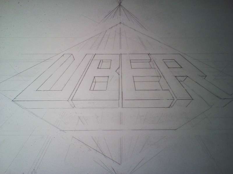
Incredible. The Competitor main logo is simplistic and sleak, I love it. I'm also a big fan of the "calculated chaos" vibe of the Pidove logo. Despite papers being thrown all over the place, the entire design is very organized and thorough. I'm diggin' the background too.
You're the man, Zrack =)
You're the man, Zrack =)


