Well, these polar vortex schenanigans are decidedly awesome. Not only did school get cancelled today, but it also got cancelled for tomorrow. Can I get a hell yeah?
Anyway, I could talk about winter being awesome later, but what's important is not that you have free time, but what you do with it. Likewise, I've been busy. Have some QC shorties I threw up in an hour.
Clawitzer


Literally all I did was add points to the whiskers, as they lack points in the current iteration. That's it. Everything else looks great imo.
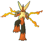
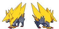
Mega Aggron

More minor edits to this one. Primary edit was making the tail plates have an extra outline shade, as the outline looked too solid considering it only marked an angle. I also fixed the shape of the outline in a few spots, and fixed the shading on the very last tail plate as well, as it was all screwed up for some reason. Other than that, I like the edits you made, Layell. Kudos to you.
Espurr

So I dulled the eyes and removed a few of the highlights on the frontsprite. I didn't increase its height any as I wanted to ensure there was a noticeable height difference between Espurr and Meowstic, and also Espurr has a pretty comparable height in comparison with other 1'00" first forms. Also the proportions are right as it stands currently, as I made sure to literally stick my DS on the computer screen so that the 3D model was side-by-side with the sprite in order to ensure it was all there. I did make the ear edit, however.
So, now that the small stuff's out of the way, I'm proud to unveil my newest creation so that you all can
tear it limb from limb give me constructive feedback. +)
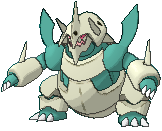
Aurorus

So hey, I made an Aurorus sprite finally. Colors shamelessly ripped from Walrein and Shiny Sceptile (literally just the crystals). Looking for any comments you guys have to toss in the pot, although I do have a couple of points in particular I'd like feedback on.
1. The sails. I didn't know what would be the best way to go about shading these, so I went with my gut and decided to do what looked cool. I couldn't think of any other pokemon at the time with such prominent sails, or any that really matched what Aurorus had going at least. So I decided to opt for a bit of a ripple effect with the shading, as its sails do undulate in-game. I could easily swap it over to a more flat style, but I think it'd be cool if we could tie it rippling into the animation somewhere down the line. But yeah, thoughts on how I should make this would be vastly appreciated.
2. The face. This thing was hard to make, and although I did finally make a design I was happy with, I can't be sure everyone here would enjoy it as well, so yeah.
3. Proportions. I always have concerns with proportions lol.
Other concerns will also be considered for implementation, so please feel free to fire away.
Layell Gogoat looks amazing and your choice of shiny green is spot-on. Great job on that. I think I may edit the fur on Furfrou's backsprite soon though, as it seems odd in the sense that it looks like a messier version of Noivern's old ruff. If I do hit that up, it'll probably be at school on Thursday, so yeah.
Expect some updates on Mega Charixard and maybe even some Dragalge edits tomorrow. (Yes, Dragalge. I'm finally getting around to those edits you mentioned two weeks ago that I forgot about, pom.)