• Snag some vintage SPL team logo merch over at our Teespring store before January 12th!

Sticky X/Y Sprite Project

LF5ePKF.gif
2kvodfG.gif

This should be complete now. I'll give it a few days before doing all the frame rate and colour fixes, just to make ABSOLUTELY SURE that nothing else needs to be updated. If you have any concerns about this animation, better share them now.
Question: Is the dress suposed to open like that from both sides? If yes, it should be clear on the front sprite that that happens on the back.
And, where are it's legs?
1 more thing, I think the dress should move in a more fluid and delicately way (If I'm using the right term.)
gardevoir-mega.gif
gardevoir-2.gif

Here are some 3D model for reference
 
Last edited:
7FtyHE5.gif
Rn495XL.gif


I took out the huge head line, the rest is the same. The head line is slightly in grimer/ditto but they get away with it more because of the colours/texture involved. The outside colours and line breaking are part of the animation style so I'm not touching that.
 
I have some ideas for Tyrunt colours, as I said before that sprite can be simplified a tad.

also fine with ice dino QC or even revamps, the big thing will be eyebrows and sail colours, how we approach that. Use from the current ones what you will.

I've mentioned this before but the Noivern thing is really just that his wingspan cannot compare to any other sprited mon, that is all, it's why he's been a ticky fellow in general.

EDIT: So long as LU makes skirt a slightly different purple I am happy.

I am also bigger on overall style, while I get some spriters stick to some style parts more than others I see QC as largely the way to fix those things.
 
Glad to hear you liked how Tyrunt and Noivern came out. Likewise, I do believe that Noivern looks better without the dithering, as I feel our emphasis in regards to the project should be to make sprites look amazing rather than making them look official. I always took the official sprites to be nice guides, but I don't see why stepping outside of the lines is necessarily bad.

In regards to Mega Aggron, yeah, I had missed your earlier point, thanks for bringing it back up. +) I'll look into it if I get time this weekend. It's looking like I might not with my current *last week before the holidays* homework load, but we'll see.

In regards to Amaura, I literally whipped that sprite up in around 2 hours, so I don't exactly feel too attached to it. Colors can be edited later without much trouble. (I just ripped the blues from Huntail, Blastiose, yellows and pinks from Blast and Luvdisc) As for the size of it, it's actually two pixels taller than Cranidos atm, which is the tallest existing fossil pre-evo. I can make it bigger if need be, but in regards to its current height, that's the reason I chose it. Also, Aurorous prob just needs a new backsprite more than anything. It's front isn't half bad atm.

And I'll just leave this here. Fennekin should be coming soon(tm).
 
aXl If the brown spot is supposed to be in the centre of the head, I would move it across to the right, just off centre but still on the left hand side of the head and then it would look like its supposed to. But other than that I think your sprite is fantastic! Other things that bother me is the feet on the front sprite should be more pointy instead of rectangular and the head leaf things on the back sprite. I think the left leaf on top should be slightly raised and a tiny tiny bit more tilted to the top (if this looks weird in the end, just leave it how it is because its fine anyway, just a minor nitpick). Then the other thing is on the top three leaves, the two left bottom pixels in the middle leaf should be moved a bit because at the moment it looks like the left leaf is behind it when actually the middle leaf is behind both of them.

But other than that it is fantastic!
XY_Prerelease_wild_battle.png

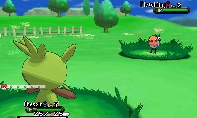
In regards to the backsprite, it actually could use some editing in regards to leaf placement and the like, but because I was suffering from migraines yesterday while simultaneously having to study for the ACT, I never really got around to making them, instead focusing on just getting it resized. The primary fix that still needs to be made is that the top leaves are supposed to come out of his head at an angle instead of jutting straight out. And yeah, the brown spot, as you can see in this picture, is really just randomly placed off-center for absolutely no reason. I still have plans to edit the leaves, and I'll take your advice on the front's feet to mind when I pick it back up again. Yesterday I was in too much of a rush to explain it in detail, so yeah, sorry about that.
 
MegaMewtwoshiny_zpsaaee6e81.png
i hope these are ok for you i also changed the outline so it doesn't go away with the black bg issues. :P

Just throwing this out there, but these might need to be redone whenever we find out what Mega Mewtwo's colors actually are, as currently a shiny Mega Mewtwo is unattainable due to it being shiny-locked in X/Y. Once Pokebank comes out, actual colors will come with it, so be aware that this might need to be redone later.

Also, I recommend that if you're about to double post on the thread, you should probably just edit your previous post, as it clutters the thread less.
 
aXl If the brown spot is supposed to be in the centre of the head, I would move it across to the right, just off centre but still on the left hand side of the head and then it would look like its supposed to. But other than that I think your sprite is fantastic! Other things that bother me is the feet on the front sprite should be more pointy instead of rectangular and the head leaf things on the back sprite. I think the left leaf on top should be slightly raised and a tiny tiny bit more tilted to the top (if this looks weird in the end, just leave it how it is because its fine anyway, just a minor nitpick). Then the other thing is on the top three leaves, the two left bottom pixels in the middle leaf should be moved a bit because at the moment it looks like the left leaf is behind it when actually the middle leaf is behind both of them.

But other than that it is fantastic!

Actually, the spot is leaning towards the left:
19.jpg


Also, aXl, your Amaura is great, but the blue should be a bit paler imo.
 
hey Legitimate Username noticed a slight issue with mega luc's feet on his back sprite that has been bugging me when its seen in ps. The way it shifts in and out of place looks off. The front sprite with his knees does it as well but its slightly less noticeable.
 
Ok so I looked at this and I saw taht the green on chespin looks a bit... Glossy
It looks like it's been covered in oil or something
Can someone make it look less so

Yoink.

Chespin.png
Chespinback.png


Really like the size update for Chespin, well done aXl :)

EDIT: After the comments about that Amaura on the previous page, I've had a quick go at updating it's palette. Left - original. Right - new palette:
amaura.png
amauraedit.png
 
Last edited:
Back
Top