Sticky X/Y Sprite Project

TIME TO OPEN UP THE C&C CORNER AGAIN

Not much I can really say about this one. Noivern's back has a surprisingly large amount of black, and since the frontsprite literally only used two shades of black (barring the outline) that was kind of awkward. Also, the fins on its right wing were kind of annoying, so I'd like to hear what you guys think of my job with them. I'd like to hear feedback on that especially. Other than that, yeah, it's a Noivern. Only the fourth one we have here lol. As always, shoot me up with any comments or criticisms you guys can come up with and I'll try to keep Noivern updated throughout the day.

Still plan on doing the four-sprite Noivern plan to help out with whoever animates Noivern, but for the time being, I'll be taking a break to work on some smaller sprites just as a pallet cleanser, as I've been working on this beast for literally the past week. Probably going to tackle Tyrunt as I had previously alluded to, as all I ever hear following its name is (insert issues here). Maybe I can cook up something that works for it, but the four-to-ten sprites created already certainly makes me nervous.

Anyway, back to listening to the Jet Set Radio soundtrack and pretending I ever owned a Dreamcast.

Oh yeah, almost forgot. Here are the two Noivern's side-by-side, because what's a backsprite post without the frontsprite?
 
To Layell, and other admins of this thread:

Hi! I'm making a pokémon game called Pokemon Cosmos Version. I am trying to incorporate XY pokemon. This includes all regional pokemon, and Mega Evolution. I am using Maruno's RPG Maker XP Pokemon Essentials Kit, Version 13. My main questions is if anyone can use these sprites if proper credit is given. Plase respons ASAP. I am tying to get this game out before May 2014.

Thanks

Dark
 
Last edited:
Alright. I read it. Could you elaborate? I saw the different games utilizing the sprites. Does this mean I just tell Layell about my game? And then its authorized? Or What? Please elaborate. Thanks Siiilver.

Dark
 
Yeah I'm very free and generous just message me and show me where the credits for the spriters will go. Thing like that are cool.
 
Chespin and Fenneken's sprite are way too big o.o

Not convinced they are - if anyone wants to try and reduce their size they can do, but I feel they're suitably small enough.

Just going to split these up now:
Chespin.png
Chespinback.png
Quilladin.png
Quilladinback.png
Chesnaught.png
Chesnaughtback.png

Fennekin.png
Fennekinback.png
braixen.png
braixenback.png
delphox.png
delphoxback.png
 
Not convinced they are - if anyone wants to try and reduce their size they can do, but I feel they're suitably small enough.

Just going to split these up now:
View attachment 5307 View attachment 5308 View attachment 5309 View attachment 5310 View attachment 5305 View attachment 5306
View attachment 5311 View attachment 5312 View attachment 5313 View attachment 5314 View attachment 5315 View attachment 5316
Chespin is missing the brown spot on the back of his head.


Threw these up in literally two minutes to settle the sizing issue. By comparison to other first-stage starters who share a similar body type, Chespin and Fennekin are kinda big as it stands. It could be argued in Chespin's defense that the head leafs don't count in his height, but then he is smaller than Cyndaquil in the Pokédex, so that doesn't really hold up. For him, I'd shrink his size down by half the height difference between him and Piplup, as his head foliage should give him a bit of extra height, but not as much as it is right now. Fennekin just straight up towers over its fire brethren and could use some shrinkage to put them on-par. Also, on an unrelated note, Chespin's outline seems really dark in comparison to the other starters. I could see brightening up his outline shades a tad. I may tackle these as a side project after school if no one wants to mess with them, although we should probably check with the original artist to ensure he doesn't mind us editing his work.

Also, does no one have any C&C for Noivern's backsprite? I find the silence to be a tad stifling atm. +~+
 
I may tackle these as a side project after school if no one wants to mess with them, although we should probably check with the original artist to ensure he doesn't mind us editing his work.

Also, does no one have any C&C for Noivern's backsprite? I find the silence to be a tad stifling atm. +~+

Been there, done that with Geo - I asked him if he'd be willing to reduce the size of them, but he was too busy with commissions and his own projects. Didn't have a problem with us editing them. Feel free to shrink them, I'm reluctant to do it myself as I don't want to mess up the proportions (same with the colours) xD

No issues with your Noivern backsprite, imo :)

Sounds good to me. I'll try to make time for edits over the next day or so in that case.

Also, glad to hear you like it. +)
 
ok so some fatass who may or may not be the owner of this site commented to me on Mewtwo X

150.png
mewtwo-mega-x.png


Namely mewx doesn't have the lightest colour of grey skin compared to regular and Y. So if someone is feeling brave they can edit that, then maybe we can get it done to the animation too. Who knows???

I'll be sending in an update tonight.

Speaking of Mewtwo X, the thing that's sort of grated on me for a good while is the lines above the eyes.
mega_mewtwo_x_battle_1.jpg

Looking at the picture above, I feel like the lines leading up to the horns should be a little paler after less than a quarter of the way, in addition they appear too close together just between the eyes. Let me show you what I mean (I've had a go at add the highlights on the head that the bossman was requesting).
mewtwo-mega-x.png
Mega Mewtwo X.png
Mega Mewtwo X2.png

Left: Old
Middle: New
Right: New (full line experiment)

I've moved the right 'line' on MewtwoX's head one pixel across, meaning there are now two pixels rather than one between the eyes. I'd tried to remove the pair of them as they don't meet at all in the picture, but it looks very awkward when I do. In addition, I've changed the colour of most of both lines into the shame shade of grey used for shadows. I've also experimented with colouring the whole of that line with the grey shadow colour - if you want me to put it back to purple to see how looks like that, feel free to ask.
 
ok right looks pretty good there, the lighting isn't as big of an issue on the back but an update there would be nice as well.

also paging Siiilver can you give that Fletchling a transparent bg for me?
 
Last edited:
ok right looks pretty good there, the lighting isn't as big of an issue on the back but an update there would be nice as well.

There's no update to make, I think - there's no lighting on the back of Mewtwo Y either.

EDIT: aXl made the Quilladin sprite, not me - I just edited the palette xD
 
Last edited:
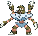
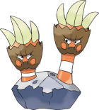
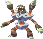
Any comments on Binacle and Barbaracle? (Note, edited the sprites above - just realised I'd edited a colour I shouldn't have XD)

Do you mean the orange? Because Binacle's stripes are actually bright orange...it's not the exact same color as Barbaracle. The brown used on the skin is a more vivid color for Binacle, while Barbaracle's is a dullish shade, closer to Olive. The rocks they're in should be the same color though. But for the most part the contrast is actually pretty much how Game Freak intended it.

688.png
689.png


688.png
689.png
 
Quanyails: Does anyone really mind that Tyrunt is facing more left than other sprites? @_@
Layell: it doesn't bother me!!!
Layell: but I've seen how
Layell: some people have done tyrunt
Layell: and I don't care for it
Layell: so if people want to try they better really be ready to impress me


ALSO

Last back is literally Mega Manecric, that is the one we need.
 
Last edited:
Quanyails: Does anyone really mind that Tyrunt is facing more left than other sprites? @_@
Layell: it doesn't bother me!!!
Layell: but I've seen how
Layell: some people have done tyrunt
Layell: and I don't care for it
Layell: so if people want to try they better really be ready to impress me
612px-Challenge_accepted.png
In all seriousness though, I feel the main issue with Tyrunt is that people aren't trying to pose it similarly to Cranidos. The official art is nice and all, but Cranidos literally is one of the closest examples we have of the body type and this thing has every right to be not chewing the pavement.

Last back is literally Mega Manecric, that is the one we need.

I believe BroBat mentioned he was working on one, but if not, I might try my hand at this since Mega Manectric is badass in the stupid way that fits me perfectly.

EDIT: If you're seeing this, I'd appreciate it if my name could be added to the credits for Clawitzer, as it's been contributed to Quanyails alone for quite some time apparently.
 
Last edited:
Quanyails: Does anyone really mind that Tyrunt is facing more left than other sprites? @_@
Layell: it doesn't bother me!!!
Layell: but I've seen how
Layell: some people have done tyrunt
Layell: and I don't care for it
Layell: so if people want to try they better really be ready to impress me


ALSO

Last back is literally Mega Manecric, that is the one we need.

I've actually been working on it...Pardon my inconsistency with this project. Life catches me at times, then a lack of motivation...But I'm about halfway done with the backsprite, it's not too hard just a massive cluster of tricky angles. I tweaked the front sprite with a few very subtle edits too. Both will be shown soon as I get the back done
 
Do you mean the orange? Because Binacle's stripes are actually bright orange...it's not the exact same color as Barbaracle. The brown used on the skin is a more vivid color for Binacle, while Barbaracle's is a dullish shade, closer to Olive. The rocks they're in should be the same color though. But for the most part the contrast is actually pretty much how Game Freak intended it.

688.png
689.png


688.png
689.png

Hm, I see what you mean - think the orange on the original sprites were a little too pale (as they were based off the 3D model I believe), hence why I changed it.

Lightened the orange on Binacle, darkened the brown on Barbaracle.
Binacle.png
Binacleback.png

barbaracle.png
barbaracleback.png
 
Hey. 1 more thing I would like to point out:

tumblr_muzo5u9K3I1r9cjrmo2_r3_250.gif
tumblr_muzo5u9K3I1r9cjrmo4_r3_250.gif

2U6QCqj.gif
l5FQWEB.gif


The new Talonflame animation isn't going down when it's flapping it's wings like on the previous Talonflame animation. Not sure if it was done on purpose or not. But if it wasn't, I think it would be an easy fix. (the Talonflame looks great btw. Great job on that.)
 
Here. Mega Manectric. Did a few minor tweaks to the front sprite, and took a solid 2 days of work to finish the backsprite, including having to use my phone to take a pic from it ingame just to have a solid reference. You better enjoy this:

2q01wzs.jpg
First I should say that you did a great job on that back sprite. I think it looks awesome. The only problem is its angle. Its pretty much facing mostly to the right while the front sprite is a bit more of an angle. Its probably not the easiest fix tho :s
 
Alright i got some edits and a whole new sprite too.
Frist off i finished my meowstic back.I actually finished it on saturday but could not post it cause of computer problems.
I actully already showed Layell on sunday but i wanted to post it on the thread to know what people think and get some feed back.
meowstic.png

I also edited meowstic's front sprite.


Hm, I see what you mean - think the orange on the original sprites were a little too pale (as they were based off the 3D model I believe), hence why I changed it.

Lightened the orange on Binacle, darkened the brown on Barbaracle.
View attachment 5347View attachment 5348
View attachment 5349 View attachment 5346
Second is my take on barbaracle's colors.
I took the colors from the dream world art.
barbaracle.png

I just think viper's colors were to dark, hope this is better.


Lastly i wanted to post the new sprite of xerneas i made.
While i was looking though the sprites i noticed xerneas's sprite looked wired to me cause the proportions were off.
I decided to edit it then just ended up making a new sprite for it.
x.png

It needs a few edits like the legs i just couldn't get right.
But any way i hope you like all the sprites, and please give feedback.
also i plan on going back and editing some of my old sprites like gourgeist, and i'm gonna make xerneas's back sprite.

also it's my birthday so yeah...bye.
 
Back
Top