Sticky X/Y Sprite Project

I got an idea for anyone who decides to sprite mega aggron. Like other mega forms you use the aggron sprite already used in older games.

You could use aggrons gen 4 or gen 5 sprite (depending on what pose you want the arms)

Spr_4d_306.png
Spr_5b_306.png


Then you throw rhyperior into the mix with its really bulky body. Since its mega form is really bulky too, it can serve as sort of an outline.

Spr_4p_464_m.png


The tyranitar sprite might work as well.

Spr_5b_248.png


They might make spriting it alittle easier since it has decent enough porportions compared to mega aggron.

EDIT: Ill look into that line your talking about on goomy after I finish with tyrantrum's basic animation.
 
Well, I've decided to step out of lurking here to post a shiny sprite for Helioptile. Just for reference, here's a picture of it ingame:
jyFYsZs.jpg

rk4r.png


And back sprite:

22uq.png
 
Tyranitar's back sprite makes it seem like the flowy things on its back (spikes? I don't know lol) are shorter than the front sprite does.

Also, isn't the head missing some spikes...? (In the back sprite)
 
Haven't worked on it that much, but begun the outline of mega abomasnow:
upload_2013-10-11_22-10-23.png

(The colors are just guides, so I know what I am doing.)
More to come soon!
 
Last edited:
Tyranitar's back sprite makes it seem like the flowy things on its back (spikes? I don't know lol) are shorter than the front sprite does.

Also, isn't the head missing some spikes...? (In the back sprite)
thanks for the feed back I'll work on that as soon as I can cause I'm currently working on diggersby's back
 
z64L9LM.gif
aYzLCPA.gif

Since XY is almost out, I'm hoping to see a good Mega Gardevoir backsprite soon so I can start animating it (or at least after the QC is done). That thing is classy as hell.

I may have to start narrowing down my signature a little more. Sad.

megagardevoir_zpsd2b32366.png
MegaGardevoirBackSprite_zps69629894.png

Here you go! I hope I did Mega Gardevoir justice. These sprites are probably my favorite from the bunch I've made in the project.

Anyways, I'm finished editing my Pumpkaboo sprites (I think...) and this is how it looks like now.
Pumpkaboo_zpsca27e87e.png
PumpkabooBackSprite_zps1b5d74bb.png
 
Last edited:
Well, I've decided to step out of lurking here to post a shiny sprite for Helioptile. Just for reference, here's a picture of it ingame:
jyFYsZs.jpg

rk4r.png


And back sprite:

22uq.png
The entire sprite seems really dark? The head and ears look very dark brown when the in-game looks far more grey, and I agree about the red being really dark.

TorterraX Wow that looks pretty good o: I can't wait to see it when it's done~
 
alright finished my mega tyranitar back and also did a edit to mega tyranitar View attachment 2153 View attachment 2154
I struggled with the back a little so if any one could give me advice on the back I would appreciate it
or you could edit it yourself
i think the right spikes on the back sprite should be smaller (as in, pointing more towards the "camera") and the left ones longer, something like this:
VMLLNKS.png


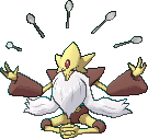
Also, i have finished mega alakazam's front sprite:
Wsrihxz.gif

Ill admit i am not entirely convinced with its head, it looks like it only has 1 yellow since they aren't too different, so it may need additional QC from more experienced hands
 
I think the yellows are definitely a little too close in shade on the head. At first glance (looking at it not zoomed in) it looked flat.
 
Jeez been pretty slow finishing tyrantrum's basic animation but its finally done. Going to add a roar for his rare animation but before that, notice anything wrong with it?

tyrantrum-1st-draft.gif


EDIT: Just noticed this is my 100th post. yayy
 
Last edited:
Duh. I'm retarted.
Anyways, 15 colors exactly. Still needs some work though; anyone have any advice? Also think it could be bigger?
View attachment 2161
Well i don't wanna be mean but there's a few important issues there. Namely:
1: Theres a few white pixels floating around the outline that should be removed.
2: Both shades of grey are really similar (something that happened to my mega alakazam too, i gotta fix it), and the dark grey is always close to the black so it's almost invisible.
3: Almost all the outlines are pure black, except the knees (which shouldnt have outlines at all, like normal medicham) and the lil cuts on the ends of each paper hands (can't find a better way to describe them. Nintendo has to cut down on the mushrooms) that are another shade of black that is barely different

points 2 and 3 combined make it look like a very early work even though it's not. A shame, since it's well drawn, but color wise it needs a lot of work
 
Also, i have finished mega alakazam's front sprite:
Wsrihxz.gif

Ill admit i am not entirely convinced with its head, it looks like it only has 1 yellow since they aren't too different, so it may need additional QC from more experienced hands
065-m.png


try to make the head spikes a bit more angular, instead of the slight curve you have.
 
Oof that zam is big. I feel that one will benefit from knowing its height.

Soon we will also start making mini icons in genV style as well, although I plan on doing this very differently. Ideally only a very small number of people make these for consistency sake. We'll get around to it once megas stop appearing every 12 hours.
 
Vtle3fU.png

I was checking out the sprites on Showdown and I found a transparency error on Mega Lucario's front static sprite. There's a very obvious white spot there above the left hand that should probably be fixed.

Also, it kinda bugged me that Goomy's static sprite was so low down, so I re-centered it to be more consistent with just about every other sprite.
KF9NrE1.png

fA3NQ0n.gif
RsUo4vY.gif
It's nothing major, but I still thought it was kind of worth changing.

yes i know i'm too obsessive and/or compulsive i'll work on that
 
Last edited:
Back
Top