Worst Pokemon Sprites?

Presenting you a sprite of our favorite boxer who stayed in RU longer than we all wanted:

Hitmonchan
!
Spr_4h_107.png

Hitmonchan never had the best sprites (though the Gen II/III sprites were decent), but this one from HGSS really takes the cake. Its face looks awkward; combine that with the pose it has and it really doesn't look like it has much fighting spirit.

Next up on the cutting board is Gliscor.
Spr_4d_472.png
Spr_4p_472.png

Pretty sure this one's been brought up before, but Gliscor's DP sprite is abominable. I'll let this speak for itself. The PtHGSS sprite is like a masterpiece compared to the DP one. Speaking of DP...

Kingdra.
Spr_4d_230.png
Spr_4h_230.png

Kingdra's Sinnoh sprite (on the left) is a side view. It doesn't even face the screen properly and looks like it's fixated on that one spot by its tail instead of its opponent. I'd like to compare this to Kingdra's beautiful HGSS sprite (on the right). I'm still baffled why the HGSS sprite wasn't chosen for Kingdra's Gen V animated sprite instead of the side view. Meh, whatever.

Quagsire
Spr_4d_195_m.png
Spr_4p_195_m.png

Quagsire's an unlucky bastard in Sinnoh. Both sprites suffer from outline color issues, notably having too much dark outline (more obvious on the DP one, but nevertheless bad on the Pt sprite). I'm not a fan of the color schemes on either; DP's Quag is too cyan and bright, while Pt's is too dark.
 
Presenting you a sprite of our favorite boxer who stayed in RU longer than we all wanted:
Hitmonchan!
Spr_4h_107.png

Hitmonchan never had the best sprites (though the Gen II/III sprites were decent), but this one from HGSS really takes the cake. Its face looks awkward; combine that with the pose it has and it really doesn't look like it has much fighting spirit.

Next up on the cutting board is Gliscor.
Spr_4d_472.png
Spr_4p_472.png

Pretty sure this one's been brought up before, but Gliscor's DP sprite is abominable. I'll let this speak for itself. The PtHGSS sprite is like a masterpiece compared to the DP one. Speaking of DP...

Kingdra.
Spr_4d_230.png
Spr_4h_230.png

Kingdra's Sinnoh sprite (on the left) is a side view. It doesn't even face the screen properly and looks like it's fixated on that one spot by its tail instead of its opponent. I'd like to compare this to Kingdra's beautiful HGSS sprite (on the right). I'm still baffled why the HGSS sprite wasn't chosen for Kingdra's Gen V animated sprite instead of the side view. Meh, whatever.

Quagsire
Spr_4d_195_m.png
Spr_4p_195_m.png

Quagsire's an unlucky bastard in Sinnoh. Both sprites suffer from outline color issues, notably having too much dark outline (more obvious on the DP one, but nevertheless bad on the Pt sprite). I'm not a fan of the color schemes on either; DP's Quag is too cyan and bright, while Pt's is too dark.
About Hitmonchan
cannotbeunseen.jpg

1fd58ff1dOEGI.png

poor_doduo_by_gdofseattle-d6lpshb.png
 
I hate the fact that they actually kept some sprites of RS in DP, and not the good ones. The shading is the only thing that changes (and the colour of Skarmory).

DP:
Spr_4d_227.png
Spr_4d_235.png
Spr_4d_264.png


RS:
Spr_3r_227.png
Spr_3r_235.png
Spr_3r_264.png


Also, isn't this the best sprite in any pokémon game?

Spr_4d_289.png


EDIT: I found out that there was a problem with the images so I (hopefully) fixed them.
 
Last edited:
^There seems to be something wrong with the sprites since they won't show up for me.
0ded544a93d115cdce076a7141735382.png


Spr_b_2g_047.png

Anyways, Parasect's backsprite from GSC is weird to me. I mean it looks like the crab arm pincer thing was attached on top of it's mushroom.

76.png

Golem's GSC backsprite here, it just looks like it's drowning and barely keeping it's arm above the water, help me SOS i'm sinking!

268.png

Also gen 6 Cascoon and Silcoon are ugly. I mean what happened to the spikes it had, the spikes were the only sort of special feature about it's desgin. Now Cascoon and Silcoon are just balls with eyes, genius.
 
Also gen 6 Cascoon and Silcoon are ugly. I mean what happened to the spikes it had, the spikes were the only sort of special feature about it's desgin. Now Cascoon and Silcoon are just balls with eyes, genius.
Those weren't spikes, they were silk strands that are supposed to keep them strapped to a wall or something.

At least that's what I think those spike-like protrusions are. Regardless yeah, they looked better with them.
 
Speaking about Golem:

Spr_1g_076.png
Spr_1b_076.png

What the actual shit. Fortunately they gave Golem a good one in Yellow.

Spr_1y_076.png
I mean, I guess that Golem looks like, um, yeah, I don't even know. The Yellow one is kind of badass though.

Here is some more:
Spr_1g_023.png
I mean, once again, I don't even know what this was meant to look like. They could at least have tried to make it look good.

machampn.png
Looks to be a bit in the style of the Golem sprite Fluke showed, and that is not pretty.
 
Actually, call this an unpopular opinion if you like, but I think Golem's design isn't very good to begin with. Every sprite artist - or regular artist - seem to have to move its arms and legs around to work for the pose in question. If you take any picture of Golem in one of its stock poses, and looked at it from another angle, it would look ridiculous. This is clearly evident in the games with 3D models rather than sprites:
Spr_6x_076.png
Spr_b_6x_076.png

Behold, a Golem which looks okay from the front, and... not that good from the back.

To elaborate: Its arms are too short to do anything meaningful. Even if you put food in its hand, it wouldn't be able to stuff it in its mouth. The position of the head is ridiculous, giving it a "blind zone" of roughly 270 degrees both horisontally and vertically. Its legs are too short for it to walk with, and angled so that the knees stick out at weird degrees. Its body is also somewhat off-balance.
tumblr_ns2gh4D2uJ1s9cmimo1_1280.jpg
 
Actually, call this an unpopular opinion if you like, but I think Golem's design isn't very good to begin with. Every sprite artist - or regular artist - seem to have to move its arms and legs around to work for the pose in question. If you take any picture of Golem in one of its stock poses, and looked at it from another angle, it would look ridiculous. This is clearly evident in the games with 3D models rather than sprites:
Spr_6x_076.png
Spr_b_6x_076.png

Behold, a Golem which looks okay from the front, and... not that good from the back.

To elaborate: Its arms are too short to do anything meaningful. Even if you put food in its hand, it wouldn't be able to stuff it in its mouth. The position of the head is ridiculous, giving it a "blind zone" of roughly 270 degrees both horisontally and vertically. Its legs are too short for it to walk with, and angled so that the knees stick out at weird degrees. Its body is also somewhat off-balance.

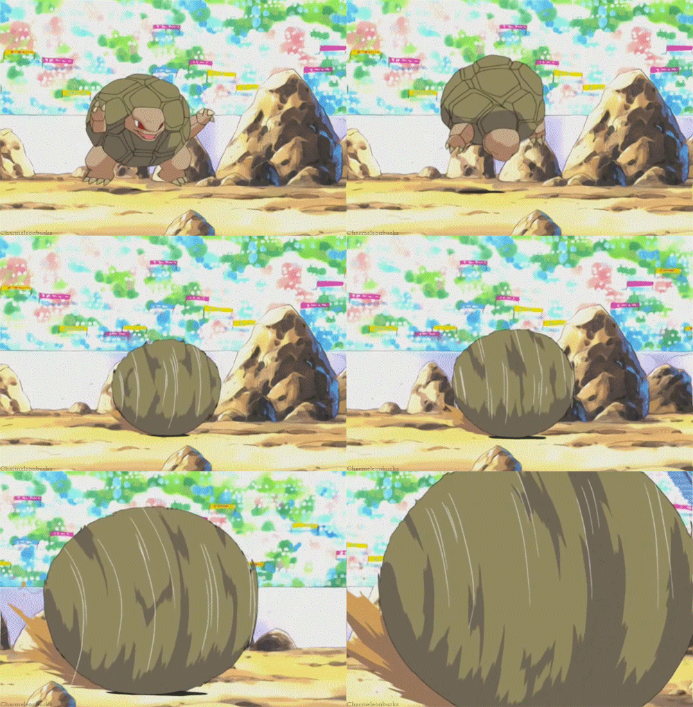
I feel what you're saying, but that's kind of what Golem is; a turtle-like bipedal Pokémon. Turtles are also barely able to touch their own face, right? The anime has shown that Golem is able to withdraw its head, arms, and legs into its shell and roll at high speeds. Therefore I think that it makes a lot of sense having such short arms and small limbs. It kind of gives him a more sturdy and robust look, as well as it ables Golem to quickly withdraw in its shell to start rolling in berserk mode. Golem is dangerous when doing this, as it is unable to see and may crash into or run over anything in its path. Therefore I think it's somewhat logical for Golem to have this rough 270 degrees so called 'blind zone'. I see Golem as this really calm monster, resting in mountainous regions, always moving really slowly. But then when it gets angry, it goes all berserk with tunnelvision on its enemy.

I agree with you on the 6th gen sprite though, as I also think it looks kind of stupid. It just doesn't look like the thing Golem would be. However, I think Golem looks really good in the following example sprite images:

Spr_1y_076.png


Spr_3f_076.png

Spr_5b_076.png

I don't really know how to say it, but I just really think Golem's look matches what it in essence is. Short limbs for quick withdrawal and a rock-hard sturdy body. Generally speaking these highly defensive Pokemon are also quite slow, hence I think Golem's short legs fit it. Indeed, seemingly too short to walk with, but its entire appearance tells me it moves in a different way than 'just walking' when in action.
original.gif

tumblr_mjbjao2ujJ1r5fhkdo1_500.gif
 
  • Like
Reactions: JES
Golem's design is weird in general, since it's a fairly large departure from the "rock with a face on it and also limbs" design of Geodude and Graveler.
 
Back
Top