
-
Welcome to Smogon! Take a moment to read the Introduction to Smogon for a run-down on everything Smogon, and make sure you take some time to read the global rules.
-
Congrats to the winners of the 2024 Smog Awards!
You are using an out of date browser. It may not display this or other websites correctly.
You should upgrade or use an alternative browser.
You should upgrade or use an alternative browser.
Worst Pokemon Sprites?
- Thread starter Rankumander
- Start date
Oh... wow.
This Pysduck is doing SOMETHING....is it poking its eye? Pointing to its nose? I see it doing the same thing that Aerodactyl did in that one episode of the anime.
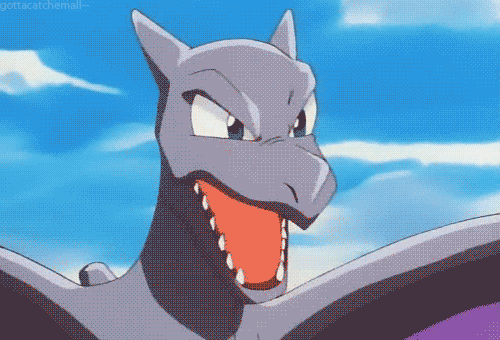
Aerodactyl's sprite in DPP and BW just seems so bad to me... the jaw looks larger than it should be.
It's a Japanese gesture called an akanbe, and is generally used in Japanese media by tsundere characters. Such as Jessie.
So what Aerodactyl is really saying is, "It's not like I like you or anything...baka."It's a Japanese gesture called an akanbe, and is generally used in Japanese media by tsundere characters. Such as Jessie.
Ugh, this is why I like yandere better than tsundere. They are straightforward with their emotions.
So what Aerodactyl is really saying is, "It's not like I like you or anything...baka."
Ugh, this is why I like yandere better than tsundere. They are straightforward with their emotions.
And all this time, I thought that Aerodactyl was saying "you can't get me, you pathetic stupid lizard, *in a sing-song voice and sticks out tongue*.
I just thought it was a random rude gesture they made up. 
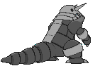
Alright, i'm going to be completely honest here. Although I enjoyed playing through BW1, there was one sprite, out of all 649 that I detested oh so greatly. Look no further than Weavile's back sprite:

In my opinion, the way the arms were bothered me too much to even use this thing on my main in-game team. It was just terrible.
In my opinion, the way the arms were bothered me too much to even use this thing on my main in-game team. It was just terrible.

Ditto wants to fly?
Pidgeot has such an odd Emerald animation. It's... doing a somersault.

Pidgeot has such an odd Emerald animation. It's... doing a somersault.
Last edited by a moderator:

Wasn't there a controversy some time ago where they had Registeel perform a Nazi salute? I think it was a 4th Gen game.


Here it is. I'm not seeing the issue, but eh?
Edit: More sprites on the way as I find them. Here's some Registeel stuff for now:

Gotta get the daily jog in!
Also the Gen VI sprite kinda looks...awkward. I don't even KNOW what it's doing with its arms there.

Seriously. Registeel just CANNOT get it right with the arms.
On the subject of the regis, here's some Regirock stuff:

This is Gen III....what happened to its chin? It looks odd and chunky.
Gen IV fixed it, though.

And what about Rattata? These couple of sprites are CERTAINLY not top percent:

Silver decided to make this thing stand up. I mean, really; it looks like something from a cartoon. Totally non-threatening. Gold got it much better:

I mean, this is the thing that doesn't even care if it's gonna lose. It'll bite your ankle off anyway.

RSE decided it should stand up as well. Not FRLG, but...ehhh
Last edited:
Yeah, that Registeel sprite. You know at least one idiot named their Registeel "MeinFurher".Wasn't there a controversy some time ago where they had Registeel perform a Nazi salute? I think it was a 4th Gen game.
Also, this thread has now invoked Godwin's Law.
I'd tell you to just be glad it hasn't invoked Rule 34, but I think it already did when I posted Miltank's animation on Page 4. (That really should count as porn.)Yeah, that Registeel sprite. You know at least one idiot named their Registeel "MeinFurher".
Also, this thread has now invoked Godwin's Law.
I'm surprised that no one has commented on DP Gliscor. Some things were not meant to be viewed head on. (At least when they're limited to 80x80 pixels.)

The sprite differences between Emerald and Fire Red were jarring for me. I don't know what to say about Magneton, but Graveler looks like it has two areas that could be the top of its head..


RB Magneton is missing a face. I don't think it looks that bad, but I thought that it was kind of funny.

(Don't tell me it's facing backwards. You can't see its face on the back sprite.)
It looks like the Magneton (higher up) might be upside down.
It feels like the other two are upside down instead. :/It looks like the Magneton (higher up) might be upside down.
I meant the sprite higher up, and the two on the bottom are upside down.


For some reason the old Growlithe sprite reminds me of something that would appear in an episode of MLP. o-o
No, you are wrong. At least, this sprite was not designed by an human being. Btw, the glitchy look fascinates me, and this can't be worse than RBY Golbat. Seriously.Actually, thinking about it, THIS is the worst Pokémon sprite ever:

I mean, it's a glitchy Utah.
You mean this.

Gaze upon it and despair. Seems like a tossup to me. Missingno never really moved me, mainly because I hate glitches (and that is why I absolutely refuse to play Gen I, but that's beside the point). Actually, I'd have to say Golbat is worse. Human hands created that thing. On purpose.
Gaze upon it and despair. Seems like a tossup to me. Missingno never really moved me, mainly because I hate glitches (and that is why I absolutely refuse to play Gen I, but that's beside the point). Actually, I'd have to say Golbat is worse. Human hands created that thing. On purpose.


I never really understood the hate on R/B Golbat. Sure there are a lot of things wrong with the design, but it's not the worst sprite out there, and it is kinda fitting for a game featuring a bunch of cartoony monsters. I can think of many sprites that are far worse (looking at you, Green Mew).
Can't post any sprites since I'm on my phone, but it took Game Freak an entire generation to get Bellossom's color scheme right.
Can't post any sprites since I'm on my phone, but it took Game Freak an entire generation to get Bellossom's color scheme right.
Just because it isn't the worst, and just because it was Gen I, doesn't make it not bad.
Concerning Bellossom, I assume this is what you're referring to: (from Silver)

Compare that to even Crystal:

Both of those are way off. The GS one seems to be GameFreak forgetting which one was supposed to be Shiny again. Compare to Gen III:

Much better.
(The Crystal animation seems to be trying to hula or something. Couldn't tell you what the Emerald animation is.)
Concerning Bellossom, I assume this is what you're referring to: (from Silver)
Compare that to even Crystal:
Both of those are way off. The GS one seems to be GameFreak forgetting which one was supposed to be Shiny again. Compare to Gen III:
Much better.
(The Crystal animation seems to be trying to hula or something. Couldn't tell you what the Emerald animation is.)
Just because it isn't the worst, and just because it was Gen I, doesn't make it not bad.
Concerning Bellossom, I assume this is what you're referring to: (from Silver)
Compare that to even Crystal:
Both of those are way off. The GS one seems to be GameFreak forgetting which one was supposed to be Shiny again. Compare to Gen III:
Much better.
(The Crystal animation seems to be trying to hula or something. Couldn't tell you what the Emerald animation is.)
I never noticed but have to say that I really like it with pink instead of red. How about this, I know it's a model (which should just be incorporated into the thread) but it really annoys me.
It's even worse from the back, though I can't find an image. It's just ugly without fire constantly spewing from it's back. They should have at least added smoke until it attacks if that's what they were going for.

Here's the model from the back. Such a shame. It was my favorite back in Gen II and they ruined it.
I never noticed but have to say that I really like it with pink instead of red. How about this, I know it's a model (which should just be incorporated into the thread) but it really annoys me.
It's even worse from the back, though I can't find an image. It's just ugly without fire constantly spewing from it's back. They should have at least added smoke until it attacks if that's what they were going for.
Yeah, I have to agree. Cyndaquil was my very first Pokémon in the very first game I ever owned, so that family line will always have a special place in my heart.
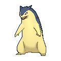
I'm guessing they are trying to now paint the picture that Typhlosion only fires up while attacking, presumably to save energy, though he hardly looks as intimidating now.
This I think is inconsistent, or did Typhlosion always do this in the anime?