
-
Welcome to Smogon! Take a moment to read the Introduction to Smogon for a run-down on everything Smogon, and make sure you take some time to read the global rules.
-
Congrats to the winners of the 2024 Smog Awards!
You are using an out of date browser. It may not display this or other websites correctly.
You should upgrade or use an alternative browser.
You should upgrade or use an alternative browser.
Unpopular opinions
- Thread starter antemortem
- Start date
Which brings another point
Not all sprites are good, and they typically shouldn't be the standard for design for a mon. Gligar Gen 4 had a color crisis, BW Darmanitan 2nd form moves its arms when it shouldn't, etc
Also I said this already, I really hate the low material diversity for Mons, and the sprites barely did anything for that. Many steel types don't really look metallic due to low contrast as a result
It was one of the reasons Detective Pikachu's movie interested me, cuz mons were forced to have different textures for the species and env. Bulbasaur's toady leathery skin, Slaking's fur, many bird mon feathers, Charmander's scales, and Lickitungs slimy tongue
It feels limiting going back to canon games/anime and everything just looks like plastic toys
I think fur and metal should have stylistic textures, but I dont know much about anything else. Maybe slime?
But i feel like scales can make things uncanny due to how small and how many there are, unless you draw big ones, like on silvally's feet. Also the fact charmander has scales deeply upsets me
But i feel like scales can make things uncanny due to how small and how many there are, unless you draw big ones, like on silvally's feet. Also the fact charmander has scales deeply upsets me


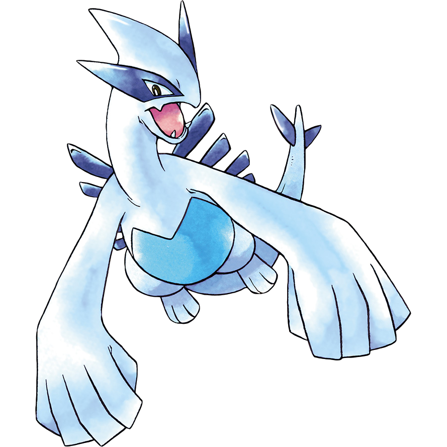
I'm with you on this, it's great. Most of the HGSS sprites are horrible but Lugia's sprite in those games is particularly atrocious.
Lugia in particular has always had a tough time with poses due to its hand wings. Many of its good stock art poses just treat its hand wings as just wings or doing a more simple hand gesture:


Which brings another point
Not all sprites are good, and they typically shouldn't be the standard for design for a mon. Gligar Gen 4 had a color crisis, BW Darmanitan 2nd form moves its arms when it shouldn't, etc
Also I said this already, I really hate the low material diversity for Mons, and the sprites barely did anything for that. Many steel types don't really look metallic due to low contrast as a result
It was one of the reasons Detective Pikachu's movie interested me, cuz mons were forced to have different textures for the species and env. Bulbasaur's toady leathery skin, Slaking's fur, many bird mon feathers, Charmander's scales, and Lickitungs slimy tongue
It feels limiting going back to canon games/anime and everything just looks like plastic toys
I agree with Lemingue here, while there are certainly some textures that could be given some additional details like metal, rock, slime, etc.. I think the very fine detail textures like scales, fur and feathers may throw off the Pokemon's appearance more than help it, at least for the games. Great they added it in for Detective Pikachu and making the Pokemon look like actual living creatures... but that's because the movie is live action using non-CGI human actors. But the world the Pokemon games take place in is a cartoon, an anime, where humans also look more simple and "plastic-y". So with the humans looking that way it makes sense for the Pokemon to look that way so they look like they belong in the world and interacting with the human characters and environment.
Now other spinoff games like Pokken and Super Smash Bros to a degree have also added some more realistic details... and while fine once you get used to it at the same time for some Pokemon the details did make the Pokemon look a bit off. Notably in Pokken where the human characters are STILL anime humans so adding in the realistic details of scales, fur, and even leathery skin kind of did make the Pokemon look more stranger then they should have.
(Sorry for using my own art, im on mobile rn and cant really grab images real fast.)
I feel like if it were to give pokemon fur textures, it'd be something stylized, probably even less detailed than what i did here. Drawing big fur strokes instead of disney's "every single hair needs to be modeled and animated or so help me" could keep the cartoony vibes of pokemon while also giving them a bit more of a texture. Not only that, any pokemon who has short fur can probably just stay that way. No need to complicate things more.
My style isnt even the best example since its a bit more realistic than pokemon but its all that i got in this phone other than memes, dont @ me.

Scales need to be in big chunks and very stylized, like on the arms and legs there. Too small and too many will look uncanny.
Skin/rough skin can just stay the way it is, any details can really make things look bad imo. (See pokkens blastoise) Slime can be given some basic sheen but i wouldnt do more than that.
Rocks, metal, gems etc could have different reflections and sheens depending on the material, but I wouldn't add anything else.
Tl;dr just give it some small cartoony textures on some stuff. Most of its is fine as it is other than the metals but even then its not that bad. I just hate the pokken textures tbh
I feel like if it were to give pokemon fur textures, it'd be something stylized, probably even less detailed than what i did here. Drawing big fur strokes instead of disney's "every single hair needs to be modeled and animated or so help me" could keep the cartoony vibes of pokemon while also giving them a bit more of a texture. Not only that, any pokemon who has short fur can probably just stay that way. No need to complicate things more.
My style isnt even the best example since its a bit more realistic than pokemon but its all that i got in this phone other than memes, dont @ me.
Scales need to be in big chunks and very stylized, like on the arms and legs there. Too small and too many will look uncanny.
Skin/rough skin can just stay the way it is, any details can really make things look bad imo. (See pokkens blastoise) Slime can be given some basic sheen but i wouldnt do more than that.
Rocks, metal, gems etc could have different reflections and sheens depending on the material, but I wouldn't add anything else.
Tl;dr just give it some small cartoony textures on some stuff. Most of its is fine as it is other than the metals but even then its not that bad. I just hate the pokken textures tbh
I agree with Lemingue here, while there are certainly some textures that could be given some additional details like metal, rock, slime, etc.. I think the very fine detail textures like scales, fur and feathers may throw off the Pokemon's appearance more than help it, at least for the games. Great they added it in for Detective Pikachu and making the Pokemon look like actual living creatures... but that's because the movie is live action using non-CGI human actors. But the world the Pokemon games take place in is a cartoon, an anime, where humans also look more simple and "plastic-y". So with the humans looking that way it makes sense for the Pokemon to look that way so they look like they belong in the world and interacting with the human characters and environment.
Now other spinoff games like Pokken and Super Smash Bros to a degree have also added some more realistic details... and while fine once you get used to it at the same time for some Pokemon the details did make the Pokemon look a bit off. Notably in Pokken where the human characters are STILL anime humans so adding in the realistic details of scales, fur, and even leathery skin kind of did make the Pokemon look more stranger then they should have.
I think that a balance could be achieved though, Stadium 2 did have some mons with a metallic sheen and more noticeable fur, so it all depends on adding a little bit of detail on the textures to not break the artstyle too much. Pokkén did go overboard imo. (But it made Pikachu legit fun to play, so it evens out.)
Time for my dumb stupid pointless "hot take", ahem, Meganium is one of the biggest downgrades in all of pokemon, yes even more than lickilicky. Now hear me out.


Everyone shits on Lickilicky because it's a bigger fatter version of lickitung with a dumb hair tumor on top of its head. However looking at lickitung its design isn't super great by any degree. It's a weird pink lizard thing that probably feels uncomfortable to touch. I'd say Lickilicky is basically similar in terms of design quality.


These two on the other hand, it's just a straight downgrade. Notice Bayleef, arguably the best designed of any middle evolution starter, has it all. A cool head leaf, weird bud neck things, the nice shade of yellow. It looks sturdy, you can't hurt it even if you try. However if you lay a goddamn finger on bayleef everyone will beat the shit out of you because it's also cute. It somehow has the ability to be cool, cute, and tough all at once. Just an overall great design. Meganium on the other hand looks worse. Sure it has that flower collar, and that's pretty nice, but it goes back to being green! Also it loses the cool leaf for antennae. What doesn't help is that I think they're supposed to resemble stamens, and to those that don't know a stamen is essentially a plant dick. Fucking meganium is out here showing its plant cocks off to everybody, fertilizing the whole damn forest! Oh sure it's taller but that means it's neck is longer. A longer neck means some motherfucking staraptor could fucking dig its talons into meganium and it goes extinct! Anyway Meganium is a downgrade, stop evolving your bayleefs and give them a lump of purple clay.
Everyone shits on Lickilicky because it's a bigger fatter version of lickitung with a dumb hair tumor on top of its head. However looking at lickitung its design isn't super great by any degree. It's a weird pink lizard thing that probably feels uncomfortable to touch. I'd say Lickilicky is basically similar in terms of design quality.
These two on the other hand, it's just a straight downgrade. Notice Bayleef, arguably the best designed of any middle evolution starter, has it all. A cool head leaf, weird bud neck things, the nice shade of yellow. It looks sturdy, you can't hurt it even if you try. However if you lay a goddamn finger on bayleef everyone will beat the shit out of you because it's also cute. It somehow has the ability to be cool, cute, and tough all at once. Just an overall great design. Meganium on the other hand looks worse. Sure it has that flower collar, and that's pretty nice, but it goes back to being green! Also it loses the cool leaf for antennae. What doesn't help is that I think they're supposed to resemble stamens, and to those that don't know a stamen is essentially a plant dick. Fucking meganium is out here showing its plant cocks off to everybody, fertilizing the whole damn forest! Oh sure it's taller but that means it's neck is longer. A longer neck means some motherfucking staraptor could fucking dig its talons into meganium and it goes extinct! Anyway Meganium is a downgrade, stop evolving your bayleefs and give them a lump of purple clay.
I shit on Lickilicky because its mouth and tongue are far less disturbing. Its' just a line and a U-shape, while with Lickitung its tongue is waving all over the place and you can actually see its mouth. Lickilicky is too simplified. Also its name is dumb.Time for my dumb stupid pointless "hot take", ahem, Meganium is one of the biggest downgrades in all of pokemon, yes even more than lickilicky. Now hear me out.
Everyone shits on Lickilicky because it's a bigger fatter version of lickitung with a dumb hair tumor on top of its head. However looking at lickitung its design isn't super great by any degree. It's a weird pink lizard thing that probably feels uncomfortable to touch. I'd say Lickilicky is basically similar in terms of design quality.
These two on the other hand, it's just a straight downgrade. Notice Bayleef, arguably the best designed of any middle evolution starter, has it all. A cool head leaf, weird bud neck things, the nice shade of yellow. It looks sturdy, you can't hurt it even if you try. However if you lay a goddamn finger on bayleef everyone will beat the shit out of you because it's also cute. It somehow has the ability to be cool, cute, and tough all at once. Just an overall great design. Meganium on the other hand looks worse. Sure it has that flower collar, and that's pretty nice, but it goes back to being green! Also it loses the cool leaf for antennae. What doesn't help is that I think they're supposed to resemble stamens, and to those that don't know a stamen is essentially a plant dick. Fucking meganium is out here showing its plant cocks off to everybody, fertilizing the whole damn forest! Oh sure it's taller but that means it's neck is longer. A longer neck means some motherfucking staraptor could fucking dig its talons into meganium and it goes extinct! Anyway Meganium is a downgrade, stop evolving your bayleefs and give them a lump of purple clay.
But yeah, Meganium definitely has Coalossal Syndrome. Its two previous evolutions have a cool unique thing (lead on head) and then Meganium just drops it for some reason.


I've actually always loved Lickylicky. Its a much nicer shade of pink than its pre-evo and its smaller, less wavy tongue combined with its simpler color scheme and design makes it look much cuter.Time for my dumb stupid pointless "hot take", ahem, Meganium is one of the biggest downgrades in all of pokemon, yes even more than lickilicky. Now hear me out.
Everyone shits on Lickilicky because it's a bigger fatter version of lickitung with a dumb hair tumor on top of its head. However looking at lickitung its design isn't super great by any degree. It's a weird pink lizard thing that probably feels uncomfortable to touch. I'd say Lickilicky is basically similar in terms of design quality.
Did you know, Chikorita used to be yellow before Crystal, even in art?Time for my dumb stupid pointless "hot take", ahem, Meganium is one of the biggest downgrades in all of pokemon, yes even more than lickilicky. Now hear me out.
Everyone shits on Lickilicky because it's a bigger fatter version of lickitung with a dumb hair tumor on top of its head. However looking at lickitung its design isn't super great by any degree. It's a weird pink lizard thing that probably feels uncomfortable to touch. I'd say Lickilicky is basically similar in terms of design quality.
These two on the other hand, it's just a straight downgrade. Notice Bayleef, arguably the best designed of any middle evolution starter, has it all. A cool head leaf, weird bud neck things, the nice shade of yellow. It looks sturdy, you can't hurt it even if you try. However if you lay a goddamn finger on bayleef everyone will beat the shit out of you because it's also cute. It somehow has the ability to be cool, cute, and tough all at once. Just an overall great design. Meganium on the other hand looks worse. Sure it has that flower collar, and that's pretty nice, but it goes back to being green! Also it loses the cool leaf for antennae. What doesn't help is that I think they're supposed to resemble stamens, and to those that don't know a stamen is essentially a plant dick. Fucking meganium is out here showing its plant cocks off to everybody, fertilizing the whole damn forest! Oh sure it's taller but that means it's neck is longer. A longer neck means some motherfucking staraptor could fucking dig its talons into meganium and it goes extinct! Anyway Meganium is a downgrade, stop evolving your bayleefs and give them a lump of purple clay.
It made going from yellow to green seem like an evo, as opposed to a reversion
Also proportion wise, it isn't longer for neck either, it's just overall bigger

The OG line was supposed to look like this and despite the body change, you can notice more similarities like the antennae and big flower. This beta Bayleef actually fit better imo than what we got. But I guess the Ash x Bayleef shipping would get a little weirder

Last edited:
View attachment 297542
The OG line was supposed to look like this and despite the body change, you can notice more similarities like the antennae and big flower. This beta Bayleef actually fit better imo than what we got.
I'm still convinced that Beta Bayleef is from a scrapped Grass Starter line. It's just there as placeholder since I'd imagine in most cases the Starter's first and final forms are made with the middle evo made last to try and bridge the two.
But I guess the Ash x Bayleef shipping would get a little weirder
But I guess the Ash x Bayleef shipping would get a little weirder
Yung Dramps and Lemingue said:Reactions to Human x Pokemon shipping
(Actually, that is the first time I've heard that one, specifically.)
(Actually, that is the first time I've heard that one, specifically.)
In the anime, Ash's Chikorita/Bayleef was very clingy and affective towards him.
And it's not the only mon that gets attracted towards Ash. Latias (?) and Meloetta say hi.

Well, I prefer our Bayleef more than the one in beta. It's much smoother evol thant Beta Sprite -> Meganium
And it's not the only mon that gets attracted towards Ash. Latias (?) and Meloetta say hi.
Wait, Meloetta? I never got the interaction between Ash & Meloetta being ship-y. Shaymin showed more interest in Ash (via a tsundere attitude) than Meloetta which more acted like Victini did, friendly and playful.
However I have heard of ships for Bayleef and of course Latias. Of course I don't take any of those ships seriously, even moreso than the usual crack ships they made with Pokemon characters.
Though my favorite ships are always the one that are between married couples, lol. Like, I don't know, are you sure May & Max's dad likes their mom?
Norman seems to always be portrayed either as an oblivious nice dude or the spawn of the devil outside the games and I really dont know whyThough my favorite ships are always the one that are between married couples, lol. Like, I don't know, are you sure May & Max's dad likes their mom?
I am confused... arent "shipping" meant to be fan theoryes about charachters being in love with each other?hough my favorite ships are always the one that are between married couples, lol
...why do fans ship MARRIED COUPLES???
Considering how somewhat common it is to ship married people with someone else, shipping actual couples isnt that farfetched. I guess the term evolved from fan theory to just "hehe character go kiss"I am confused... arent "shipping" meant to be fan theoryes about charachters being in love with each other?
...why do fans ship MARRIED COUPLES???
Here's an unpopular opinion
I don't hate Max
Yes I know, he was invented to be the "kid to relate to" character, and he was always chewing out on Ash. But honestly, it's better than Bonnie
Who literally was only a reverse Brock that advertised cute things
And when they couldn't advertise Dedenne anymore, they just had her advertise Zygar- Oop, I mean, "Squishy"
Which funny enough, Max himself is very much Misty 2.0, but taken in a different direction. He had character development for the Jirachi movie too, and his sibling relation was better with May than Bonnie and Clemont
"Squishy"
IDK why but someone naming something with (potential) power akin to the various box legendaries something like “Squishy” just strikes me as absolutely hilarious. Granted, Zygarde is one of the few where that actually makes sense, but still.
Here's an unpopular opinion
I don't hate Max
Yes I know, he was invented to be the "kid to relate to" character, and he was always chewing out on Ash. But honestly, it's better than Bonnie
Who literally was only a reverse Brock that advertised cute things
And when they couldn't advertise Dedenne anymore, they just had her advertise Zygar- Oop, I mean, "Squishy"
Which funny enough, Max himself is very much Misty 2.0, but taken in a different direction. He had character development for the Jirachi movie too, and his sibling relation was better with May than Bonnie and Clemont
I'm going with the popular opinion here, Max really irritated me at moments (his very poor battling skills despite all his bragging, his reaction when Norman loses, etc.), but he was mostly just fine. But his sibling interactions were the best part of him. I'm also pretty 'meh' with Bonnie, and it's kinda hypocritical seeing how people trashtalk Max but gush all over her. She even gets an overused romantic gag similarly to Max, except this one's worse...
Wait, Meloetta? I never got the interaction between Ash & Meloetta being ship-y. Shaymin showed more interest in Ash (via a tsundere attitude) than Meloetta which more acted like Victini did, friendly and playful.
I can remember some blushing moments with her? Then again, I haven't watched BW in a loooong time so I might be remembering wrong...