Smogon Front Page B&W Pokemon Art Submissions

Status
Not open for further replies.
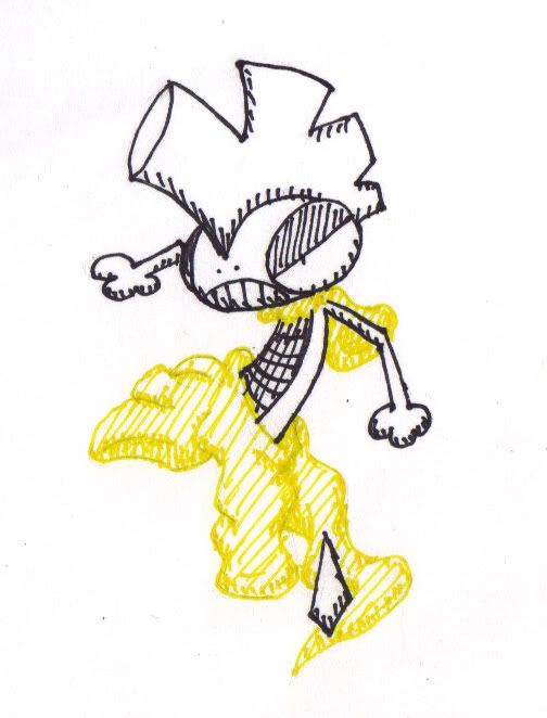
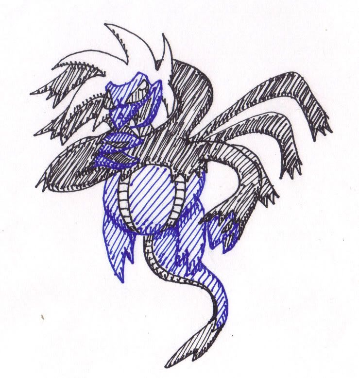
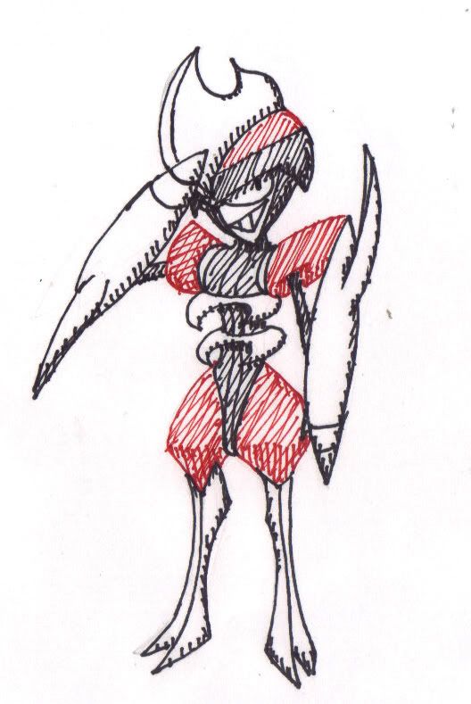
Ok I'll give this a go as long as no one minds the scratchy pen and ink :P

Red: Bisharp
Blue: Sazandora
Yellow: Scrafty

Heh, they're all dark types...
 
I guess I'll join in
Blue:
Seismitoad
Seismitoad.png

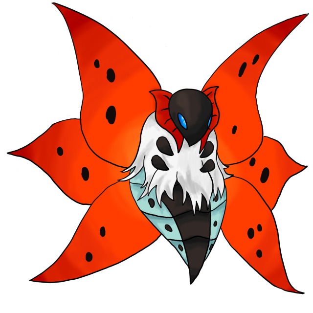
Red:
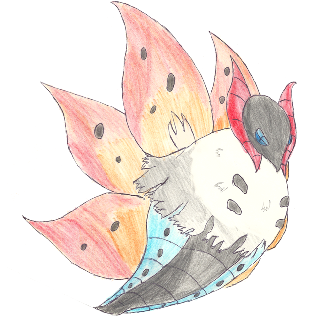
Volcarona
Volcarona.png

Yellow:
working on Galvantula
 
What do you guys think are good candidates for the color red? I'm browsing through the thread, and I can't help but feel that Volcarona might vary in proportions, and Kirizikan's okay. I'm thinking maybe Excadrill or Sawsbuck might be other options, but they're better off in a brown scheme.
 
i want try. i made some sketches:

red- excadrill
blue- chandelure
yellow- whimsicott?

the only true problem is who few things of univa have yellow as color.
 
Yeah, but all the Pokemon being posted here have to be..."OU Material", so that means Joltik's out of the question. On a side note, not sure if Swanna counts as OU material too, since it looks so...good to draw and all.
 
Whipped these up today. I just focused on the color they were picked for and just did the rest black and white. I think they look ok and hope they're satisfactory:
BisharpRed.jpg

ScraftyYellow.jpg

HydreigonBlue.jpg
 
Yeah, but all the Pokemon being posted here have to be..."OU Material", so that means Joltik's out of the question. On a side note, not sure if Swanna counts as OU material too, since it looks so...good to draw and all.

not so!

they just need to be "competitively viable"
 
Holy crap Naraku those pics are amazing.

That is possibly the best Samurott I have ever seen and it is beautiful. Zoroark is good too.

The Archeops is a different story. I can't really put my finger on it, but I'm pretty sure that pose doesn't do it a lot of justice. The colors are also a bit off, but I don't know how to make it better. Right now it looks like it's wearing a jester suit instead of feathers. imo, the colors need to be either darker or shinier, either direction should work, and there has to be more dynamic shading to give it that fluffier feeling.

They're beautiful no matter how you slice it, so take my words with a grain of salt.
 
If I enter everything, I have to win something!
Right?

Anyway, it would make sense that the first picture is one of the most threatening new pokemon... A tiny mole:
excawhite.png

There is some disagreement over whether Galvantula is not blue, but yellow.
Every one else says it is, I say it isn't.
galvwhite.png

And for yellow/green... I haven't decided yet.

At the moment the backgrounds are transparent, I'll change them to white when I post the third.
 
Holy crap Naraku those pics are amazing.

That is possibly the best Samurott I have ever seen and it is beautiful. Zoroark is good too.

The Archeops is a different story. I can't really put my finger on it, but I'm pretty sure that pose doesn't do it a lot of justice. The colors are also a bit off, but I don't know how to make it better. Right now it looks like it's wearing a jester suit instead of feathers. imo, the colors need to be either darker or shinier, either direction should work, and there has to be more dynamic shading to give it that fluffier feeling.

They're beautiful no matter how you slice it, so take my words with a grain of salt.

I don't like my Archeops either to be honest. I tried to go back to the animal he was based off of, which was a flightless prehistoric bird. That's why I chose that pose, but it didn't turn out the way I wanted. His neck is too thick also.

I appreciate your comments though, don't get me wrong :3
 
It's funny cause every time I try to do a Volcarona I mean for it to be a full-front, symmetrical view, but it always ends up tilted like this.

I tried to do this shading thing on the wings, instead of shading them individually, I treated them as a whole and did this "glow" from the center. Don't know if that's visible or not. :/

Volcarona.png


Holy crap Icepick that's a nice Hydreigon. The rugged shading really does it for me.
 
icepick I love the shading on that Hydregon. And Energy, the wing shading looks really nice. Everything is sooo good in this thread =D
 
So... Here's my first go at a 5th gen guy, I'm still getting the hang of that digital transition...:S

Darmanitan.png


Can't decide who to try for the yellow/green and blue though. :(
 
Status
Not open for further replies.
Back
Top