
-
Welcome to Smogon! Take a moment to read the Introduction to Smogon for a run-down on everything Smogon, and make sure you take some time to read the global rules.
-
Congrats to the winners of the 2023 Smog Awards!
New Style Smogon Dark v2
- Thread starter Stellar
- Start date
- Status
- Not open for further replies.


Fixed the uploader/etc.I like this new wider look compared to default, but I feel like the margin on the sides is a bit too thin. Would prefer it to be at least the size of the margin as seen between the post and the editor here:
View attachment 158408
The image placer is pretty hard to read as well:
View attachment 158409
Still need to fix white arrows on posts on mobile and the share link text box.
Last edited:


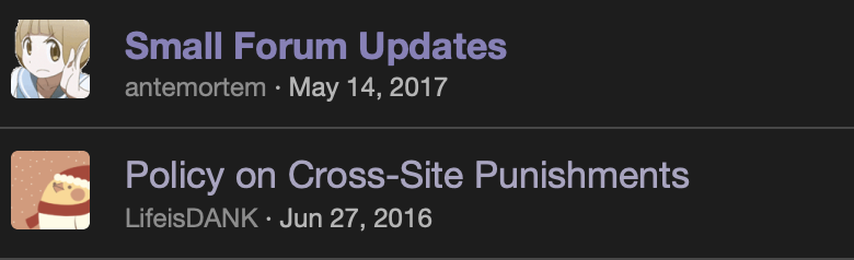
I find it a bit difficult to see in which threads new posts have been made. Example:
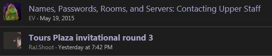
I am able to see the difference but think a more obviously different look would give a better immediate overview when looking at the forum.
I am able to see the difference but think a more obviously different look would give a better immediate overview when looking at the forum.
FriendOfMrGolem120 I changed the unread link color ever so slightly. It should stand out more without being jarring.

This. Is. AWESOME!
Very cool, and the BW Smogon logo too!
Very cool, and the BW Smogon logo too!

These styles in general only apply to the forums.Will this also extend to the analysis pages?
- Status
- Not open for further replies.