
-
Welcome to Smogon! Take a moment to read the Introduction to Smogon for a run-down on everything Smogon, and make sure you take some time to read the global rules.
-
Congrats to the winners of the 2024 Smog Awards!
You are using an out of date browser. It may not display this or other websites correctly.
You should upgrade or use an alternative browser.
You should upgrade or use an alternative browser.
Pokemon designs that were ruined by 3D models
- Thread starter Chestnutty
- Start date

u dont have to get so upset, I know what it's based off but that doesn't mean I have to like it. It being based off of real world martial arts poses doesn't make it any less silly for me
I mean, you were acting way more upset that it's ridiculous design got changed to reflect it's namesake in 3 different languages, but whatever i guess. It's just annoying seeing people trying to shit on designs when they have no idea what they are drawing from in real-life, and sound kinda silly when they do so

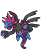
I can sort of see that (& I love me some Doronjo references) but also it looks bad and it's not even present in the original sprite & artwork. Also feel like the inspiration would get across better if the white patterns where on the legs and such as well, instead of just the upper arms and back.I's because Purrloin is a reference to Doronjo the leader of the Dorombo gang, the villains from Yatterman

incidentally it's not just famous in japan, it's pretty much a template, the Team Rocket from the anime are a standard Dorombo-style characters
not only that, Purrloin also references Leopard (get it?) Doronjo's daughter and successor from Yatterman Night (notice that Leopard might also reference Purrloin itself since while the similarities between both are more obvious Purrloin predates Leopard, then again the point may be moot since both are references to the same character)
It's just not a design that works as well bipedal as they think it does.
Though again, this is not necessarily a fault with 3D Model itself as it is they decided the 3D model was the time to bring this aspect into the main games.
I mean, you were acting way more upset that it's ridiculous design got changed to reflect it's namesake in 3 different languages, but whatever i guess. It's just annoying seeing people trying to shit on designs when they have no idea what they are drawing from in real-life, and sound kinda silly when they do so
please dude i just dislike hitmontops model i dont want these passive agressive responses lolu dont have to get so upset, I know what it's based off but that doesn't mean I have to like it. It being based off of real world martial arts poses doesn't make it any less silly for me
please dude i just dislike hitmontops model i dont want these passive agressive responses lol
.... I was referencing your original post where it sounded like you had no idea at all why they would've gone with that design at all. I thought that was obvious/clear what i meant when i said that, but i guess not *shrug*

So actually Gamefreak finally being able to show the other part of the inspiration for Hitmontop (being based on capoeria, not a "stupid dance" as you called it") due to shifting to 3D, now renders Hitmontop nonsense and boring? Hell, it's Japanese, French, and German name even references capoeria, which you can easily see if you looked at the names on Bulbapedia, and there, it even also references capoeria. If anything, it's more faithful to it's design based on it's Japanese, French, and German name alone
Honestly, with both Purrloin and Hitmontop, it feels like people aren't actually looking up anything to figure out why the 3D models are the way they are, and instead cry out "OMG, ruined and awful and shit now!!!"
Maybe you right, but even if it references something, that doesn't mean I need to like it. I prefered both sitting Purrloin and spinning Hitmontop and no reference is going to change my opinion.
capoeria
It's capoeira, not capoeria lol. And probably because I used to practice it I think Hitmontop's "gingado" is the greatest thing to have ever graced us.capoeria
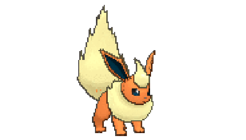
The one 3D model that really rustles my jimmies is Flareon's. I hate how it doesn't look as fluffy anymore. And why is its tail always up?
Ugh, terrible.

Commenting about what I've read on this thread, Reshiram and Archeops got hit hardest imo. Reshiram's 2D sprite was just great with that posing. Agree that all of Reshiram, Zekrom and Kyurem-W/B have lost it's charm losing their blue/orange shades. Archeops's 2D sprite was also cool, but the 3D model just looks dumb.
Eelektross now actually looks like a swimming eel. Fine for me. Scizor's 3D model isn't half bad and the attacking animations are great.
Vaporeon, Golem and Mr. Mime also suffered imo. I get it that Mr. Mime it's doing what the Pokédex says it can do (create invisible barriers) but it just looks horrible with that posing.
Most flying animantions are OK to me. Aside from the coloring I like 3D models better than the sprites. Tropius's model is an improvement over the sprites imo, but the back model isn't that good.

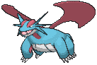
I don't really think Salamence's 3D model is bad and the attacking animations are fine. But look at its DPP sprite. Maybe it's the posing that makes it look huge and bulky, something the other sprites/models kinda lack.


Gengar's attacking animations are good, but its idle pose has lost a lot of its charm imo.
EDIT:


Also, there's something I don't kinda like about Umbreon's model. It's among the Pokémon that suffer the most about the coloring of 3D models. It also seems like it looks too fierce for that pose.
By comparison, the official artwork it's much better. I think it captures all what makes Umbreon's design great, having that misterious and somewhat dark touch.
Eelektross now actually looks like a swimming eel. Fine for me. Scizor's 3D model isn't half bad and the attacking animations are great.
Vaporeon, Golem and Mr. Mime also suffered imo. I get it that Mr. Mime it's doing what the Pokédex says it can do (create invisible barriers) but it just looks horrible with that posing.
Most flying animantions are OK to me. Aside from the coloring I like 3D models better than the sprites. Tropius's model is an improvement over the sprites imo, but the back model isn't that good.
I don't really think Salamence's 3D model is bad and the attacking animations are fine. But look at its DPP sprite. Maybe it's the posing that makes it look huge and bulky, something the other sprites/models kinda lack.
Gengar's attacking animations are good, but its idle pose has lost a lot of its charm imo.
EDIT:
Also, there's something I don't kinda like about Umbreon's model. It's among the Pokémon that suffer the most about the coloring of 3D models. It also seems like it looks too fierce for that pose.
By comparison, the official artwork it's much better. I think it captures all what makes Umbreon's design great, having that misterious and somewhat dark touch.
Last edited:
I think Umbreon is pretty close its official colors, actually. I also wouldn't say it really looks all that fierce. Flareon is one trying to look fierce, i think, with the haunches and raised straight up tail.
3D Salamence has plenty of obvious bulk to it, I think the problem with its 3d Model is it just kind of...hangs. 2D Salamence puts its bulk to be menacing with a strong stance and raised head and so on (kind of snake-like in how it makes use of its bulk maybe?), 3D Salamence is like a fun plush with his legs just laying about. It probably would have been better if it tucked its legs in a bit, like tropius does
Speaking of flying though...I hadn't seen Lugia's before.

I think something is lost a bit here. Not RUINED, but not great. I'm not sure why specifically, but it just seems a bit off. Maybe its the proportions? Feels like the body is a bit too big and the wings a bit too small. Lugia always came off as fairly "elegant" so this just comes off as lethargic. Might just be a trick of the posing, though, since I think ssb4 uses the same model and it generally looks fine
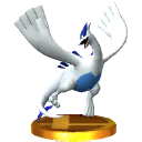
maybe the wings seem a little bigger.
3D Salamence has plenty of obvious bulk to it, I think the problem with its 3d Model is it just kind of...hangs. 2D Salamence puts its bulk to be menacing with a strong stance and raised head and so on (kind of snake-like in how it makes use of its bulk maybe?), 3D Salamence is like a fun plush with his legs just laying about. It probably would have been better if it tucked its legs in a bit, like tropius does
Speaking of flying though...I hadn't seen Lugia's before.
I think something is lost a bit here. Not RUINED, but not great. I'm not sure why specifically, but it just seems a bit off. Maybe its the proportions? Feels like the body is a bit too big and the wings a bit too small. Lugia always came off as fairly "elegant" so this just comes off as lethargic. Might just be a trick of the posing, though, since I think ssb4 uses the same model and it generally looks fine
maybe the wings seem a little bigger.
Gengar's attacking animations are good, but its idle pose has lost a lot of its charm.
Gengar has one of the best Gen 2 sprites. The amount of his character put into it is just overwhelming. But it's idle 3D models looks... fat. I know it's his body shape, but I've never saw Gengar from this angle before I saw his 3D.
Speaking of flying though...I hadn't seen Lugia's before.
I think something is lost a bit here. Not RUINED, but not great. I'm not sure why specifically, but it just seems a bit off. Maybe its the proportions? Feels like the body is a bit too big and the wings a bit too small. Lugia always came off as fairly "elegant" so this just comes off as lethargic. Might just be a trick of the posing, though, since I think ssb4 uses the same model and it generally looks fine
maybe the wings seem a little bigger.
It's leg proportions look wierd. It's wings are fine tho.
I don't know, the yellow rings just feel... weird. Especially the one in its head. Flareon's model doesn't look scary or dangerous to me. Might have something to do with it being a fluffy fiery rabbit.I think Umbreon is pretty close its official colors, actually. I also wouldn't say it really looks all that fierce. Flareon is one trying to look fierce, i think, with the haunches and raised straight up tail.
Flareon and Jolteon actually have some nice 3D models imo.
Lugia's a bit goofy-looking in general, with its big fat body and giant hand-wings. I've got a model kit of it and the proportions aren't much different from the model (I think the body is bigger and the head is smaller, but not by much).Speaking of flying though...I hadn't seen Lugia's before.
I think something is lost a bit here. Not RUINED, but not great. I'm not sure why specifically, but it just seems a bit off. Maybe its the proportions? Feels like the body is a bit too big and the wings a bit too small. Lugia always came off as fairly "elegant" so this just comes off as lethargic. Might just be a trick of the posing, though, since I think ssb4 uses the same model and it generally looks fine
maybe the wings seem a little bigger.
I guess the big yellow ring is a bit thick, but it's not too bad.I don't know, the yellow rings just feel... weird. Especially the one in its head. Flareon's model doesn't look scary or dangerous to me. Might have something to do with it being a fluffy fiery rabbit.
Flareon and Jolteon actually have some nice 3D models imo.
Cute things trying to seem tough never results in being tough, but that kind of stands is genearlly meant to be aggressive. Succeeding is another issue of course
Yeah looking at a bunch of other eferences, he's always a bit weird. Sprites just hide it better guess due to persepctive tricksLugia's a bit goofy-looking in general, with its big fat body and giant hand-wings. I've got a model kit of it and the proportions aren't much different from the model (I think the body is bigger and the head is smaller, but not by much).

I agree fully with this. That model of Salamence is actually much prettier and more accurate than its counterpart from Pokemon XD, it is all in the posing. Here is the model I am referencing.[...]
I don't really think Salamence's 3D model is bad and the attacking animations are fine. But look at its DPP sprite. Maybe it's the posing that makes it look huge and bulky, something the other sprites/models kinda lack.[...]
If you look past the amazing pose, you will notice that its wings are half dodecagons instead of the rounded crescent shape they are supposed to be. The pose led me to believe that this was the better translation from the sprites though which goes to show just how important pose really is.
I think this is another problem with pose (and lighting). All of its sprites have Umbreon posed in a way that it shows off at least one full side of its body and its joint rings as a result. This on top of the much brighter color (its yellow was noticeably less vibrant in every other translation) the rings display make it seem like it is "off". In-game camera movement helps with its new pose though.[...]EDIT:
Also, there's something I don't kinda like about Umbreon's model. It's among the Pokémon that suffer the most about the coloring of 3D models. It also seems like it looks too fierce for that pose.
By comparison, the official artwork it's much better. I think it captures all what makes Umbreon's design great, having that misterious and somewhat dark touch.
Examples: Old pose types:


Even the concept art has a side pose to it.
New:

There are a couple other dragons who have features that wouldn't have translated well to 3d regardless of what GF did with them:
The biggest problem here was they needed to attach the wings to the body and even though they match the BW sprite proportionately, they can't use the same small impossible angle tricks they used to make it look like it was half levitating half flying. The size of the sprite also allowed for more drastic levitation height differences that actually worked and created interest. That doesn't work well in a 3d world where there are many references around Hydreigon that make that kind of animation look half-assed and unrealistic. Its arms could have been longer and its head could have been higher too.


Giratina-O's biggest problem is its body position (and appendages). If you look at its gen 4 and 5 sprites, it was able to hold its body and tail position in a neat looking pose without it being off-putting. In a 3d world with a moving camera this doesn't work and they had to do something with it without grounding it or putting in way to many animation bones to separate its torso from the rest. Its tentacle-like appendages would also require many animation bones each in order to get them to do what they are doing in BW without making them look stiff and any other movement from them would look a bit silly or not match the original concept. It looks like GF just decided to make them move, but also to not put much work into how they were moving because any resource friendly movement was gonna look silly regardless. The levitating animation that plagued Hydreigon also applies to Giratina-O.
Scraggy is one of my favourite pokemon and its sprite amazing. Just look at the lil' guy!

He's trying to act all tough and then he just pulls up his little "pants" and they drop instantly. Adorable and filled with personality.

In 3D, Scraggy is no longer the scrappy lil' youngster he once was. Instead, the thing looks like an anxious wimp. It's eyes and mouth also look pretty silly on a 3D model.
On the flip side, Scraggy's big bro, Scrafty actually benefited from the shift to 3D.
Look at this dude's pathetic little hop and dopey expression. It isn't intimidating and doesn't fulfill the delinquent theme. Also, what is he chewing?

"Whoa! This gum has some kick!"

Much better. The 3D model actually makes it look like a cool, unimpressed gangster ready to hi-jump kick your head in.
"You can't penetrate this!! Oh.""Its skin has a rubbery elasticity, so it can reduce damage by defensively pulling its skin up to its neck.
He's trying to act all tough and then he just pulls up his little "pants" and they drop instantly. Adorable and filled with personality.
In 3D, Scraggy is no longer the scrappy lil' youngster he once was. Instead, the thing looks like an anxious wimp. It's eyes and mouth also look pretty silly on a 3D model.
On the flip side, Scraggy's big bro, Scrafty actually benefited from the shift to 3D.
Look at this dude's pathetic little hop and dopey expression. It isn't intimidating and doesn't fulfill the delinquent theme. Also, what is he chewing?
"Whoa! This gum has some kick!"
Much better. The 3D model actually makes it look like a cool, unimpressed gangster ready to hi-jump kick your head in.
Last edited:
I've always found that with Pokémon it's very much the essence of "less is more". You look at how the R/B sprites where and now compare them to the actual Gen VI+ animated sprites and a lot of them have lost their 'rawness' in a sense. Main one for me always has been;
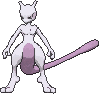

One to me looks like its Pokédex entry; "It was created by a scientist after years of horrific gene splicing and DNA engineering experiments." The other looks like its been rounded off, made to look cute.
One to me looks like its Pokédex entry; "It was created by a scientist after years of horrific gene splicing and DNA engineering experiments." The other looks like its been rounded off, made to look cute.
is this also the place for ruined shinies


That's not even the 3d games fault thoughI've always found that with Pokémon it's very much the essence of "less is more". You look at how the R/B sprites where and now compare them to the actual Gen VI+ animated sprites and a lot of them have lost their 'rawness' in a sense. Main one for me always has been;
One to me looks like its Pokédex entry; "It was created by a scientist after years of horrific gene splicing and DNA engineering experiments." The other looks like its been rounded off, made to look cute.
Like the 3D mewtwo design is about on par with

The yellow sprite, and all future sprites have been like this moving forward. I guess the 3d model is a little smooth but it's design as a whole has been smooth for well over a decade.
RGB's spritework had a lot of "raw" (some ferocious, some incompetent) sprites but a lot of that was thrown away near instantly
This thread is fundamentally wrong, this is like judging someone from their online profile pictures rather than what they look in real life.
Also you choose to ignore the move animations that are characteristic to many pokemon.
Salamence model for example looks so weird because indeed an animal like that cannot exist for a plethora of reasons, from its stubby legs to the scales that are supposed to be wings.
Also you choose to ignore the move animations that are characteristic to many pokemon.
Salamence model for example looks so weird because indeed an animal like that cannot exist for a plethora of reasons, from its stubby legs to the scales that are supposed to be wings.
One also has to remind that RGB, Yellow and several gen 2 sprites were very unnatural in proportions in order to show head or main features of the Pokemon, which obviously was not possible to do well in 2d sprites.That's not even the 3d games fault though
The yellow sprite, and all future sprites have been like this moving forward. I guess the 3d model is a little smooth but it's design as a whole has been smooth for well over a decade.
RGB's spritework had a lot of "raw" (some ferocious, some incompetent) sprites but a lot of that was thrown away near instantly
vs

In gen 5 Blaziken looked scary and like it was about to kill ur ass but in gen 6&7 it just stands there doing nothing lol.
Because it IS just standing there genius. It moves when it attacks just like everything else.


still looks worse then gen 5 no matter how u look at it lol.Because it IS just standing there genius. It moves when it attacks just like everything else.
vs
In gen 5 Blaziken looked scary and like it was about to kill ur ass but in gen 6&7 it just stands there doing nothing lol.
Uh... no, I disagree in this one. What is Blaziken even trying to do in its BW animation? Roar? It looks awkward IMO.
The 3D idle animation is nothing spectacular but it's alright for what it intends to be. It could have been improved with a fighting stance, though - it looks too relaxed.
I can definetly see where ur coming from i just think that Gen 6 sprite is too bland compared to gen 5Uh... no, I disagree in this one. What is Blaziken even trying to do in its BW animation? Roar? It looks awkward IMO.
The 3D idle animation is nothing spectacular but it's alright for what it intends to be. It could have been improved with a fighting stance, though - it looks too relaxed.