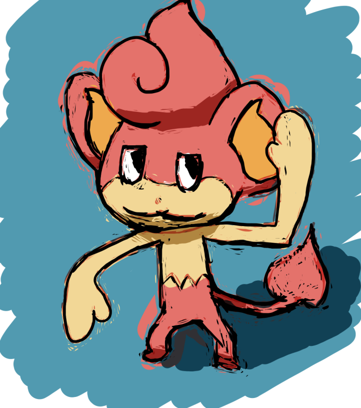
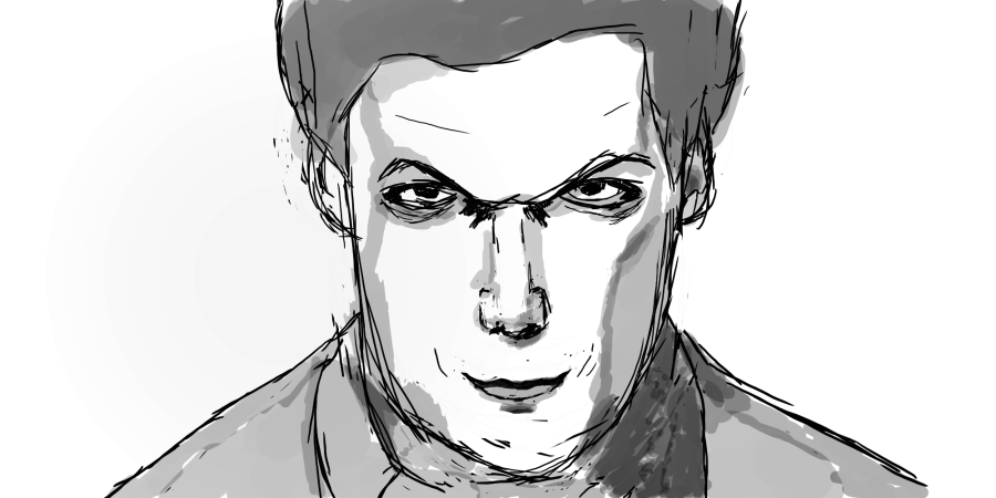
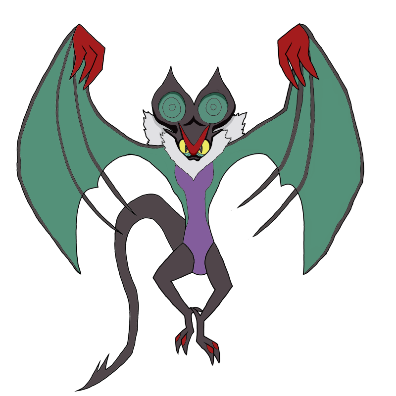
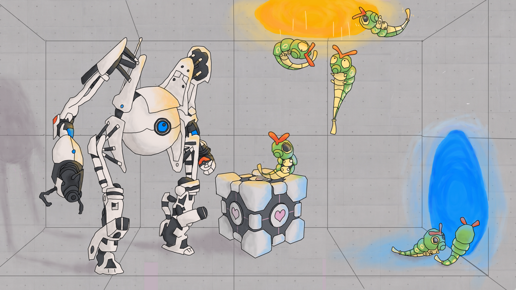
You've been pumping out a large number of images as of late! It's also good that you're experimenting with colors and different body positions, as both when used skillfully can really make a picture stand out much more. However, as some of the above images are intended for requests posted in
Art for Articles, there's more to be expected from them as they are intended to be illustrate and emphasize the contents of a thread rather than being stand-alone creations you display as your own art, so I'm gonna write down some thoughts about them.
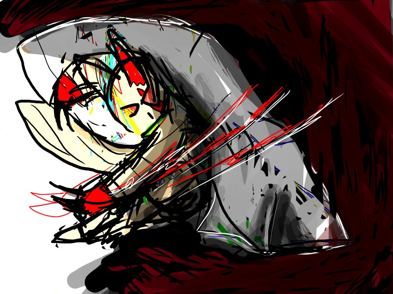
Starting off with the Zangoose, the request was
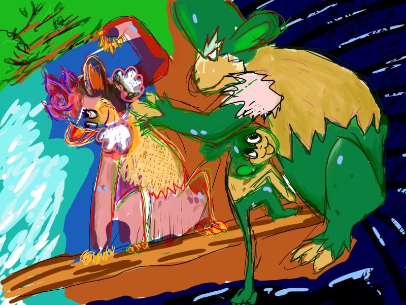
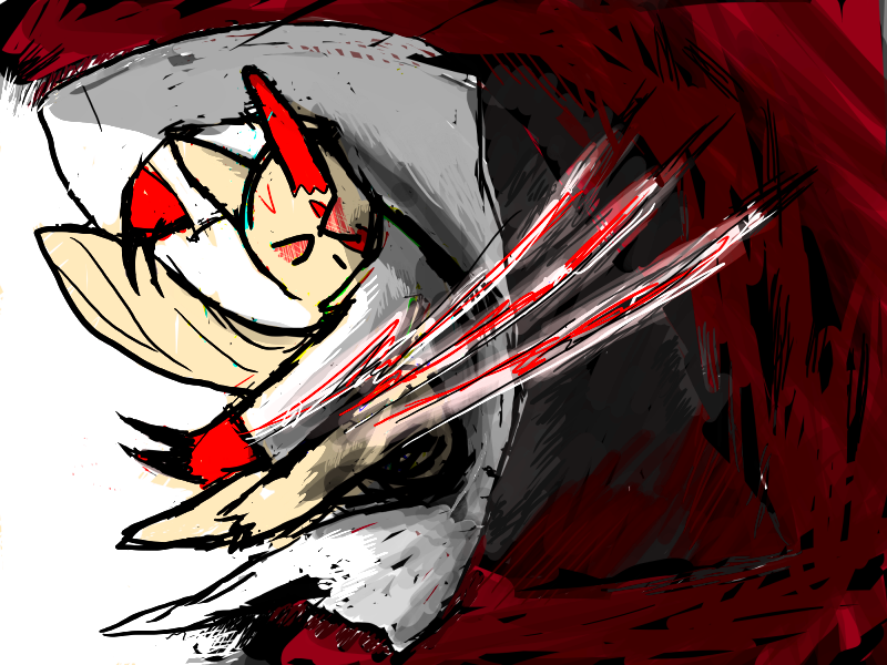
FireMage's post is going to be about the particular mons explanations, so we had something in mind with Zangoose. Zangoose is a more solitary pokémon, so we went with that. Zangoose will be displaying his attack "Night Slash", in a way you can see how exactly he does it; it's up to you how you display this. The only other requirement is that he still looks cool and kinda angry as in his official art and that he wears a lab coat.
At first, I had difficulties seeing what the image was depicting, as I had forgotten what they wanted it to contain and thus I needed to read the request again to know what to look for. Granted, the requirement of adding a labcoat complicated matters further, and while Zangoose stance is good, there's a lot that needs to be cleaned up in this picture. The lineart is gritty, to put it simply, as the strokes are thick and overlapping, making it difficult to tell what they are. So with plenty of loose ends sticking out and small black remnants here and there, it looks like a rough sketch, and not like finished lineart where unneccessary lines have been removed and finer details have been added. His coat could also follow his body more closely in the bottom right part, and not stick out in the direction of the corner, seeing as his slashing movement would make his garments tag along in the same direction.
As for the colors, you did well to pick some darker colors to make it more appropriate for the move Night Slash, but the traces of blue and green around the image is unnecessary as they don't fit with the color scheme and appears to have been added purely on random. And the black/red background enveloping our slasher stands in great contrast to the left part of the image, which is entirely white. If anything, the dark part in the background could actually be somewhat brighter, seeing as it's his slash that should gain the most attention, and not the surrounding effects.
In short, you had a good starting point as his stance, the viewer's perspective, and the slash is well placed, but you need to clean up the lineart and make the background stand out less if you want the image to seem more clean and proper, and not as a fast sketch (regardless on the time spent on it).
As for the next image
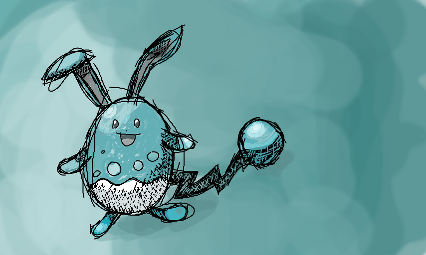
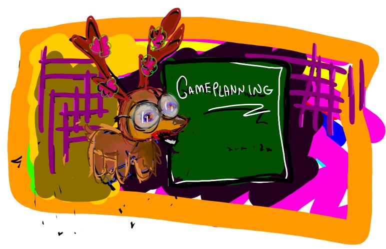
The request for this post is fairly simple; it's a Sawsbuck, wearing a labcoat and glasses, standing next to a chalkboard with GAMEPLANNING written on it, while he's munching on some chalk. It may be a bit funny and over the top, as long as it's good art, I'll appreciate it. I would like it to be the Spring/Summer version of Sawsbuck. That's pretty much it.
Let's get something clear first: Experimenting is fine. It allows you to get outside your comfort zone and see how you manage with tasks you're not used to. However, when you're making a request for someone else, it'd be wise to stick to what you know, as you wouldn't want to present something you're neither secure or confident about. You didn't really say if this is a work-in-progress, or if you're even going to submit it Article thread, but seeing as it's clearly based on that request, I'll treat it as such.
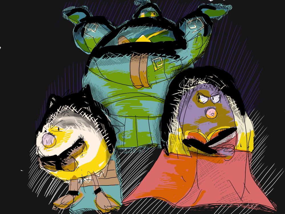
First off, colors are delicate elements, as more variety can bring more life to a piece, while having too many can at the same time ruin any color scheme you'd hope to establish. Looking at this, the background alone has a bigger variation that the foreground, even though it could work just as well with a plain, bright color considering the classroom setting this request has. The strokes are also random and haphazard with no sense of structure, so if anything, it looks like a chalk-induced drug trip. Random stuff can be appropriate when the situation allows it, but as serious as the topic 'Game Planning' sounds like, then it's most unfitting. As for the Sawsbuck, I would have ahd difficulties recognizing it if it were to be posted elsewhere. Disregarding its head, its body is comically small compared to its official appearance, and even though there's room to have things out of proportion, there's a limit to everything, so a more mature body physiology would be for the best if is to look knowledgeable.
I don't really know how much of this I actually need to tell you though, since I know that you're capable of some really good images. Like the Sawk watching Replays? That one is
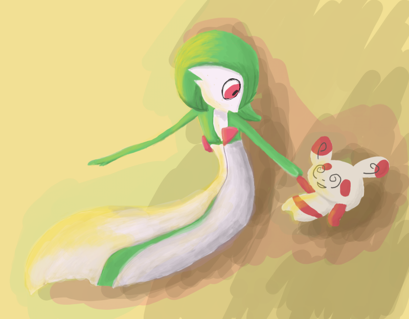
genuinely good, and the Gardevoir and Spinda picture went in a similar direction, so I was surprised to see how you handled the other two requests. But nonetheless, it's good of you to practise, as that makes you more comfortable with your tools and thus can put more effort into polishing and adjusting them to better serve your needs. Keep the lineart clean and less smudgy, the same can be said about your colors, and things will start looking better with each image you create.


