I guess my main point of the simple vs complex wasn't so much to say that complex design is always a bad thing, but that overdetailing can ruin or seriously uglify an otherwise decent design. As for the megas, a lot of them really aren't all that complicated. Venusar gains very little, Ampharos stays the same bar the luscious locks and red hair pearls, Mawile just gains a second mouth and some more color, etc. In my opinion, Mega Lucario is absolutely hideous with that intricate mess of detail and gross color palette. Mega Beedrill isn't quite as bad, but not super great either. Mega Charizard X I think is really shitty, but that's more because it looks like fanart my 6 year old cousin would draw than an official mon, it just looks silly. I think too much, and too contrasting, of color is the bigger issue. Yes, Dialga and Palkia and Giratina have lots of detailed line patterns, but the color scheme is almost as simple as Snorlax! Dialga is made up of a grand total of two colors, Palkia of three, and Giratina of only four! But like I said, this is really only a factor of many, and no amount of simplicity or complexity is going to fix a shitty base design (looking at you, Probopass). Also, proportions are a huge part, too. You wouldn't give a scary monster big, doofy, round eyes. Anyway. I've spent too much time typing this on the shitter, my legs are asleep
-
Check out the relaunch of our general collection, with classic designs and new ones by our very own Pissog!
-
Welcome to Smogon! Take a moment to read the Introduction to Smogon for a run-down on everything Smogon, and make sure you take some time to read the global rules.
You are using an out of date browser. It may not display this or other websites correctly.
You should upgrade or use an alternative browser.
You should upgrade or use an alternative browser.
Let's talk about Pokémon designs
- Thread starter Codraroll
- Start date
You wouldn't give a scary monster big, doofy, round eyes.
Oh, but they did...

And here's the salt in the wound: Let's try to apply a tiny change to those eyes and see what it does to the design:

I'm actually amazed at how much better Garbodor's design becomes if it's allowed to have slightly more menacing eyes. The right arm is a little disproportioned in the fan art here, but the latter Garbodor still looks so much better, because the eyes form an expression. It emits character. The first image depicts a Pokémon whose IQ is in the single digits, waving at bystanders and shouting "HEY I'M HERE ON THIS HERE LANDFILL, ISN'T IT NICE?". The second is a menacing creature that wouldn't hesitate to bludgeon you into compost with its club-like fists, then use your belongings to decorate its scrap-heap lair (and yes, it has a proper lair, Mad Max style, which it defends with raw ferocity). Eyes are so extremely important when designing Pokémon, and for Garbodor, it seems like they just gave up.
Many say "People don't like Garbodor because it's just a trash bag, blah blah Muk blah blah". While that may be the actual argument many people use, I'd rather say people don't like Garbodor because it looks flipping stupid. The design base is clever, it's toxic troll somewhat resembling a torn trash bag. It has passable stats and interesting lore. But its eyes are big and blank, with tiny pupils, conveying pure derp and uneccessary stupidity. In its official art and in-game sprites, Garbodor looks dumb. With just a tiny bit more effort, it turns into a really interesting creature.
Some Pokémon designs have been changed subtly over the years (as exemplified by Serebii.net's current banner). Pikachu has become slimmer and more expressive. Magmortar and Abomasnow both shed some weight to become proportionally taller and less round. Charizard has received longer legs and a proportionally smaller head. Let's hope the designers will have a second look at Garbodor at some point in the future, and reconsider its tiny pupils and blank stare. It's a simple matter of using a larger-diameter pencil when drawing the eye. It'd be funny if it wasn't so tragically bad.
On the other hand, Garbodor looking so docile expresses its own character as well - The fact that in nature, Garbodor AREN'T OUT to be a menace, but are innocent trash creatures, compared to Grimer and Muk (in some sprites and art - Even they were different slightly in Gen 1) being more of creatures that are spawned by humans' destruction towards nature, and seem to not be OK with this outcome.
While yes, eyes are extremely important to a design, having docile eyes says just as much of a design, compared to angry, pleasant, and all sorts of expressive eyes. It is very important that those eyes help an artist express to the viewer that "Hey, this is what this person is like" without needing to say a word.
While yes, eyes are extremely important to a design, having docile eyes says just as much of a design, compared to angry, pleasant, and all sorts of expressive eyes. It is very important that those eyes help an artist express to the viewer that "Hey, this is what this person is like" without needing to say a word.
On the other hand, Garbodor looking so docile expresses its own character as well - The fact that in nature, Garbodor AREN'T OUT to be a menace, but are innocent trash creatures, compared to Grimer and Muk (in some sprites and art - Even they were different slightly in Gen 1) being more of creatures that are spawned by humans' destruction towards nature, and seem to not be OK with this outcome.
While yes, eyes are extremely important to a design, having docile eyes says just as much of a design, compared to angry, pleasant, and all sorts of expressive eyes. It is very important that those eyes help an artist express to the viewer that "Hey, this is what this person is like" without needing to say a word.
Agree here that the eyes don't necessarily need to be menacing- but in Garbodor's case they aren't anything. They literally exude no emotions/ personality one way or the other, nor signify any sort of intelligence or sentience. I think what Codraroll is saying is that any change in the eyes would allow Garbodor to exude so much more personality and, in addition become a much better (and possibly more liked) design
Pretty much. Litleo has been brought up before but it suffers from the derp eye as Garbodor. Compare how fanartists draw Litleo:
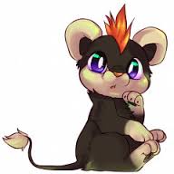

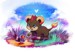
To how it REALLY looks:
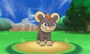
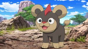

(I'd also like to point out the other feature they cut is the that puffy upper lip).
It's kind of interesting that there's a difference between the real deal and what people percieve it as. Like how I like to think that Goomy's green cheeks are the eyes and the real eyes are nostrils. Not that artistic license is a bad thing though.

To how it REALLY looks:
(I'd also like to point out the other feature they cut is the that puffy upper lip).
It's kind of interesting that there's a difference between the real deal and what people percieve it as. Like how I like to think that Goomy's green cheeks are the eyes and the real eyes are nostrils. Not that artistic license is a bad thing though.
Last edited:
Pretty much. Litleo has been brought up before but it suffers from the derp eye as Garbodor. Compare how fanartists draw Litleo:
View attachment 62476View attachment 62478
To how it REALLY looks:
View attachment 62477View attachment 62479
(I'd also like to point out the other feature they cut is the that puffy upper lip).
It's kind of interesting that there's a difference between the real deal and what people percieve it as. Like how I like to think that Goomy's green cheeks are the eyes and the real eyes are nostrils. Not that artistic license is a bad thing though.
Similar to your goomy perception, I thought wailmer's blow holes were its eyes for the longest time. I still can't unsee it
I thought the eyes in Cradily were just weird moving teeth, and the weird target marks on the head were eyes.
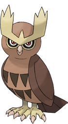
It has come to my attention that I forgot a bulk of the generation two designs were mostly designed at around the same time as the generation one designs. And hey, just like generation one, generation two has some rather dull designs as well. For example, you have Noctowl. Noctowl to me just looks like your standard owl, with the only thing it has standing out about it is its wicked unibrow. You've got Marcargo which has an awesome concept, but in terms of appearance, it still looks like a regular snail. Just brighter colors and all. Mareep is just a generic sheep, Ledyba is just a generic ladybug. I think one thing I like about designs are when they stick out from what they're based on. It doesn't have to be like that with all Pokemon, but originality goes a really long way.
In its small roster, Gen 2 had some interesting designs. The most popular might just be Scizor. You can barely recognize it came from Scyther. I would have liked if it had scythes over pincers, but still, I really like this one. On the pincers you have the markings that make them look like eyes. It's similar to how a butterfly's wings have markings that resemble fierce faces to make them look more intimidating to predators. The bold red really demonstrates a powerful design. As skinny as Scizor is, that stance it holds somehow just makes it look more robust and solid. Scizor has the real look of a bulky but quick battler, and gosh that red just looks amazing.
I like what they did with Houndoom as well. They ended up really pushing that Dark type devilish type of look on it. It's clad with bones of a skeleton on the exterior of its body and has some real kickass horns on it as well, not to mention a nice pointed devil's tail. Around its neck, some bones form to make a dog collar, and it has the cuffs on its ankles. Cuffs always add that tough effect to it. To keep the colors realistic, they made Houndoom's muzzle and belly an orange hue and the rest of its body pitch black to communicate the Dark and Fire typing. Another cool design.
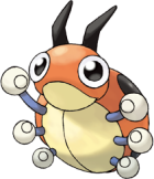
One last quick mention is Ledian. Ledian sucks ass in battle but it's a very cool take on a ladybug. It has those silly childish eyes it had as a Ledyba turned into big dark colored bug eyes. It also gets redder and more bolder looking as a result. It starts standing on two legs and has little boxing glove-like hands to give it almost a brawling appearance. No wonder they gave it Iron Fist. Ledian still sucks and his design is a lot better than his battling capabilities. But I think it's a nice change from Ledyba.
I could go on and on, but I will keep trying to cover each generation and go over examples of designs from them that I do and don't like, as well as possibly go over controversies of certain designs that we'll see later. When I'm done, I'll go over to talking about individual ones
if you like care or something i dunno...
It seems like there are many ways to criticize Gen I designs, usually involving their simplicity. But here's a slightly different one: Gen I made surprisingly little use of the potential variety of the type chart. I'm not saying the Gen I designs are bad per se, but it seems like when the designers of the original games got an idea, they decided to use it over and over and over again, with little regard for trying to do something different.
The games introduced fifteen different types, for a possible total of 225 unique combinations, many of which haven't been utilized to date. Still, with 151 Pokémon across 78 evolutionary families, there should be plenty of opportunities to utilize a wide variety of designs.
...and Gen I didn't quite deliver on that. To start off, there are NINE Grass/Poison Pokémon in Gen I. There are 14 Gen I Pokémon that are Grass type in some way or another. Almost three quarters of them have Poison as a secondary typing. The remaining five are the families of Exeggcute and Paras, plus Tangela. Yep, of the three types in the all-important starter triangle, one was only represented in pure form by a very obscure, rare and weak Pokémon. Grass was blessed with three three-stage families, but all of them had Poison as a secondary typing.
Luckily, other starter types were more lucky. There are actually 12 Fire types in Gen I. But all of them are pure Fire, except for two: Charizard and Moltres. They both share a secondary Flying typing. Half of all Gen I Fire types are mammals that belong to a two-stage evolutionary family.
Water is very well represented, with a whooping 32 Water types, 18 of which were mono-Water. Then again, water is sort of a counterpart to land, holding as much biological diversity as land does, and when it is represented by only one type, there will necessarily have to be a lot of Water Pokémon. This trait is found in all generations, so no particular picking on Gen I here.
Electric can be said to be the final starter type, and it's in the same boat as Fire. Gen I introduced nine Electric types. All but one (Zapdos) are mono-type. Like with Fire, there are three sets of monotype, two-stage evolutionary families.
I'm not going to go through the entire type chart, but some other type trends are remarkable enough to warrant a mention:
So... yeah. There are many bad reasons to frown upon Gen I Pokémon, but an often overlooked one is how much the Pokémon typings repeat themselves rather than being diverse. In far too many instances, dual typings are skipped entirely, while the mono-type is repeated again and again. Or one single dual typing is used so much that they become the norm, such as Grass/Poison and Rock/Ground (to be fair, Rhyhorn's family is Ground/Rock). And some types are almost ignored; it kind of feels like the Ghost and Dragon types were created specifically for their one evolutionary family.
Later generations freed themselves from these conventions, and typings have become way more diverse since then. There are remains of them still around, though, if you know what to look for. The "No primary Flying types" rule was only fully lifted this generation, for instance. And most of the Pokémon with Poison as a secondary typing still have something in common...
The games introduced fifteen different types, for a possible total of 225 unique combinations, many of which haven't been utilized to date. Still, with 151 Pokémon across 78 evolutionary families, there should be plenty of opportunities to utilize a wide variety of designs.
...and Gen I didn't quite deliver on that. To start off, there are NINE Grass/Poison Pokémon in Gen I. There are 14 Gen I Pokémon that are Grass type in some way or another. Almost three quarters of them have Poison as a secondary typing. The remaining five are the families of Exeggcute and Paras, plus Tangela. Yep, of the three types in the all-important starter triangle, one was only represented in pure form by a very obscure, rare and weak Pokémon. Grass was blessed with three three-stage families, but all of them had Poison as a secondary typing.
Luckily, other starter types were more lucky. There are actually 12 Fire types in Gen I. But all of them are pure Fire, except for two: Charizard and Moltres. They both share a secondary Flying typing. Half of all Gen I Fire types are mammals that belong to a two-stage evolutionary family.
Water is very well represented, with a whooping 32 Water types, 18 of which were mono-Water. Then again, water is sort of a counterpart to land, holding as much biological diversity as land does, and when it is represented by only one type, there will necessarily have to be a lot of Water Pokémon. This trait is found in all generations, so no particular picking on Gen I here.
Electric can be said to be the final starter type, and it's in the same boat as Fire. Gen I introduced nine Electric types. All but one (Zapdos) are mono-type. Like with Fire, there are three sets of monotype, two-stage evolutionary families.
I'm not going to go through the entire type chart, but some other type trends are remarkable enough to warrant a mention:
- All Rock Pokémon in Gen I are Ground types too, or fossils. All but one of the five fossils have Water as a secondary type.
- Speaking of Ground types, they are either combined with Rock (6 Pokémon, 3 families), Nidos (2 Pokémon, arguably within one family) or remain monotypes (three sets of two-stage families). Oh, the variety.
- Normal/Flying is almost as widely used as Grass/Poison. Eight Pokémon have this typing, across four evolutionary families.
- Ice is represented by five Pokémon. Three of them are Water/Ice. At first glance, that isn't as egregious as previous examples, until you notice the three Water/Ice 'mons belong to different evolutionary families. "What mixes well with Ice?" "Uhh, Water?" "Good, let's find three different ways to arrive at a Water/Ice design". Seemingly, half of what Ice had to offer was being a "theme" to Water types.
- Fighting is also like Fire and Electric. Eight 'mons have this typing in Gen I. Seven of them are pure Fighting (the last is Poliwrath).
33.
That's right. Thirty-three. In Kanto, Poison is more common than Water. Half of all Poison-type Pokémon ever created were made in Gen I (there are now 58 in total, counting Mega Gengar and Mega Beedrill). Three two-stage, pure Poison-type families (for comparison, there have only been two of those since). Three three-stage Grass/Poison families. Two Bug/Poison. Another two-stage family that's also Flying. Two three-stage families which eventually get a secondary typing. A pair of poisonous Water types. And all the Ghost Pokémon at the time, for good measure.
This abundance of Poison types in Gen I is another of the elements that made the Psychic type so overpowered. You can't swing a Meowth around in Kanto without hitting three Poison-type Pokémon. They say Koga was Kanto's Poison specialist, but that actually isn't true. There is another Poison specialist in Kanto, though masking as something else (and while I realize this description fits Janine to a T, it's not her). In the main series games, all of Agatha's Pokémon have been Poison types, save for a Misdreavus in the FRLG rematches. Kanto had so few Pokémon none of the Elite Four specialists actually had five Pokémon of their type on their team - but Agatha, the supposed Ghost trainer, had no problems finding five Poison Pokémon. She could actually have ditched her Haunter and Gengar, and still had enough fully-evolved Poison types to choose between to create two full teams of six Pokémon.
So... yeah. There are many bad reasons to frown upon Gen I Pokémon, but an often overlooked one is how much the Pokémon typings repeat themselves rather than being diverse. In far too many instances, dual typings are skipped entirely, while the mono-type is repeated again and again. Or one single dual typing is used so much that they become the norm, such as Grass/Poison and Rock/Ground (to be fair, Rhyhorn's family is Ground/Rock). And some types are almost ignored; it kind of feels like the Ghost and Dragon types were created specifically for their one evolutionary family.
Later generations freed themselves from these conventions, and typings have become way more diverse since then. There are remains of them still around, though, if you know what to look for. The "No primary Flying types" rule was only fully lifted this generation, for instance. And most of the Pokémon with Poison as a secondary typing still have something in common...
snip
While I agree with your analysis generally, I think the argument can be made that the lack of diversity in gen 1 might be due to the fact that it is gen 1, rather than exclusively a lack of creativity. That is to say that we had a game to get used to type interactions, which could get confusing to young kids especially when considering dual-types and how they could flip weaknesses to become neutralities and neutralities to become weaknesses, etc. I think a look at the diversity of gen 2 could help us assess whether my thesis is correct but I cannot do that at the moment. I'll edit this post later with that data.
Last edited:
Codraroll Your analysis on Kanto's presence of the same type combinations makes more sense than most reasons for bashing Gen I. Some bash it because they are capable, and then feel obligated to.
Let's see what kind of Ice-types we have in Kanto: Lapras, Dewgong, Cloyster, Jynx, and Articuno. Note how the first three have Water as their other type, while Dewgong and Cloyster do not gain their Ice typing until evolution. Jynx is still unique to this day, but brought a controversy in the Western world. Articuno is a Legendary, and the birds were actually good back then.I'm not surprised that we didn't receive an Ice/Electric-type with high Speed and Special back then; that would have been some OP Tauros-sh!t.
Also, has anyone noticed that all of Kanto's Flying-types are either birds, bugs, bats, or pterosaurs? Zubat and Golbat are bats, while Aerodactyl is a pterosaur; the rest are nothing but freaking birds and insects! We have not even received true wind-elementals until Tornadus, Noibat, and Noivern were introduced in their respective generations (Yes, Noivern's primary Flying typing implies wind, not flight)! Some recent Flying-types revolve around their superb abilities to jump, such as Hawlucha.
Let's see what kind of Ice-types we have in Kanto: Lapras, Dewgong, Cloyster, Jynx, and Articuno. Note how the first three have Water as their other type, while Dewgong and Cloyster do not gain their Ice typing until evolution. Jynx is still unique to this day, but brought a controversy in the Western world. Articuno is a Legendary, and the birds were actually good back then.
Also, has anyone noticed that all of Kanto's Flying-types are either birds, bugs, bats, or pterosaurs? Zubat and Golbat are bats, while Aerodactyl is a pterosaur; the rest are nothing but freaking birds and insects! We have not even received true wind-elementals until Tornadus, Noibat, and Noivern were introduced in their respective generations (Yes, Noivern's primary Flying typing implies wind, not flight)! Some recent Flying-types revolve around their superb abilities to jump, such as Hawlucha.
Also, has anyone noticed that all of Kanto's Flying-types are either birds, bugs, bats, or pterosaurs? Zubat and Golbat are bats, while Aerodactyl is a pterosaur; the rest are nothing but freaking birds and insects (and Gyarados! - CRoll)! We have not even received true wind-elementals until Tornadus, Noibat, and Noivern were introduced in their respective generations (Yes, Noivern's primary Flying typing implies wind, not flight)! Some recent Flying-types revolve around their superb abilities to jump, such as Hawlucha.
I think this stems from a bit of a design quirk in Gen I. The presence of a "Bird type" in the games' code indicates that at some point, what we know today as Flying Pokémon was really only meant to be birds. The Flying moves of the era seem to reinforce this: Drill Peck, Fly, Mirror Move (called "Parrot Mimicry" in Japanese), Peck, Sky Attack, and Wing Attack. Notice how these are all bird-related attacks. Beaks pecking, wings beating, talons scratching and dive-bombing from above. Gen I did introduce three wind-related moves (Gust, Whirlwind and Razor Wind), but those were all made to be Normal moves. The "Air elemental" archetype was not connected to the Flying type at all (even though Gust was exclusive to the Pidgey line in the beginning). The decision to give the Bird type to Pokémon other than birds must have come rather late in the design process (half of Gen I's winged Bugs have other secondary types, after all), at which point the Bird name was dropped. How and when Gyarados was given the Flying type, I have no idea. I can imagine the designers saying something like "We have to do something special with its type, but making it Dragon would be too OP. What other types are there?"
Personally, I think the Flying type was made primarily as a means for bird Pokémon to be immune to Ground attacks. The Flying type was, in a sense, the first Ability. It was given some characteristics of a typing, a way to say "this thing flies" and tie it to the game mechanics. With the immunity to Ground comes a weakness to other things, and the ability to strike from above. But the ability to fly was always a secondary characteristic, no Pokémon was truly defined as a Flying type until Tornadus. It makes kind of sense. A Flying type is "something that flies", but that requires something to fly. You can't have the term "a flying ____" without a noun (OK, you may pronounce the underscore as a beep, and convey a specific idea that way, but a noun is still implied). Flying is a flavour, but you can't experience flavour without something to put in your mouth. That something can't be flavour itself.
So in the beginning, the Flying type was primarily meant to separate bird-based Pokémon from their grounded brethren that shared their typing. Then it was expanded to be the designers' way to say "and by the way, it can fly too". Only recently was the ties to wind cemented when a wind-spirit Pokémon was released. Why the heck Noibat and Noivern are primarily Flying dual-types, I don't know. They're clearly not dragons, but they have the Dragon type, so... Flying first, to downplay the Dragon type? It seems like that type still isn't fully integrated with the rest, and it isn't as versatile on its own, but it's a fine tool to expand on other types.
I don't think Noibat and Noivern having Flying as their primary type means anything. Nothing about them even suggests they're themed as wind elementals like Tornadus is; they're just bats that are also dragons for some reason.We have not even received true wind-elementals until Tornadus, Noibat, and Noivern were introduced in their respective generations (Yes, Noivern's primary Flying typing implies wind, not flight)! Some recent Flying-types revolve around their superb abilities to jump, such as Hawlucha.
Why the heck Noibat and Noivern are primarily Flying dual-types, I don't know. They're clearly not dragons, but they have the Dragon type, so... Flying first, to downplay the Dragon type?
I can't answer the first question but as for the "clearly not dragons" part:

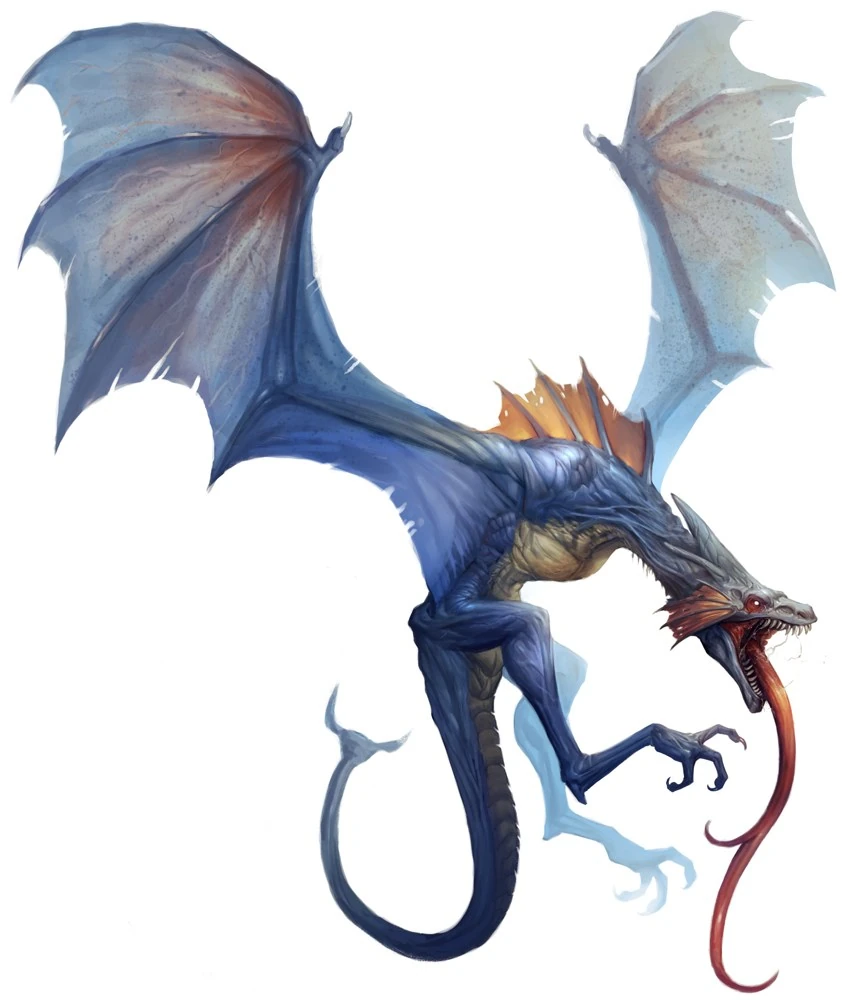
Noivern is based on the wyvern. While "dragon" as a whole is a very loose term that can come in a variety of shapes and sizes, wyvern tends to have a standard body-type where the front limbs are also the wings, making it very bat-like.
There are exceptions of course, but just googling wyvern can tell you that the there is a stereotypical body shape and that's Noivern all over.
Edit*: I don't know who resized that wyvern pic but thank you so much!
Last edited:
Dragons in Pokémon are more based on Eastern folklore and their depiction of various animals as dragons, such as Kingdra, Altaria, Flygon, Dragalge, Goodra, and Noivern. That's also why Charizard's base forme is not labeled as a Dragon: European folklore wasn't really taken into account back in Generations 1 and 2. Even though Dragonite resembles a Western dragon, it behaves more like an Eastern dragon, and so do its Prevos.
As Cod stated before I replied, Ghost and Dragon seemed to designate themselves toward Gengar, Dragonite, and respective Prevos at first. Even now, they haven't become much more common. Ghost is still just as poorly-distributed as Ice, which receives a lot of alleged dislike from Game Freak. Ever since Blizzard received an accuracy nerf in Gen 2, Ice-types got shafted. At least we're getting lower-tier Dragons as of Gen 6. I mean, look at Goodra, Dragalge, Tyrantrum, Noivern, and even freaking Zygarde 50.Not sure about Zygarde 10 or Complete, as they aren't even playable yet.
As Cod stated before I replied, Ghost and Dragon seemed to designate themselves toward Gengar, Dragonite, and respective Prevos at first. Even now, they haven't become much more common. Ghost is still just as poorly-distributed as Ice, which receives a lot of alleged dislike from Game Freak. Ever since Blizzard received an accuracy nerf in Gen 2, Ice-types got shafted. At least we're getting lower-tier Dragons as of Gen 6. I mean, look at Goodra, Dragalge, Tyrantrum, Noivern, and even freaking Zygarde 50.
The Dragon type has actually been an oddball for a while too. Originally, Dragonite seems to be designed like an "Easter egg", or a reward for looking for Pokémon in every spot. Dratini is extremely hard to find (unless bought at the Game Corner), has poor stats even as a Dragonair, and evolves extremely late. Yet its final evolution is a true dragon, with tons of resistances, few weaknesses, a very wide movepool, and some of the highest stats in the game. Dragonite is a unique, late-game powerhouse that requires knowledge and investment to obtain. Pokémon's original "Infinity +1 sword", like you find in many RPGs, a very powerful item hidden in an obscure dungeon.
The designers apparently decided to leave the bar where Dragonite put it. The norm for Dragon types stayed the same: obtained late in the game or via obscure methods, terrific stats, wide movepools and all-around badassery in every department. It became a go-to type for cover Legendaries. Not only was the Dragon type itself tuned to inherently be very powerful, most Dragon Pokémon were very powerful too. And their STAB moves (which experienced a bit of a power creep too, considering what Dragon moves were like in Gen I, II and III) were only resisted by Steel, whose Pokémon rarely had the means to do anything back to the Dragons. Although the designers sort of began to experiment with weaker Dragon types in Altaria, it took a while for them to tune down Dragon from being an "elite type". Only with the introduction of the Fairy type was Dragon given a counter like so many other types have, and recently it seems like they're letting other types catch up to Dragon's power level, if not nerfing the Dragons themselves.
The designers apparently decided to leave the bar where Dragonite put it. The norm for Dragon types stayed the same: obtained late in the game or via obscure methods, terrific stats, wide movepools and all-around badassery in every department. It became a go-to type for cover Legendaries. Not only was the Dragon type itself tuned to inherently be very powerful, most Dragon Pokémon were very powerful too. And their STAB moves (which experienced a bit of a power creep too, considering what Dragon moves were like in Gen I, II and III) were only resisted by Steel, whose Pokémon rarely had the means to do anything back to the Dragons. Although the designers sort of began to experiment with weaker Dragon types in Altaria, it took a while for them to tune down Dragon from being an "elite type". Only with the introduction of the Fairy type was Dragon given a counter like so many other types have, and recently it seems like they're letting other types catch up to Dragon's power level, if not nerfing the Dragons themselves.
The Dragon type has actually been an oddball for a while too. Originally, Dragonite seems to be designed like an "Easter egg", or a reward for looking for Pokémon in every spot. Dratini is extremely hard to find (unless bought at the Game Corner), has poor stats even as a Dragonair, and evolves extremely late. Yet its final evolution is a true dragon, with tons of resistances, few weaknesses, a very wide movepool, and some of the highest stats in the game. Dragonite is a unique, late-game powerhouse that requires knowledge and investment to obtain. Pokémon's original "Infinity +1 sword", like you find in many RPGs, a very powerful item hidden in an obscure dungeon.
The designers apparently decided to leave the bar where Dragonite put it. The norm for Dragon types stayed the same: obtained late in the game or via obscure methods, terrific stats, wide movepools and all-around badassery in every department. It became a go-to type for cover Legendaries. Not only was the Dragon type itself tuned to inherently be very powerful, most Dragon Pokémon were very powerful too. And their STAB moves (which experienced a bit of a power creep too, considering what Dragon moves were like in Gen I, II and III) were only resisted by Steel, whose Pokémon rarely had the means to do anything back to the Dragons. Although the designers sort of began to experiment with weaker Dragon types in Altaria, it took a while for them to tune down Dragon from being an "elite type". Only with the introduction of the Fairy type was Dragon given a counter like so many other types have, and recently it seems like they're letting other types catch up to Dragon's power level, if not nerfing the Dragons themselves.
How could you forget the original mediocre-statted Dragon, my boy Kingdra? It even got banned from Mediocremons if I remember correctly... u_u
Dragonite and his kin being strong, hard to obtain monsters make sense because they're dragons. When you think of dragons, you imagine mighty, fire-breathing beasts of legend. Pokémon is no different and Dragon Pokémon were made powerful and badass. When they attack, they unleash their Imperial Rage (Outrage's Japanese name and the coolest move name ever) on you and summon freaking asteroids from the sky. They just HAVE to be an "elite" type. The word "Dragon" itself has a unique cool factor to it and not even Fairies could take it away completely.
The Bug type suffers from the exact opposite. Bugs are the epitome of tiny, weak creatures (although they are among the strongest animals compared to their size and can do serious damage when they are numerous enough). Not only is Bug a mediocre-to-shitty type both in offense and defense, but most Bugs are cursed with bad stats. Just like dragons are meant to be mighty, bugs are meant to suck. And just like dragons, only in recent gens they started to balance them out with outliers such as Volcarona and Scolipede (which I am thankful for, since both Volcarona and Scolipede are great).
^At the time of its introduction, Kingdra was surprisingly strong. It was only weak to three moves in the entire game, two of which had a BP at or below 60 (and the last had a very limited distribution). Kingdra also had decent stats all over the board, and a passable movepool for Gen II. Kingdra is currently sitting at BL in Smogon's Gen II Strategy Dex.
I think the "Elite type" thing for Dragons actually worked well, for the reasons you describe. Dragons are, well, dragons, and it seems logical to make Dragon Pokémon the strongest out there. It only became a problem when the number of Dragon Pokémon grew to the point that you could stuff your entire team with them, with few drawbacks. Dragons could attack "everything" with their STAB moves and deal great damage, they had few counters and high stats, and this combination did not only make Dragon types very strong, it kind of overshadowed other Pokémon. Dragons feel at home on a pedestal, but when they're alone up there, the rest of the game suffers in comparison.
As for the Bug type, I find it to be among my favourite types. There are so clearly meant to be two types of Bug Pokémon: Those wimpy ones you catch early on and discard during the mid-game, and those rare and strong ones you find mid-game and stick around with. When people think of Bug types, they usually picture Butterfree or Ledian or something. Weak Pokémon encountered early in the game, when you're still in that "forest behind your house" setting. However, just like in real life, there are rare, big and scary bugs out there too. In RBY you had Scyther and Pinsir. Hopelessly difficult to find and catch, but they were strong and ferocious, at least they would be if the Bug type had been among the types to get actual moves. At least their design was kick-ass, and later gens redeemed their usability. Gen II gave us Heracross, which had the game's only good Bug move, and it kicked butt wherever it went. Over the course of the generations, some of the strongest threats in the metagame have been Bug types: Heracross, Scizor, Volcarona, Mega Pinsir, Scolipede, Mega Beedrill. The Bug type is riddled with the likes of Beautifly and Ariados, but the Bug Pokémon you find in the late-game are often among the best Pokémon out there. There have always been inbetweeners, Bugs that are neither terrible nor awesome (Venomoth was arguably the first, later we've had ones such as Accelgor and Crustle), but I dare say the type is defined by its position at the very bottom and the very top of the barrel. In a series inspired by/based on bug catching, I think it is fitting that the Bug type is such a mix of "backyard bugs" and exotic, dangerous monster bugs.
Most Unova Bug-types were intended to have reasonable power, somewhere in between the backyard bugs and exotic monster bugs, just like Venomoth. The closest Gen 5 Bug-type to a backyard-species is the Sewaddle line, and one is unlikely to discard it until five badges. The rest are pretty damn exotic due to Unova's alleged isolation from the rest of the Pokémon world. Bug had even become one of my top five types recently, alongside Fairy, Ice, Electric, and Ghost. I still can't believe Kalos's lack of Bug-type representation, considering that the franchise was initially based on a simulator for insect collecting.
It seems that Sinnoh and Unova really cared about the Bug type; the former showed concern for moves, while the latter catered to the Pokémon themselves.
It seems that Sinnoh and Unova really cared about the Bug type; the former showed concern for moves, while the latter catered to the Pokémon themselves.
While it's true that strong Bugs have always existed, most were held back by terrible movepools in early generations. Scyther famously had only Normal-type attacks in Gen I and was a bitch to catch, same for Pinsir, and even Scizor in GSC had to use Hidden Power for a Bug STAB.
Personally I think the badly designed movepools of early Bugs held them (and the whole type) back. A Scyther with a decent STAB attack (say X-Scissors) would have been cool in Gen I, with all the Psychics running amok and a good chance for a critical.
However, this is still a thread about design, so I grab the chance to say that movepools are an integral part to Pokémon design. Or at least, a good or bad movepool affects the way we see the Pokémon itself. RBY Scyther is a prime example of it. A more recent example is Serperior, a pretty original design in my opinion, but most of the times it's overlooked because "it has no moves" outside its Contrary Leaf Storm shenanigans.
addressing stuff in this thread:
dragonite vs. mence: I don't think it's fair to call any one more airworthy than the other; dragonite's wings are equally undersized. I personally prefer the more streamlined looking mence over dnite.
goodra: the thing I like the absolute least about it is the eyes. this gives it this kind of (for lack of a better way to describe the artstyle) a tumblry flair or (although I hate to make this comparison) almost neopet-like. the rest of it is fine, but I guess a little generic looking. kind of sad considering how cute sligoo and goomy are.
cobalion: cobalion is my least favorite of the 3 musketeers. terrakion looks like it'll beat something up with a well-aimed tackle and virizion looks like it'll stab something to death, but cobalion just... has these awkward little booties. something about it just isn't quite right.
lumineon: I can see this as being real because aquatic life can get stranger than stuff on land. then again it's ultimately ~another fish pokemon~ but with butterfly wings so it's not particularly bad or anything
genie trio: yeah these are lazy pokemon. they look cool at least, I guess, so the triple copypaste isn't /as/ bad. I didn't know people didn't like landorus-t, though; I've always thought that it's the most imposing of the 3 therian formes.
popplio: I actually think popplio is super cute. samurott is kind of... awkward imo since it doesn't look like it'd be suited to movement and would flop around on both land and water. it also magics a sword longer than its legs out of its sheaths, which is... kinda weird. I like the two mons before it but not the final evo as much.
slurpuff: slurpuff and hawlucha were some of the hardest gen 6 mons for me to come around to accepting initially. hawlucha I got over eventually but slurpuff still just look /wrong/ to me. swirlix is a cute little ball of sugar that evolves into a horrible cream dog monstrosity.
chikorita line: in all honesty part of what makes them kind of boring is that they more or less ape the bulbasaur line but with less success. they keep the same body shape and basically go leaf -> bigger leaf -> flower (compare to bud -> bigger bud -> flower). I still think they're cute I guess
gen 1 / 5 copying: I don't think tympole is the same as poliwag (beyond them being tadpoles) since the two have totally different gimmicks (one is cellphone / "tadpole means musical note in japanese" frog and the other is visible intestines frog). Timburr lines / roggenrola lines / psychic tapir lines / moles vs. pangolins / bats / fight mons / gearmons / pink blobmon are all pretty clearly tied to their counterparts (especially the first 2) but beyond that most of the mons are pretty original. whimsi is cotton whereas jumpluff is weeds... though I guess there really isn't all that much different between lilligant and bellosom as concepts short of the type of dance they emulate. elemonkeys are throwaway designs, but I don't really know how you incorporate the 3 wise monkeys without having 3 pokemon for them. I guess the fight mons got screwed over a bit since they were originally meant to be onis but got dropped once the genies came into development. the red and blue ogre star in a popular kids fable but somehow they got transformed into... martial artists.
vanillite line: I think I'm literally the only person in the world that likes this line and thinks it looks cute... vanilluxe isn't exactly a creative pokemon, I guess
pyroar: I really wish it had a better color scheme. I get that it's supposed to be a "rising sun" thing with the mane, but I can't help but think of ketchup and mustard every time I see it
sinnoh legends: palkia is one of the most phallic and oddly shaped pokemon to exist. it has a color scheme only a mother could love. Dialga and giratina look nicer and giratina-o in particular looks very smooth.
probopass: give it a chance; it's cute :(
garbodor: honestly the more I look at garbodor the more I realize that it has almost the exact same body shape as slurpuff. the design grew on me as time went on, I guess, but it's really hard to see it as anything but goofy.
to make something actually original:
audino is a pokemon that no matter how hard I try I cannot really come to terms with. it just doesn't look right. it's humanoid but... it's just this weird pink blob. it has this off-putting, stubby appearance that makes it look slow and undynamic while still being kind of thin and poorly suited to its role as a healer. kind of like a ripoff chansey but infinitely less appealing in every way.
We talk about Complex vs. Simple, but there are some other design types in Pokemon. One we haven't touched on is inspiration types.
There's about four categories of inspiration with a pokemon:
1. Animal: based off a real animal.
2. Myth: based off an established mythological creature or person like the unicorn or a yokai.
3. Inanimate objects
4. Fully original monster. And you'd be surprised how few 'mons fall into this category, but then again, nihil sub sole novum.
There's a lot of overlap, but in general any given 'mon is one or more of these four. And on this post I'm focusing on inanimate object pokemon.
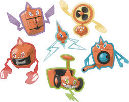
Like complex design, people tend to have a knee-jerk reaction to pokemon based on inanimate objects. Some criticize that they are more uninspiring and too simple...
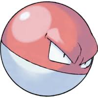
...and they might have some points. But I feel that's not really fair, at least as a blanket cover-all for this type. I'd say that a lot of animal based pokemon are still pretty bland and too close to the real thing
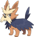
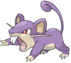
 And personally, what's more "original": a recolored mouse, or bringing life to something lifeless?
I think the real reason that inanimate object pokemon tend to get booed before even seeing them is due to Uncanny Valley. You see, our brains are hardwired to detect the difference between normal shapes/features and abnormal ones. So our brains naturally gravitate us to pokemon that appear as cartoonish versions of real animals because they have features we are hardwired to like (symmetry, soft rounded edges, etc.)
Inanimate object pokemon don't follow this pattern, they're too far removed from their originals that our brains just keep shooting red flags that-
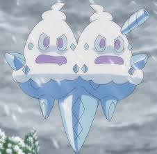
-THIS DOESNT FOLLOW PROTCOLS THIS IS DIFFERENT WE HATE THE DIFFERENT TAKE US AWAY FROM THE DIFFERENT
So while any singular person can come to love an inanimate object pokemon's design
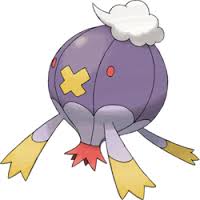


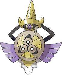
on a wide audience they just don't have that starting popularity boost pokemon based on animals have. The don't follow nature's design rules and our brains flag it as abnormal. But just because these guys don't conform that doesn't mean they are automatically "bad". Maybe all they need is a little love...
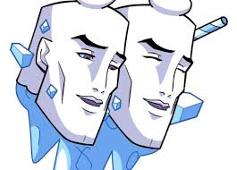
TOO MUCH LOVE! TOO MUCH LOVE!
Well, obviously there's tons more that I didn't talk about, but I think I made my point. Inanimate object inspiration isn't inferior or unoriginal compared to any other pool of thought. So I'd be okay with more of them.

I mean, as long as they don't go overboard.
There's about four categories of inspiration with a pokemon:
1. Animal: based off a real animal.
2. Myth: based off an established mythological creature or person like the unicorn or a yokai.
3. Inanimate objects
4. Fully original monster. And you'd be surprised how few 'mons fall into this category, but then again, nihil sub sole novum.
There's a lot of overlap, but in general any given 'mon is one or more of these four. And on this post I'm focusing on inanimate object pokemon.
Like complex design, people tend to have a knee-jerk reaction to pokemon based on inanimate objects. Some criticize that they are more uninspiring and too simple...
...and they might have some points. But I feel that's not really fair, at least as a blanket cover-all for this type. I'd say that a lot of animal based pokemon are still pretty bland and too close to the real thing


I think the real reason that inanimate object pokemon tend to get booed before even seeing them is due to Uncanny Valley. You see, our brains are hardwired to detect the difference between normal shapes/features and abnormal ones. So our brains naturally gravitate us to pokemon that appear as cartoonish versions of real animals because they have features we are hardwired to like (symmetry, soft rounded edges, etc.)
Inanimate object pokemon don't follow this pattern, they're too far removed from their originals that our brains just keep shooting red flags that-
-THIS DOESNT FOLLOW PROTCOLS THIS IS DIFFERENT WE HATE THE DIFFERENT TAKE US AWAY FROM THE DIFFERENT
So while any singular person can come to love an inanimate object pokemon's design


on a wide audience they just don't have that starting popularity boost pokemon based on animals have. The don't follow nature's design rules and our brains flag it as abnormal. But just because these guys don't conform that doesn't mean they are automatically "bad". Maybe all they need is a little love...
TOO MUCH LOVE! TOO MUCH LOVE!
Well, obviously there's tons more that I didn't talk about, but I think I made my point. Inanimate object inspiration isn't inferior or unoriginal compared to any other pool of thought. So I'd be okay with more of them.

I mean, as long as they don't go overboard.
Last edited:
We talk about Complex vs. Simple, but there are some other design types in Pokemon. One we haven't touched on is inspiration types.
There's about four categories of inspiration with a pokemon:
1. Animal: based off a real animal.
2. Myth: based off an established mythological creature or person like the unicorn or a yokai.
3. Inanimate objects
4. Fully original monster. And you'd be surprised how few 'mons fall into this category, but then again, nihil sub sole novum.
There's a lot of overlap, but in general any given 'mon is one or more of these four. And on this post I'm focusing on inanimate object pokemon.
View attachment 62967
Like complex design, people tend to have a knee-jerk reaction to pokemon based on inanimate objections. Some criticize that they are more uninspiring and too simple...
View attachment 62971
...and they might have some points. But I feel that's not really fair, at least as a blanket cover-all for this type. I'd say that a lot of animal based pokemon are still pretty bland and too close to the real thing
And personally, what's more "original": a recolored mouse, or bringing life to something lifeless?


I think the real reason that inanimate object pokemon tend to get booed before even seeing them is due to Uncanny Valley. You see, our brains are hardwired to detect the difference between normal shapes/features and abnormal ones. So our brains naturally gravitate us to pokemon that appear as cartoonish versions of real animals because they have features we are hardwired to like (symmetry, soft rounded edges, etc.)
Inanimate object pokemon don't follow this pattern, they're too far removed from their originals that are brains just keep shooting red flags that-
View attachment 62972
-THIS DOESNT FOLLOW PROTCOLS THIS IS DIFFERENT WE HATE THE DIFFERENT TAKE US AWAY FROM THE DIFFERENT
So while any singular person can come to love an inanimate object pokemon's design
View attachment 62973 View attachment 62974
on a wide audience they just don't have that starting popularity boost pokemon based on animals have. The don't follow nature's design rules and our brains flag it as abnormal. But just because these guys don't conform that doesn't mean they are automatically "bad". Maybe all they need is a little love...
View attachment 62975
TOO MUCH LOVE! TOO MUCH LOVE!
Well, obviously there's tons more that I didn't talk about, but I think I made my point. Inanimate object inspiration isn't inferior or unoriginal compared to any other pool of thought. So I'd be okay with more of them.

I mean, as long as they don't go overboard.
I agree with this, I think there is a place for inanimate objects in Pokemon. Just as basing Pokemon off of animals and not adding much flavor to them can be bad, I think gamefreak needs to pick and choose more wisely what can qualify to be a good inanimate object Pokemon. For example, a chandelier is awesome and has the potential to do a lot of things, whereas two gears, well not so much. It's not that they couldn't have made gears cool, it's the fact that they just took gears and put a face on it that makes it bad. No matter what the Pokemon is based on, it needs to stray away from that to really BE a Pokemon. It's what separates Pokemon from just normal animals. If I wanted to raise normal animals I would just go play zoo tycoon (not really (well... kinda)).
Rather than the simple description of animals, couldn't that work as the category of "Organisms," since plants, fungi, protists, and (eu/archae)bacteria are living things as well? Even though animals are already broad now, we don't have enough plants, fungi, protists, or bacterial colonies to give each group their own categories. They don't really fit under Objects, since they also live and breathe. I could understand viruses being labeled as objects, though.
As such, we could use the categories of biological organisms, mythological creatures, inanimate objects, and generic monsters. Most generic monster Pokémon seem to arrive from Kanto, such as the Nidoran, Slowpoke, Machop, Abra, Cubone, Lickitung, and Rhyhorn lines. We haven't gotten many generic monsters ever since. Haxorus and Druddigon might be the most recent examples of that category. They don't resemble a particular animal, even with extensive research.
As such, we could use the categories of biological organisms, mythological creatures, inanimate objects, and generic monsters. Most generic monster Pokémon seem to arrive from Kanto, such as the Nidoran, Slowpoke, Machop, Abra, Cubone, Lickitung, and Rhyhorn lines. We haven't gotten many generic monsters ever since. Haxorus and Druddigon might be the most recent examples of that category. They don't resemble a particular animal, even with extensive research.
I guess the animal category could just as well be "living things" but I also said there's overlap between all 4 categories. So don't think of them as labels but pools of inspiration. They can (and have) mix and matched references in the past, like we just talked about how Noivern is a bat and wyvern making it both animal and myth.Rather than the simple description of animals, couldn't that work as the category of "Organisms," since plants, fungi, protists, and (eu/archae)bacteria are living things as well? Even though animals are already broad now, we don't have enough plants, fungi, protists, or bacterial colonies to give each group their own categories. They don't really fit under Objects, since they also live and breathe. I could understand viruses being labeled as objects, though.
As such, we could use the categories of biological organisms, mythological creatures, inanimate objects, and generic monsters. Most generic monster Pokémon seem to arrive from Kanto, such as the Nidoran, Slowpoke, Machop, Abra, Cubone, Lickitung, and Rhyhorn lines. We haven't gotten many generic monsters ever since. Haxorus and Druddigon might be the most recent examples of that category. They don't resemble a particular animal, even with extensive research.
But I was trying to make a brief point, so forgive me for shortening some details. I did want to bring up how most grass pokemon could count as inanimate objects if you use the term loosely, but got bored of typing (and got distracted by funny images as you can probably tell).
The original monster category is indeed the most scant though, because nihil sub sole novum. Even of the examples you listed,
Nidodran is a rabbit line that evolves into Kaiju
Slowpoke's evolutions are based on a water demon and hermit crabs
Machop's is based off of bodybuilders (and maybe Hindu deities?)
Abra's is (infamously) based off Uri Geller
Rhyhorn is drills and rhino's
Druddigon is based on gargoyles (we think)
Haxorus is based on an axe, a dragon, and a dinosaur.
Not to say that you're wrong to think they have all original monster traits in their designs, again they can draw reference from multiple pools of inspiration.
Last edited:


