Custom 3D Animated Renders

hey! I love your work. :) so, Rapidash has always been of my favourite mons design wise, but it's 6th gen sprite is really dull. it's like, yo, i'm here to battle, i think.
078.gif

while older gens Rapidash's sprites were more, lively? even the gen 1 one


5jMACYY.png


can't wait to see your response, keep up the good work!
 
Last edited:
kTLsUQT.gif

Typhlosion
Original
typhlosion.gif
---> New
5atlAX5.gif

Original
typhlosion.gif
---> New
sFP9yJp.gif

Original
typhlosion.gif
---> New
lMOlJpb.gif

Original
typhlosion.gif
---> New
kewf0uI.gif


I wanted to do Typhlosion for quite a while now. I find Typhlosion's pose in XY to be one of the most boring when compred to its 2D sprites in previous games. The biggest factor is of course his fire being absent in his idle animation, but I also wanted to repose it, naturally. For those who've played Pokemon Gold or Crystal, you might recognize this pose. It's a shame that Typhlosion is currently complete garbage in every single tier he's legal to use in, though.
Nice work dude! but the legs of the back sprite look strange. Look D: >
kewf0uI.gif
< compared to:
typhlosion.gif
 
Hey man, I quite like your work.

Could I request a Slaking that isn't, well, Slacking? Don't get me wrong, I understand how it laying down is an integral part of its design, but I've always been a fan of how it appears standing semi-upright, such as in the PMD games or, iirc, the anime.

Iirc the 3d model for Slaking is now available, so could I resubmit this request?
 
Request: Is it possible to make Inkay flip around? It kinda looks boring just floating in the air. It alludes to the whole topsy-turvy thing with it's evo line.
 
Hey, I am very intrigued by your artwork! If you have the time, could you try to make an alternate Yanmega pose? It's one if my favorites from Gen IV, when its pose was a bit more curved. Something like this:
Spr_4d_469.png

Right now its just flat and boring.
Spr_6x_469.png

If you're up to it, you can even make it more curved:
Spr_4p_469.png

I hope this isn't too hard, and it's ok if you can't do this. I'd just like for Yanmega to look more menacing!
 
Last edited:
Could we get one of Slaking that doesn't look as bad as they all are? I like the idea of the first few seconds of this Gorilla That would be awesome, give this beast the respect he deserves!
 
DJ I got it! I'll just use my 100th post to crit ur stuff :P

The left leg looks kinda weird. I think the stance can lower a bit so it's always bent, not alternating between bent and straight? Also the eye looks anti aliased.

I'm not sure if I'll be able to do this for a while.
blaziken-mega.gif

See the fire coming out of his wrists? Well, I have absolutely no idea how to replicate that effect. There are so many things that I can't get right. The black outline doesn't render correctly, the color and dynamic textures of the fire, etc. I'll promise you that I will get to M-Blaziken when I can figure out a solution. This problem also applies to any other Pokemon that has this effect (Moltres, Chandelure, Emboar, Infernape, Rapidash, etc.)
Try mapping FireCoreA1 and FireStenA1 to the shader's opacity, then set diffuse to orange then animate the V coordinate. The outlines might need to be composited.
nSGDoTl.gif
ht1crcu.gif
KMN4jPV.gif

...not quite there yet but I reckon that's the concept ._.

DJTHED said:
Suicune could potentially be one of the hardest ones to reanimate souly because of those pesky ribbons (at least... I think those are ribbons). There's literally 23 individual bones for each ribbon, and it's incredibly hard to probably rig and to get it to look right. I'll see what I can do, though.
I think something like that can be done with cloth physics.

The finger wagging looks a bit off to me (especially how it's perfect sync with the mouth). In animation, every movement that's not a follow through should be purposeful--either go all out on it or don't include it at all. It can do without the hand gestures I think

DJTHED, I was pointed to your work by someone posting your Typhlosion redo in the worst sprites thread, and let me just say this is fantastic. I honestly thought some of those were official models for a while; they all just look so great!
...One thing that might just be me, though, the flames on Typhlosion look a little off...
Ah, looking at BW sprites:
Spr_5b_157.png
, the coloring seems to be a tiiiiny bit different, with vibrant reds on the edges and the oranges and yellows you have more towards the middle...Of course, this may just be me thinking it looks odd, as you perfectly nailed the flames animation/placement IMO. Just a suggestion if you happen to go back and tweak the model in the future, nothing too pressing...Keep up the good work :)!
DJTHED said:
Well I used the official Pokemon XY model and textures (this is the texture that was ripped from the game for the flames). You should be saying that to GameFreak, not me. :P
You mean, adding red stripes on that image? I'm sure most of the artists here can do that if you asked

YDtvpb5.png
tadaa! (re render? :3)

Nice work dude! but the legs of the back sprite look strange. Look D: >
kewf0uI.gif
< compared to:
typhlosion.gif
DJTHED said:
There's nothing I can really do about it, it's how Gamefreak rigged the model. I assume they never intended to have Typhlosion extend his legs out that far.
How about upping the scaleX of the lower limb bones to get a *lean looking* extension? Right now it's like, his right leg's got a lump of fat in the front view fat typhlosion fetish confirmo :D


---
Also I got a request! How about give Krilowatt a twitchy motion like Porygon Z?
26SjUSh.gif


The model is here: https://drive.google.com/folderview...JDb1BCNVptZFN1SGNXOF9VYzFSVkJiWEF3M3VjaDVRSG8
PBNiIib.gif
<-- he's just like, floating there right now... seems not very electric type to me. I'm sure you'll do a better job than the idiot who made that. n_n Have a nice day~


!!
100th post shoutout to my 3d modeling friends - DJTHED, Golui, paintseagull, Quanyails and Yveltal !
 
Try mapping FireCoreA1 and FireStenA1 to the shader's opacity, then set diffuse to orange then animate the V coordinate. The outlines might need to be composited.
nSGDoTl.gif
ht1crcu.gif
KMN4jPV.gif

...not quite there yet but I reckon that's the concept ._.
Oh my god XD were these motion captured animations?
Well, I might try giving that a shot, but the main problem I was having before is that Blender had no idea where to draw the outlines when there are textures with transparency. Looks pretty good in Maya though (I don't think there should be backface culling though, try disabling that if you can and see if that helps make it look better).


The left leg looks kinda weird. I think the stance can lower a bit so it's always bent, not alternating between bent and straight? Also the eye looks anti aliased.
Alright. Whenever I get the chance to go back to my older work I'll definitely revise that. And yeah, the textures aren't using the correct texture filter for some of these older sprites, which I will also fix when I get back to it.

I think something like that can be done with cloth physics.
Actually, there's a better method that I can use in blender, which would be using Spline IK. However, I suck at rigging skeletons with the exception of rigging simple IK for the feet and hands.

The finger wagging looks a bit off to me (especially how it's perfect sync with the mouth). In animation, every movement that's not a follow through should be purposeful--either go all out on it or don't include it at all. It can do without the hand gestures I think
No, no, no wait. That's an outdated animation.
pqBOUv6.gif
<--- This is more recent. Not sure if your criticism still applies here or not.

You mean, adding red stripes on that image? I'm sure most of the artists here can do that if you asked

YDtvpb5.png
tadaa! (re render? :3)
I'll give a rerender a shot with this I suppose, but I would normally prefer to stick with official textures (I did make an exception before with Gardevoir where it looks to its side rather than to its front, which didn't come with any official textures, so idk).

How about upping the scaleX of the lower limb bones to get a *lean looking* extension? Right now it's like, his right leg's got a lump of fat in the front view fat typhlosion fetish confirmo :D
Yeah I've tried scaling the bones, but if I try scaling a bone on one specific axis, it will also scale bones it is parenting, and mind you its not on the children's own x axis scale, rather the parent's x axis, which is hard to fix and I don't know how to fix that in blender. It would be easier to scale the entire parent bone down like say 0.9x and the scale the next child bone up by 1.111...x to compensate, but I can't really do that with Typhlosion since that also causes other deforming problems that are even worse. And no I don't have a fat Typhlosion leg fetish.

Also I got a request! How about give Krilowatt a twitchy motion like Porygon Z?
26SjUSh.gif


The model is here: https://drive.google.com/folderview...JDb1BCNVptZFN1SGNXOF9VYzFSVkJiWEF3M3VjaDVRSG8
PBNiIib.gif
<-- he's just like, floating there right now... seems not very electric type to me. I'm sure you'll do a better job than the idiot who made that. n_n Have a nice day~


!!
100th post shoutout to my 3d modeling friends - DJTHED, Golui, paintseagull, Quanyails and Yveltal !
No, you do it. >:L

Congrats on the 100th post btw.
 
Last edited:
Hey. I'm bringing another suggestion along, as more models have been added to the Models Resource.

pidgeot-mega.gif

See Mega Pidgeot here? It just floats there without doing anything. It's such a boring model for a Pokémon with such an interesting design, especially since those awesome wings aren't doing anything at all. If it were to flap its wings like most other Flying-type Pokémon, it would look a lot more interesting. An idea is to make it flap its wings at a similar pace to how Moltres does:
moltres.gif

Probably faster than this, but here's at least an image of how it could be. As always, your call on whether you're doing it or not. Peace.
 
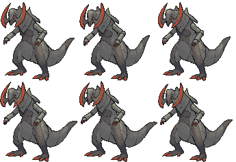
Hello, I'd like to request an animation for Haxorus?


612.gif


It has no actually interesting animation, but if it had a fighting pose like your Gallade sprite did, that would be cool. If you are reading this, please make the animation and PM me it or post the link on my profile.


Thanks a million!
 
I have a request, could someone fix a few models? (very twitchy)

Electabuzz:
electabuzz.gif

Ambipom (male):
ambipom.gif

Ludicolo (male):
ludicolo.gif

Medicham (male):
medicham.gif
 
Last edited:
Back
Top