aragornbird - Yours is definitely my favorite of the Egyptian-themed designs because of its relative simplicity. I also definitely prefer the newer version to the older one (which looks like a cute prevo, by the way!). My major complaint about it is that I don't think it tackles the Psychic typing as obviously as I'd like, but there are very few entries at all that do.
Birkal - As I've mentioned before, I'm not really into the whole magic angle, but I actually really love your Magic 8 Ball Beetle. Despite being called "magic", I see it as more of a general fortune-telling device. The design is very cute and very creative. The only problem is that it needs some explanation behind how it'll pull off Illusion, and I'm skeptical that it can be done in a way that doesn't seem like a stretch.
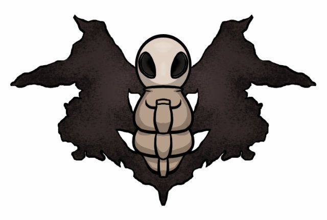
Calad - I LOVE LOVE LOVE your latest design with the cute little dowsing rod antennae. It even still looks a bit extraterrestrial like your second design, and I just generally like alien Pokemon. Definitely go with this design. My only criticism wold be to make the wings look a bit more functional, but only if it doesn't get in the way of the adorableness.
Cartoons! - I'm actually really mad at myself for not commenting on this before, because it's a fantastic design with a fantastic story. I don't really have any criticisms at all other than that it could use some explanation behind Illusion, which could be a problem considering that it already has some great story that I wouldn't want to see compromised.
Chomz - Simple design, fits perfectly. I guess I don't have any real problem with it other than that it doesn't seem to stand out. It's a psychic bug, and that's about it. Maybe give it a bit of a story? Alternatively, I'm really surprised that I haven't seen any blindfolds in any of the submitted art. It doesn't seem like a stretch at all for that bandanna it has to become one, and I think that could give it a bit of an edge.
Doran Dragon - I like this one, along with a bunch of the others that I'm commenting on, because I'd still be able to tell that it's psychic even if it's coloration were completely different. It sticks to stereotypical psychic colors without using that as an excuse to stop, which I appreciate. It's also hard to argue with those great incense-antennae.
DougJustDoug - I've already given you all of the feedback that you probably need over IRC. I'm just commenting here to reiterate that I think it's a great design with a great inspiration. It's a very clever concept, and I hope that it does well. As is the case with some of the other designs that were started before Illusion, though, it seems like it might be difficult to justify without distracting from the rest of the back-story?
DugoutCanoe - I like the idea of the abdomen looking like a chair, and I think that this design could go far, but one thing that's really bugging me (no pun intended) is the stance of the legs. I get that they're supposed to look like chair legs, but the stance looks a bit awkwardly wide. It might help maybe to go with a full four legs?
JojoX3 - I feel like this is getting overlooked, which is a shame, because I think it's very original. Please keep developing this. I especially would like to see something a bit less basic done with the central body, but only if it doesn't distract too much from the mirror wings. Maybe make them a bit less transparent? That way the final submission pose could just cover the body and leave it mysterious?
Kadew - I think that this design is really cute, and what I'd LOVE to see would be gender differences. My general stance on gender differences is "Don't" because they're usually so poorly done. Basically, I think they're "go big or go home", and this is definitely an opportunity to go big. Plus, if this wins, then I won't have to raise hell when people suggest it be female-only.
Mos_Quitoxe - I've told you all that you need to know about my opinions on IRC, but I'm just going to comment to reiterate that I think the idea is brilliantly creative and a fantastic way to showcase all of the selected abilities without resorting to the mystical. It's not "pretty" or "neat", but it's not supposed to be, and I can appreciate that. Only problem? I don't see much if any of the psychic typing visually. With a design concept this uniquely creative, it's hard to have to say that, but I do want from this CAP a design that looks more obviously psychic than what GameFreak comes up with.
Quanyails - Still looking great. I'm not entirely sure even how to comment on it beyond that other than to say I liked the older version better without the "warts", but I like what you've done with the wings on the newer one. The supporting artwork looks great, by the way! I'd love to see more of it.
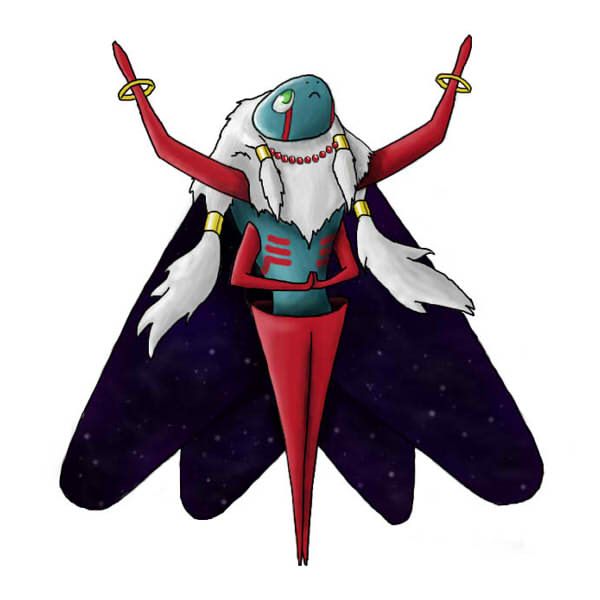
Rocket Grunt - I feel a bit of kinship with this one because we both went with something more dark. The big issue that this one runs into is the whole Illusion thing and how to fit that in there, which is a shame because the design is otherwise gorgeous, morbid as it is. I'm not sure how I feel about the giant mouth on the caterpillar's torso, but I'd love to see the concept in general experimented with.
Teravolt - I really like this design, and I'm afraid that it looks like a lot of people have forgotten about it. I think that the turban turning into huge antenna-arms is very cool. The crystal ball tail could maybe use some work not to seem quite as tacked on, but that might just be me.
ToxicPhox - So what's going on with this design? It's the only one of the "hive mind" "ant queen" concepts that I like, but we haven't seen any more since the initial post? Is this still happening? Because I think it has potential.
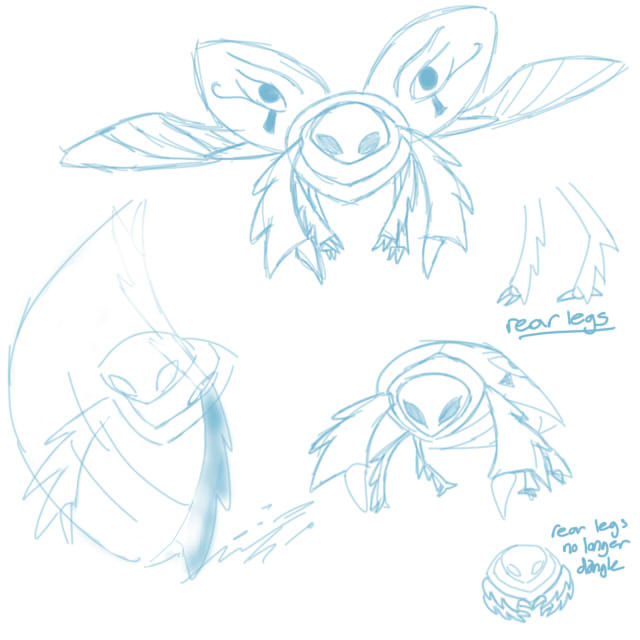
Yilx - Last but not least, I've already told you over IRC what I think. I liked the Violet Moth a lot more than I like the scorpion. I think it was better at getting across the Psychic typing visually, and I also think that it did a much better job of representing Illusion and No Guard. The Scorpion is a bit better at representing Weak Armor, but all insects have exoskeletons, so I wouldn't worry about that.