-
The moderators of this forum can be found in the CAP forum staff directory.
-
Welcome to Smogon! Take a moment to read the Introduction to Smogon for a run-down on everything Smogon, and make sure you take some time to read the global rules.
You are using an out of date browser. It may not display this or other websites correctly.
You should upgrade or use an alternative browser.
You should upgrade or use an alternative browser.
CAP 31 - Art Submissions
- Thread starter Quanyails
- Start date
- Status
- Not open for further replies.
WIP
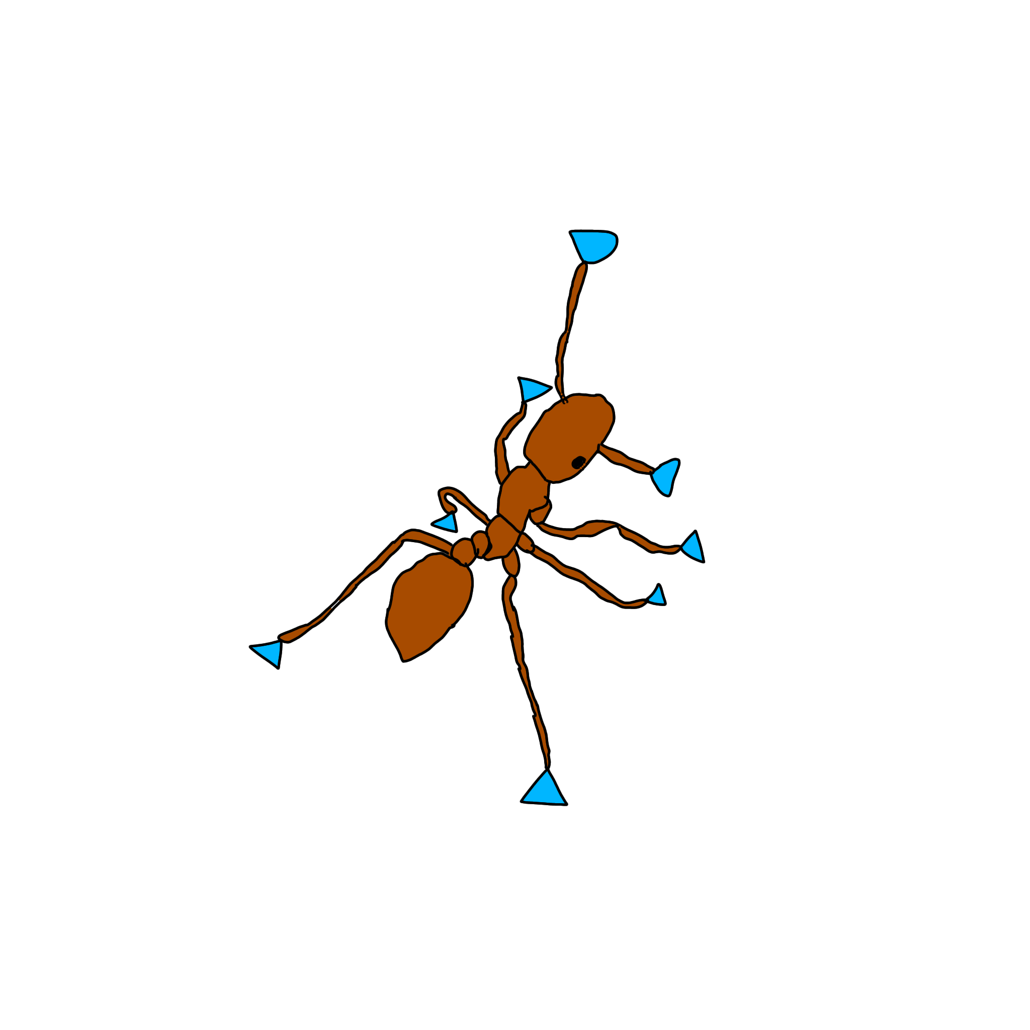
Just blocked in the colors.
Modedit: Changing oversized image to thumbnail.
Just blocked in the colors.
Modedit: Changing oversized image to thumbnail.
Last edited by a moderator:
WIP

very early concept!, inspired by the cute as hell dessert rain frogs, not a ver complex desing!
i choose thhis animal because its incredibly cute and it fits perfectly with the Ground type, being some of the only frogs that require no water to survive, plus, most of these species often get sand adhered to their skin, wich i think is a cute way to represent the crystals for diamon storm.
plu, a simple concept like this could work very nicely for a multitude of abilities (mainly the water inmunnities), so im very happy with this direction and im very open for feedback!
(pd: other desing i tough about was an egyptian baboon, but monkeys are hard to draw :p)
WIP
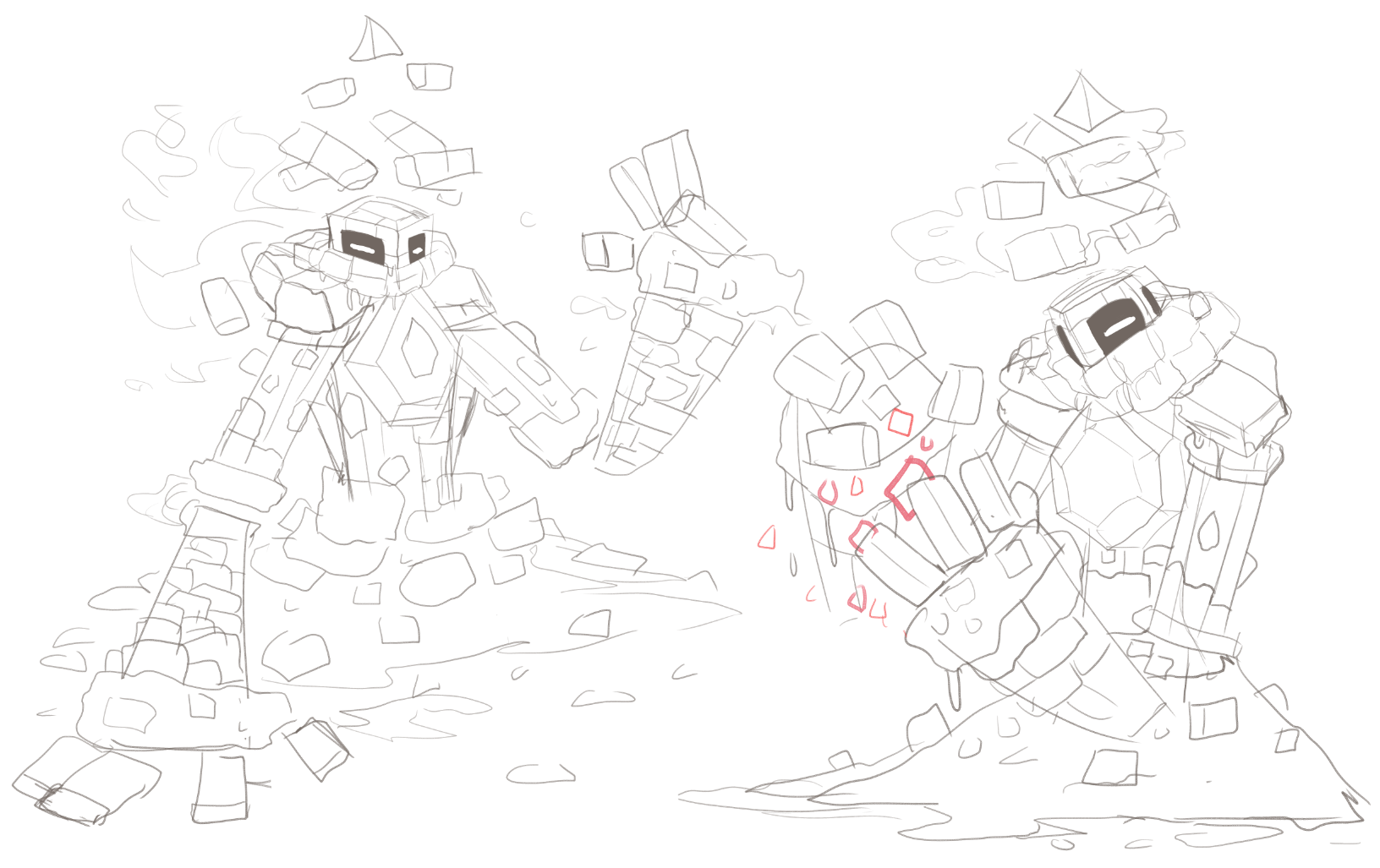
decided to play more to the integrated diamond direction from my original post, though depending on abilities i might change my mind. im probably going to refine details to make the design a bit easier to digest and until abilities are done i have no intention of coloring this just yet.
made the sandstone build and the desert pillar aesthetics much more clear, as to better imply that it's a big sand golem and not made directly of rock. i did some further research too and found some fun things that can really give this design more flavor, especially with the angle of diamond storm: mainly, the egyptian god atum (and by extension, ra and atum-ra) who is a self-created, all-encompassing deity of creation which fits perfectly with the pyramid/desert aesthetic i'm shooting for.
diamond storm is a move that can be played to much more naturally by a pokemon able to actually manifest parts of its body in a very deliberate, concentrated way, so this angle of my design explores a more "self-built" approach, which you can see more evidently by the inconsistent blockiness, the floating sand pieces, and the more pyramidal shape of its arms leading to its head!
Modedit: Scaling down oversized image.
Last edited by a moderator:
WIP

Decided to join in and post my current designs. I'm gonna wait for the abilities to be decided before I decide if I want to stick with any of these jackalopes.

Decided to join in and post my current designs. I'm gonna wait for the abilities to be decided before I decide if I want to stick with any of these jackalopes.
WIP
since it fits a lot of the current theorized abils i am working with my bandit lizard so far, based on horned lizards and bandits during the gold rush era. it would ambush cave explorers and steal their treasures. they create bullet storms firing rocks at each other, and are covered in markings from such fights

since it fits a lot of the current theorized abils i am working with my bandit lizard so far, based on horned lizards and bandits during the gold rush era. it would ambush cave explorers and steal their treasures. they create bullet storms firing rocks at each other, and are covered in markings from such fights

WIP

continuing with my frog, with a digital sketch, not much to add, light flesh tone for the skin (similar to the actual frog), with dark brown drips. the orange tones and gems are meant to keep the dessert colorations and give some variations to the desing, hope yall enjoy it!

continuing with my frog, with a digital sketch, not much to add, light flesh tone for the skin (similar to the actual frog), with dark brown drips. the orange tones and gems are meant to keep the dessert colorations and give some variations to the desing, hope yall enjoy it!
WIP

At one point Tamatoa got brought up a couple times discussing how to involve gemstones. Now I'll admit to not having seen Moana in its entirety, save snippets when we still subscribed to Disney Channel, but it occurred to me that a gem in a clam shell would probably be a good lure for a sand-lurking creature to leverage.
Normally it leaves its clam shell exposed on the beach, waiting for hapless victims to investigate its gem - but when interacted with, it extends a goose barnacle appendage while revealing its true form buried beneath the sand: a sort of crab military tank patrol vehicle. Plus my tendency to add cannons and lasers to everything, and this is CAP31 Concept #2. I'm still not sure whether battering ram or crab patroller is a better contender at this point, but we'll see what the development stages eventually decide.
WIP
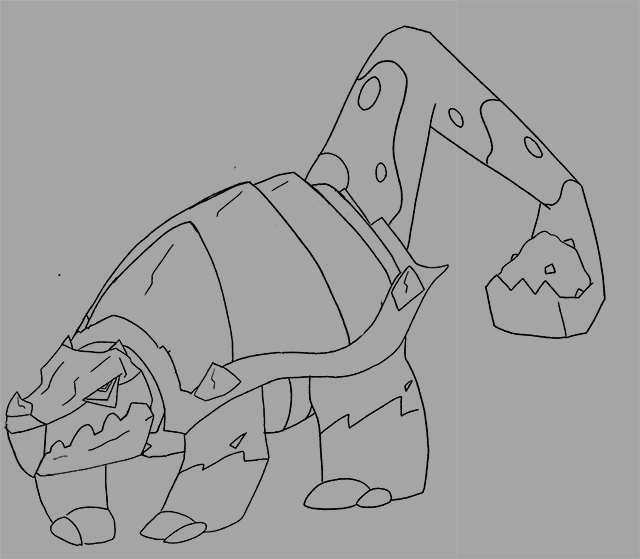
Trying to make it more ground-y.by smoothing out the plates. I also will try to add a scooper in front, either out of its jaw or some other part to make it resemble a backhoe. I'm still cutting it close, though, as its edging on ground/rock or ground/steel. i've recieved a lot of help on the design and im grateful for that, so thanks!
Trying to make it more ground-y.by smoothing out the plates. I also will try to add a scooper in front, either out of its jaw or some other part to make it resemble a backhoe. I'm still cutting it close, though, as its edging on ground/rock or ground/steel. i've recieved a lot of help on the design and im grateful for that, so thanks!
Last edited:
WIP
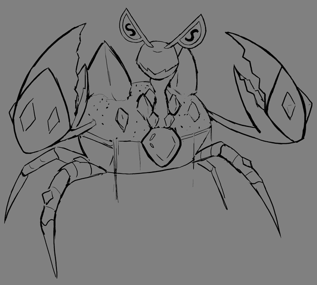
Given how Water Absorb is in the lead for ability 1, I sketched out a design using a different base animal. The design is still super-rough, though, so don't get too attached to this iteration!
Also, I had hashed out some colors for my first concept before we narrowed in on Primary Ability. This design will get scrapped, but I'm putting it here for posterity and for possible future reference once I get coloring.
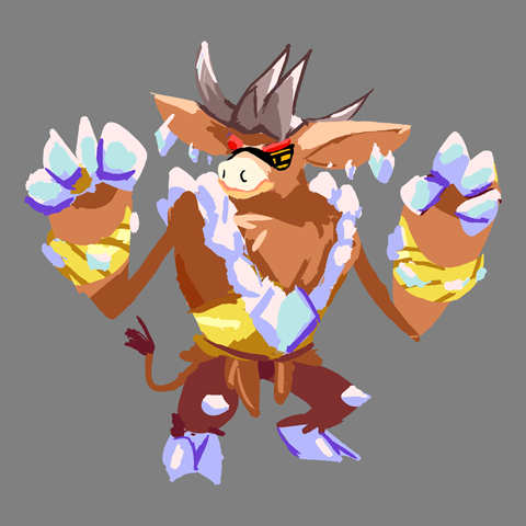
Conceptual changes:
Given how Water Absorb is in the lead for ability 1, I sketched out a design using a different base animal. The design is still super-rough, though, so don't get too attached to this iteration!
- Inverse decorator crab a la Moana, where the crab decorates itself with sparkly, shiny bling.
- Eyes are shaped like the letter "s" to evoke a certain money-loving krab, as well as cuttlefish, another sea creature.
- Body is half-covered in sand and resembles a treasure chest.
- I realized I ended up giving my last design diamond hands, so that's another fun visual pun that ended up fitting with the theme of the design.. :P
Also, I had hashed out some colors for my first concept before we narrowed in on Primary Ability. This design will get scrapped, but I'm putting it here for posterity and for possible future reference once I get coloring.
Conceptual changes:
- Made the gems look more organic by making them quartz crystals formed out of sand.
- Eyes are inspired by shutter shades.
WIP

I watched a video about starfish and wanted to make a brittle star monster. Its head is its real body and its body is made of sand

I watched a video about starfish and wanted to make a brittle star monster. Its head is its real body and its body is made of sand
My little responses!
Golurkyourself - Very cool! The 'Diamond Storm element' isn't super present here, but it's a very unique idea. Other than Starmie and Pex, we don't have any starfish mons, so I like it! For me, it doesn't really make sense how he operates, but I'd love to get to know this rad lad.
Moomany - I like your sandworm! (reminds me that someone submitted shai-hulud as a concept lol) I don't think he needs to be as colorful, especially around his neck. More earth-tone or that green color would seem to make more sense. Can't wait to see him complete!
Quanyails - Mr. Krabs and Tamatoa had a baby. I really like his design; he almost looks like a treasure chest as well! Very cool, keep doing what you're doing!
mark6780 - Drednaw's cooler cousin. As I said with Golurkyourself, it seems like it's lacking a 'DStorm element,' but aside from that, the design is great! With some color, his typing will become more clear. Keep on going bro!
Shadowshocker - Very cool design, but it just seems like there's a lot going on. I think that you should only focus on the clam shell or the tank elements.
DrifblooomCF - What a friend. I love him. I have no critiques.
WIP!

experimented a bit more with the desing, not sure if its better but im trying to see what sticks, simplyfied the gems a lot more, gave more detail to the mud-like texture on the frog back (a bit to fit more the actual animal), gave more variety to the gem colors, changed the frog face to look a bit more "pokemoney" in my opinion at least, and changed the back legs to look more like the back legs of the real frog, since they dont sit on them like in my previous desing.
plus, im trying to get better witn my lineart quality, i think im doing better but idk, i wanna know if it helps the desing :p
after a bit of discussion, i ended up changing most of the colors of the desing to a more "peach-like" tone, so it fits better with the ground type, plus changed some of the gems on its back to white (plus, changed the eyes to a more derpy look, in line with real dessert rain frogs)
and in what was probably my last edit of my frog for the time being, i made the eyes more yellowy, uprgraded a bit of the shading and lineart, i really dont know where to go from there tbh, any feedback is highly appreciated!
pd: i dont have any real feedback to give, but i can say that rn my favorites are mos`s elephant bird and T-okay naked mole queen, they are great concepts :3
Last edited:
WIP
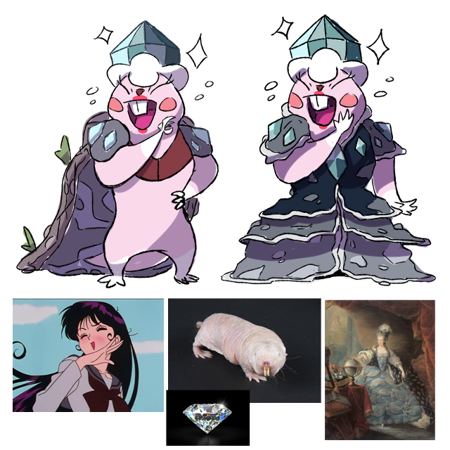
Hi ! I think to participate with this! It's a naked mole rat. These animals form societies like ants with a dominant female who is called a queen. I therefore went in this direction, basing myself above all on Marie-Antoinette of Austria. I added the noblewoman's laugh to give it more personality and a bitchy look.
I'm thinking of going with the version with the earth dress, it's the one that works best in my opinion. Besides, it's a joke... Naked mole rat... Dressed up with a dress... Got it?
I welcome your feedback ! :)
WIP

With what the abilities ended up being in the polls I decided to drop the jackalope designs and instead try something else. I somehow got the idea to do a flightless gargoyle, with the wings wrapping around itself like a cloak, that carries around a pot filled with sand, with inspiration specifically from the Aquarius constellation.
Current color scheme does make it look like a dark type so the colors may change a bit in the future, though I do want it to be on the darker side to contrast with the gems and stardust sand, and main body needs some work, but I'll probably stick with this design provided nothing goes wrong.
An entirely pedantic critique, naked mole rats' lips are behind their teeth. It allows them to dig using their teeth while keeping their mouth closed to not swallow a bunch of dirt. No idea if that's something you would want to incorporate in the design (which I love), but having spent a decent amount of time around the species, it's one of the many incredible facts about these guys that I figured was worth sharing.
WIP

Since we have a Ground type with Water Absorb and a diamond association, I decided to make a design based on Carboniferous deposits. The Carboniferous was a time of wet swamps (Water Absorb), whose remains were pressed into coal deposits (Ground), which are eventually pressurized enough to become diamonds (Diamond Storm). My design definitely needs work on the execution, but I'm pretty happy with the concept. I think the biggest challenge will be to make it look swampy without looking like a grass type. Also will need to experiment with the design of the creature.

Since we have a Ground type with Water Absorb and a diamond association, I decided to make a design based on Carboniferous deposits. The Carboniferous was a time of wet swamps (Water Absorb), whose remains were pressed into coal deposits (Ground), which are eventually pressurized enough to become diamonds (Diamond Storm). My design definitely needs work on the execution, but I'm pretty happy with the concept. I think the biggest challenge will be to make it look swampy without looking like a grass type. Also will need to experiment with the design of the creature.
WIP

Some sketches. Updated my gem-trap idea into this thing inspired by the desman. Aquatic ground creature energy. It sucks in (read: absorbs) water and other materials with its little star-shaped nose/snout and uses pressure to create gems in its clam-like tail. They use these gems to lure prey into their jaws and also adorn themselves with them for social reasons.

absorbs water

from the front

Some sketches. Updated my gem-trap idea into this thing inspired by the desman. Aquatic ground creature energy. It sucks in (read: absorbs) water and other materials with its little star-shaped nose/snout and uses pressure to create gems in its clam-like tail. They use these gems to lure prey into their jaws and also adorn themselves with them for social reasons.

absorbs water

from the front
WIP
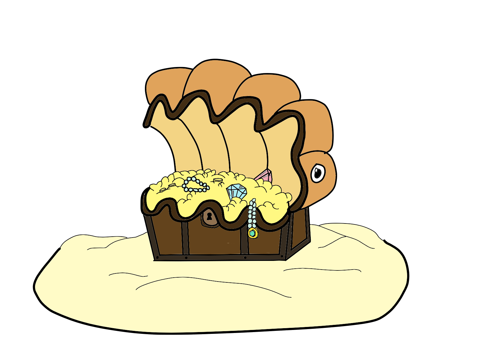
I'm not an artist at all- literally have never drawn anything but I've been lurking and watching CAP processes for a while now. Had the idea of a giant clam/buried treasure mon. Diamond Storm flavor obviously fits, and given that clams are marine creatures, and buried treasure is found on beaches, I figured that Water Absorb can make enough sense on a mon like this. Figured this art would be good enough, considering it's the 3D models that you see when you play, so I'll leave the burden to them lol
Modedit: Scaling down oversized image.
Last edited by a moderator:
- Status
- Not open for further replies.


