Bugmaniacbob. I love it. The middle one is the best for the plant body wise. The grass blades should be changed to something else though. But I think the middle concept is the best and the ectoplasm from the first is greatly needed. So if you could incorporate the ectoplasm into the middle design, IMO it would look best.

-
The moderators of this forum can be found in the CAP forum staff directory.
-
Welcome to Smogon! Take a moment to read the Introduction to Smogon for a run-down on everything Smogon, and make sure you take some time to read the global rules.
-
Congrats to the winners of the 2024 Smog Awards!
You are using an out of date browser. It may not display this or other websites correctly.
You should upgrade or use an alternative browser.
You should upgrade or use an alternative browser.
CAP 13 CAP 2 - Art Submissions
- Thread starter Wyverii
- Start date
- Status
- Not open for further replies.

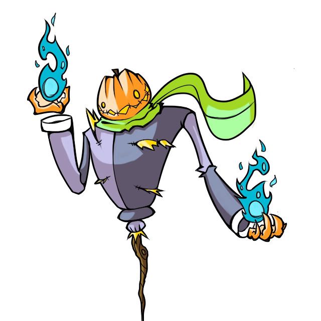
Here's the latest combination of previous possiblities. I think that the single leg emphasizes the ghost type. I made him only stuffed with hay in the torso area so that it makes sense. Also trying new color pattern. He's charging up a fire type special attack or something, I don't know!
Is this one better? Worse? I don't quite know how to feel.
Edit: Now that I look at it, I see less Jack Skelington, which is good. I feel it's much more "pokemon".
For me, worse. There was nothing really wrong with the design apart from the jacket being too bright.Is this one better? Worse? I don't quite know how to feel.


I like this version. I wasn't so much a fan of the other versions because I thought the military jacket was too humanoid for a Pokemon - but this is something I can see being a Pokemon. I like the single leg, as well. I do think it helps with the ghost type and offers a little more flexibility for speed, depending on what the stat spread is.

I have returned with more concepts! It seems I'm having difficulty finding time for CAP as finals draw nearer. I need to rethink my priorities ;)
Apologies for the hand drawn sketches.
This is not a replacement for my dead flowermon, this is an alternate idea. This concept is a uprooted flower that uses its roots to paint. The design is based on the synthesis (no pun intended) of an orchid and a dead/ghostly queen. She uses her ripped petals as hands to protect her to hold the mighty brush!
Here is a link showing what an orchid looks like:
http://eiknit.com/images/uploads/Purple_Orchid.jpg
As for my original wilted flower angel design I have not abandoned it! Here are some sketched out in different colors.
http://i262.photobucket.com/albums/ii118/mayatraese/CAPflowerjpeg.jpg
For those of you wondering its based on a lilly:
http://farm5.static.flickr.com/4066/4682907780_9c840e2df1.jpg
Does the wilted lilly or the queen orchid have more potential for development? Let me know what you all think.
Thanks for the support those of you who have mentioned my design! As a newcomer to CAP I have to say I wasn't expecting to feel the love!
And now for my opinions!
Wyyverry I love the little renaissance gypsy guy! This design captures the tricky or cute aspect that ghost pokemon sometimes exude (when not being dusclops). I really like the incorporation of real-world culture into pokemon so this design stands out.
Paras Hilton This mon is delightfully deranged. I would like to see some different colors for the body. I feel design is exciting enough to merit some different color experimentation.
Tea and Blues Your new design is a massive improvement, but it seems to lose detail as you move from the top of the head south. Perhaps giving it an interesting body pattern or making the head are less busy?
Moss-Quitoxe I love the origami samurai, but though paper is very plantlike, I agree with others on here that the grass typing could be worked in a little more. The new color design helps though, the cherry blossoms are an excellent addition!
Sentret I think something was lost in this transition and I cant put my finger on what. I personally am a fan of the military jacket. Maybe incorporate a military feel to it rather than the block bi-chromatic current one?
srk1214 Thank you for the feedback and support! I am humbled!
Mos-Quitoxe
I liked the previous red&white coloring better myself though you could lose the angry symbol since it looks like it really needed to use the bathroom. The flora patterning also seem pretty tacked on. Other than those little thing they're nothing wrong with your design. BTW leaf origami is possible.
Yilx
Simply beautiful if I do say so myself. Making the stem/ponytail green was a good idea as it indicate some grassy elements to her. Originally I did like the black&white coloring but I grown to love the red&white more however both coloring are fine with me.
SoIheardyoulikeSENTRET
Bring back the legs, it was better with them. Just add some joints to them so they don't look so stiff and maybe some ghostly aura around said joints, but that's just me.

mos-quitoxe I didn't mean a full-body flower design; I meant what had been suggested. It turned out nicely. Green color is IDK. It does make it look worse, but it does make it a bit more grassy, albeit weakly.
mayatraese I like the first one better
for the record, which pose is better?
this one (except with color):

or this one:

and how many "wings" should I give it in the picture Imma draw, and should they be retracted or protruding? (http://i1239.photobucket.com/albums/ff517/ryik7/UGhvdG8wMTEzLmpwZw.jpg)
mayatraese I like the first one better
for the record, which pose is better?
this one (except with color):
or this one:
and how many "wings" should I give it in the picture Imma draw, and should they be retracted or protruding? (http://i1239.photobucket.com/albums/ff517/ryik7/UGhvdG8wMTEzLmpwZw.jpg)

Mayatraese, I was given a warning for what was apparently a very rude post comparing your submission with Jirachi. I apologize if it came off that way, and would like to say that in fact I think your submission is fantastic. One of my favorites (although I do prefer your other one, which in my opinion is amazing). I very much like the stem-as-brush idea and the style is great.
While I do think certain changes could perhaps be made to lessen the comparison to Jirachi, they're not necessary and you have a very good piece on your hands.
You're clearly very talented, and I'm sorry if my post was offensive.
While I do think certain changes could perhaps be made to lessen the comparison to Jirachi, they're not necessary and you have a very good piece on your hands.
You're clearly very talented, and I'm sorry if my post was offensive.


Mayatraese I couldn't quite place what it was, but your new design felt less original than your first one. Fizz is onto something. Your second design reminds me a little too much of various pieces of already existing Pokemon. I get a Jirachi vibe in the overall shape, the wing-y things look very much like Volcarona's, the tail is awfully close to the original sketcher, Smeargle's, etc. Your second design is good, there's no doubt. But I greatly prefer the first one.
That being said, I still LOVE your first one!
That being said, I still LOVE your first one!
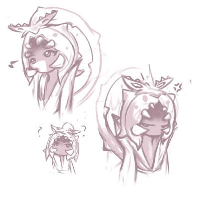
I am a fan of both of your designs.IMAGE HERE
Here's the latest combination of previous possiblities. I think that the single leg emphasizes the ghost type. I made him only stuffed with hay in the torso area so that it makes sense. Also trying new color pattern. He's charging up a fire type special attack or something, I don't know!
Is this one better? Worse? I don't quite know how to feel.
Edit: Now that I look at it, I see less Jack Skelington, which is good. I feel it's much more "pokemon".
I feel as if the two-legged one is physically inclined, and the one-legged one is specially inclined, and your designs should follow suit. The stat spread is gonna be picked like in a day or so, right?
Fizz,
No worries my friend. I was taken aback by your post's lack of explanation to the comparison, or ways I could fix it, but was not psychologically damaged in any way :)
It is hard not to draw comparisons. Several prominent designs on here have striking similarities to existing mons, as may have pointed out, but with so many pokemon now existing, its hard not to accidentally borrow ideas.
That being said, srk1214 has an excellent point.
Thank you both for illuminating the similarities. Hopefully soon I can fix them. Art coming later.
@Mayatraese, I am also a big fan of your original wilted flower angel design, and I'd love to see you work more with it. Such a great way of incorporating Sketch into the design, and it's such a perfect blend of grass and ghost elements! ^^


Wyverii that paper child is adorable! A very unique way to showcase your cute design :)
SoIheardyoulikeSENTRET I prefer this version too. Implies enough bulk while being one of the better pumpkin ghost submissions. I kind of miss the military jacket although like it's been mentioned it might be a little too human-like. I think itg ave it more character.
mayatraese, I preferred your original concept; it had more character to it and didn't feel as busy as these recent two, although they are good designs too!
Also Flytrap Miko's Aura Sphere
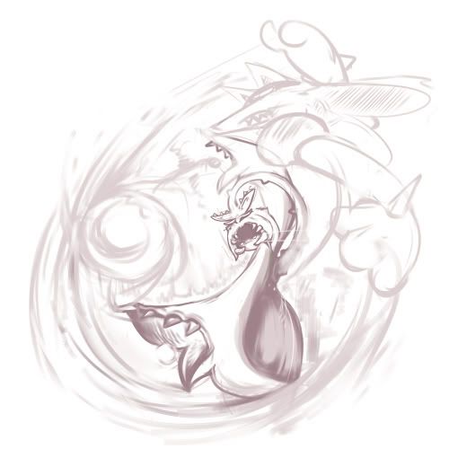
I decided after lack of feedback, and not liking the design at all, for the waratah, I decided to stick with leafy tornado. I'm still uncertain as to whether making certain the Pokemon would be appropriate for the Field egg group is absolutely mandatory or not, but I'm not too worried about that right now.

I decided to try a completely different style of shading and colours, while keeping the basic shape until I can finally draw a new, better, possible more dynamic pose for it, especially for the hands. Personally I think it looks much better than the last version/s I posted, but I am uncertain as to whether I need to pay more attention to the swirling leaves. I.e whether I should individually redo them/colour them (oh god) or if I should leave it. (haha get it, i so funny) I've also tried to experiment a little bit with a possible shiny design, where the body is made of dying/autumn leaves,
Possible shiny colouring
And while going feminine and child like with the design seems to be the new thing for this thread, I can't really think of anyway to make the tornado feminine without going stereotypical, like giving it eyelashes. As always, any critique isMANDATORY welcome.
I'll be going backwards through posts to critique, just so it'll be a little quicker:
If I had to choose my current faves so far, they'd have to be (in no particular order) CyzirVisheen, Yilx, DougJustDoug,and Mos-quitoxe's concepts, but there's a lot of great ideas in this thread!
I decided to try a completely different style of shading and colours, while keeping the basic shape until I can finally draw a new, better, possible more dynamic pose for it, especially for the hands. Personally I think it looks much better than the last version/s I posted, but I am uncertain as to whether I need to pay more attention to the swirling leaves. I.e whether I should individually redo them/colour them (oh god) or if I should leave it. (haha get it, i so funny) I've also tried to experiment a little bit with a possible shiny design, where the body is made of dying/autumn leaves,
Possible shiny colouring
And while going feminine and child like with the design seems to be the new thing for this thread, I can't really think of anyway to make the tornado feminine without going stereotypical, like giving it eyelashes. As always, any critique is
I'll be going backwards through posts to critique, just so it'll be a little quicker:
Yilx Awesome supplementary material again. Though like last time, the head branches appeared to be the main face again, initially confusing me, but that's because it's mainly a sketch. You are really good at putting your designs in dynamic poses. The colours you've ended up with look quite good too, even though had I been given the chance to vote, I would have liked to see the green head and green body together to see what it was like. Ah well.
Dust7 Pardon me if I'm mistaken, but didn't you already make a Final Submission post? Anyway, the Chikorita-like thing is pretty cute, but the scythes could be incorporated into the main body much better, rather than looking like random scythes drawn on. I also think the second pose is better, as it feel more dynamic. Also, you're not supposed to quote images in full - just link back to the original post.
mayatrease The new design is good, though like Yilx I think I prefer the original. On the new concept, however, I am kind of having difficulty telling what black parts are what - At first, I thought the second pose had it wearing a Black Mage style hat. I think slightly better colouring would clarify that. It may also just be me, but I think the brush tail might look better if it was coming out of the lower back pod when the thing is shown sideways. As for the renditions of the original design, I like the one with the green tail better, though the tips might use one more splash of colour on the end.
MektarTheOverlord Were you, by any chance, the same as the person who came up with the anvil on a parachute for the last CAP? xD Even though it is silly, I like it, and it works because it is reminiscent of designs like Vanilluxe and Klinklang. I'd suggest either putting a shadowy element or at least giving them some sort of eyes to unify the things better than just the smiles (which I didn't notice at first).
Wyverii I kind of have to agree with that one poster who mentioned the human shape similarities to Smeargle, but it's not that big of a problem. I feel that the bark clothing could be a bit more detailed, but I suppose I'll wait for the full digital rendition you promised before really going into detail. I can't really think of any problems I have with it though as it is.
bugmaniacbob Out of the three possibilities, I prefer the first one much more, though the 17 different flames is a cute idea. However, on the first one, I feel that the long hair is a bit too much. Maybe it could be toned down a bit.
Mos-quitoxe I really like this design for it's uniqueness and origami touch. My main nitpick is with the kanji you decided to use for the face - there's nothing particularly wrong with it, but it just kind of bugs me a little. Maybe it's the mouth, but otherwise it's looking good. Maybe it could be a bit yellowish to represent old paper.
CyzirVisheen It reminds me of Litwick, if only because it's adorable and creepy at the same time. I don't really have anything to critique on, besides maybe the unnatural looking way the arms perfectly stick out like that.
Paras Hilton The thing is bizarre and unique. I especially like the head axe. Without the supplementary material, though, I would have had no idea that the stump was like a helmet instead of being part of the Pokemon naturally. I also don't really like the tail, as it seems to be trying to be leaf-like but failing, but your mileage may vary.
tea and blues Cute design, but I'm uncertain whether the dress is meant to be made of plant matter (like Wyverii's), the body itself or a cloth like thing. I really like the face/mask, though, and the third supplementary picture/pose looks really good.
Last but not least, Spork The thing reminds me of both the bleeding waterfalls of Antarctica and of the fad where looking at creatures with those unnatural holes in them made you really itchy. I have to say, this is the design that creeps me out the most (and you just had to post the creepy reference, didn't you xD) My critique would be that it doesn't immediately suggest a grass typing - I'd suggest making the head a bit more mushroom like, but the bleeding tooth fungi really are shaped like that, so I don't really know.
If I had to choose my current faves so far, they'd have to be (in no particular order) CyzirVisheen, Yilx, DougJustDoug,and Mos-quitoxe's concepts, but there's a lot of great ideas in this thread!
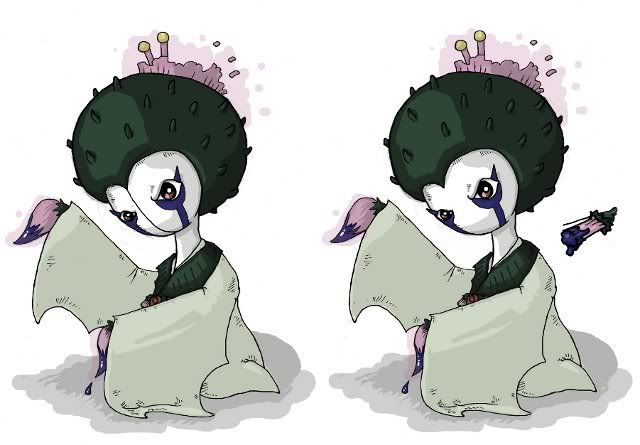
I'm still toying with some alternate brush hands and some possible changes to Thistlemon's burial kimono. I'll post those for feedback soonish. I just want to respond to the concerns about the plainness of her lower body. Her body is based on burial kimono (and it is supposed to also evoke some thistle-leaf shapes) - the plainness is by design as burial kimono are white and minimalistic. I could possibly include some sort of rotten appearance along the hem, but I quite like her kimono as plain as it is. Seeing as she can also float, it looks good to have her plain kimono feet and dress dangle like fabric. I'll see what I can do, but I'd also like to know if others feel that Thistlemon's lower body needs work.
Here's Thistlemon in a traditional kimono pose. For comparison, I've included a version without the dividing line down her face. I think she looks too friendly and mushroom-y without it. I've also included a quick doodle of the alternate hand/brushes for feedback. I can't really decide if I like the extra detail or not.
Full-size kimono pose
Edit:Quick doodle Quick rendering with alternate hand/brushes and a leafier kimono idea.
http://img.photobucket.com/albums/v54/walruskeeper/CAP2Thistleeffects.jpg
Pencil doodle of alternate features (Apologies for borked perspective)
Feedback
Yilx - Your maiden is a really complete design, it's looking stunning. I still prefer the greenish-brown, but pure brown works for the stem as well. The design keeps making me think of a Mawile evo, but only in a good way, not in a way that detracts from its ability to be this CAP.
Dust7 - You need to get your scans much more in focus. The second design is starting to look interesting, and if you can spend more time on an in-focus drawing of it, I'm sure you'll get more feedback.
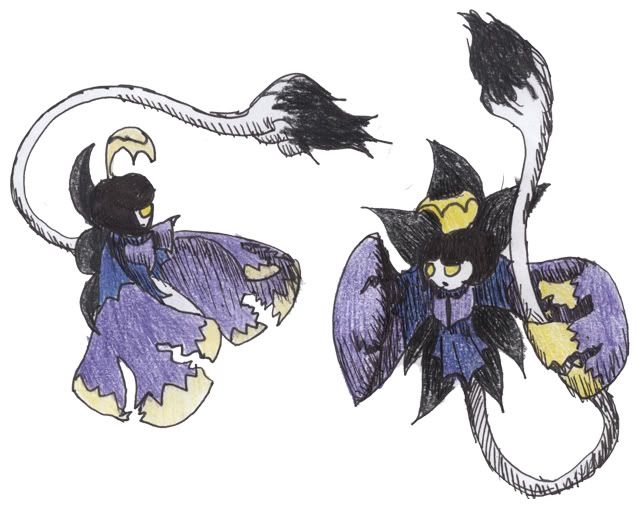
mayatraese - A really interesting little pixie-moth. I see Dark more than Ghost type, but there are plenty of existing Pokemon that I'd predict wrong based on appearances. I think the brush is a little overwhelming at the moment, and could be smaller, and less... ...appendage-y.
SoIheardyoulikeSENTRET - Your design is awesome. I'm still struggling with the pumpkin-is-too-obvious vibe, but you're helping me overcome that with your supporting work and commitment to honing the character.
Paras Hilton - I love this guy so much it's not even funny. Seriously, all I want to see is supporting art and a backstory, it's a completed design in my view.
Mos-Quitoxe - I'll be honest, I wasn't into your design until you added the flower patterns, but that made it grass type enough where paper alone didn't cut if for me. Keep those patterns, and the green. It's a lovely design.
Wyverii - Great design, I love the pose in that pencil drawing. There's something so laid-back about your character.
Here's Thistlemon in a traditional kimono pose. For comparison, I've included a version without the dividing line down her face. I think she looks too friendly and mushroom-y without it. I've also included a quick doodle of the alternate hand/brushes for feedback. I can't really decide if I like the extra detail or not.
Full-size kimono pose
Edit:
http://img.photobucket.com/albums/v54/walruskeeper/CAP2Thistleeffects.jpg
Pencil doodle of alternate features (Apologies for borked perspective)
Feedback
Yilx - Your maiden is a really complete design, it's looking stunning. I still prefer the greenish-brown, but pure brown works for the stem as well. The design keeps making me think of a Mawile evo, but only in a good way, not in a way that detracts from its ability to be this CAP.
Dust7 - You need to get your scans much more in focus. The second design is starting to look interesting, and if you can spend more time on an in-focus drawing of it, I'm sure you'll get more feedback.
mayatraese - A really interesting little pixie-moth. I see Dark more than Ghost type, but there are plenty of existing Pokemon that I'd predict wrong based on appearances. I think the brush is a little overwhelming at the moment, and could be smaller, and less... ...appendage-y.
SoIheardyoulikeSENTRET - Your design is awesome. I'm still struggling with the pumpkin-is-too-obvious vibe, but you're helping me overcome that with your supporting work and commitment to honing the character.
Paras Hilton - I love this guy so much it's not even funny. Seriously, all I want to see is supporting art and a backstory, it's a completed design in my view.
Mos-Quitoxe - I'll be honest, I wasn't into your design until you added the flower patterns, but that made it grass type enough where paper alone didn't cut if for me. Keep those patterns, and the green. It's a lovely design.
Wyverii - Great design, I love the pose in that pencil drawing. There's something so laid-back about your character.

I agree with this, it looked so much better the way it used to be, they are scared of the shift from grass to paper but c'mon, look at Parasect, or Breloom, they are mushrooms, and they are Grass types -.-, it doesnt have to be a plant IMOAlso, am I the only one that DISLIKES changing the inside to green? It negates some of the strong Shinto vibe it had before. Also, if it's folded, this means that there are Red and Green sections on it as well as White and Writing. That's rather busy now.

Mos-Quitoxe
Maybe its because I saw the green design first, but I think it looks far better than the red. I guess if I'd seen the red first I might think differently, but I feel the green contrasts nicely with the red of the flowers. I like it.
SoIheardyoulikeSENTRET
I'll be honest, I wasn't much of a fan of your design before, as I thought it looked to human-like. Having only one 'leg', however, improves it greatly in my opinion, so I'd keep it like this.
tea and blues
I'd criticized your entry before for making me think of Roserade (even if the similarities weren't that great), but I think you've sorted this out now, and I really like your new design. I think changing the eyes was the best thing, and I agree that the dividing line on the face is a better option. Personally I prefer the first brushes, but the leafier kimono.
Paras Hilton
I like it loads more now that its not as busy, great work. Also can I just say how absolutely hilarious the picture is without the stump! Brilliant.
CyzirVisheen
I'm not sure how good this would look, but I feel like irises/pupils need to be added to the eyes. I'm not really feeling the 'character' of it without the eyes being defined in more detail. It may not work though, its just something you could try.
mayatraese
Its certainly an interesting design, although to me it gives me the impression of Dark-type rather than Ghost. Its not just because its black, it also looks vaguely demon-like. I'm not sure what the best approach would be to make it seem more ghostly, but I think it needs some work.
Dust7
If you work on your second design, you need to be careful to avoid similarities with Giratina's origin forme. Perhaps make the 'wings' more vine/leaf like, because at the moment I fear it looks too similar. I'd also like to see more detail on the body/head; perhaps a close up? Keep working on it.
Playing around with emotions and stuff.

Main Colours
[Shiny Colouration] [Normal Colouration]
Supporting Material (so far)
[Sacred Fire] [Aura Sphere]
Absolclaw: It looks cooler and more intimidating posed like this. It's a vast improvement from your first design; you've come a long way :) Also, don't worry about 'making it femenine', I have no idea what caused the little fad anyway. Your design is unique on it's own.
tea_and_blues: I personally prefer the one without the line down the face, but ultimately it's up to you which one you decide to go with. The normal brush head is fine; it's more obvious that it's a brush head if you go with the bulb design rather than the other. Really loving how much you've progressed on this design.
Mos-Quitoxe: Have you tried the normal white colouration with the flower patterns yet? I think they'd go really well together. The green feels slightly out of place to me, although it indeed does justify the grass-typing more...

Yilx, you never cease to amaze me. I especially love the "human but not too human" look on your Shrine Maiden thingie. You got my vote :D Also, Sentret's got a great one, nice and flamey no matter how cliche pumpkinmon are

Yilx, your mon has stolen my heart, especially with it's lack of a paintbrush that everyone keeps trying to slap in. Too many just try to force it in; I prefer ones that tried alternate methods (mirror, mask, origami, spirit aura, shape mimicry) over those that just slapped a paint brush on. Not that all that had a paint motif were bad. The gorilla one was actually rather beautiful and a bit sad.


I hope it's not to late, I've been wanting to submit my sketch, but I have been really busy.
So here we go!
This was a simple sketch of my idea. It's also as scare-crow, but a different approach to it to, on this one i focused more on his grass aspects and made his ghost side second
Rough sketch
http://i54.tinypic.com/30m1r9e.jpg
Cleaner sketch
http://i54.tinypic.com/2qxtems.jpg
Got it sorry

Yilx, your pokemon is wonderful. I'm showing it to some friends who don't play pokemon and they can totally see it being a viable design.
It's simply amazing and the supporting material is just phenomenal. Beautiful, I keep coming back just to check on your updates. You have my vote guaranteed.
It's simply amazing and the supporting material is just phenomenal. Beautiful, I keep coming back just to check on your updates. You have my vote guaranteed.
- Status
- Not open for further replies.