CAP 18 CAP 18 - Sprite Submissions

Status
Not open for further replies.
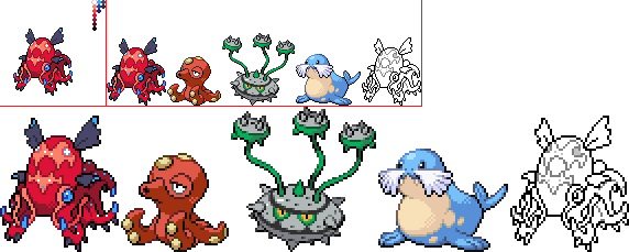
PD9RRvv.png

edit: changed the shiny palette a lot, made the front face more front.
edit 2: changed the position of a tentacle.
edit 3: moved stuff around on the back to match the front. went blah on the shiny.

comments:
Quanyails - I love the pose and like the glowier-ness better, as it makes the spots seem actually glowing rather than painted on, as the other version's look to me. thank you for the crit; I tried to add the spikes in a less out-of-the-way place rather than the back, but it didn't really work.
V4LOVER - the backsprite seems awkward and a bit large, I'm not sure why. but I do agree that the front pose conveys the details best, even if it makes the backsprite strange. thank you for the crit, I tried to make it more front-facing.
Harry.Buxton - I love your pose, but the positions of the tentacles in the backsprite don't really match the positions in the front. the second-to-last (back) tentacle is down in the frontsprite but up in the backsprite. I do like your gender differences though.
epicparker - it looks a little big to me, especially the tentacles, which seem very thick. I'm not sure why. however you handle the membrane thingie very well, props for that! thank you for the crit, I did try to make the tentacles thinner.
User of Shadows - I like your pose, but the glowy things on the undersides of the tentacles make the backsprite seem... clustered? I'm not sure what the word for it is. I love the shiny colouring in general but dislike the shiny fins, as they seem to blend in to the body too much.
[rest... probably not tba later but I'll get to them sometime]
 
Last edited:
W7IjJH5.png

So, I've started on the back sprite (and chose my second/alternate pose to base it off of). I was going to ask for advice in the art room on showdown before posting, but seeing as the server is down I decided to post this draft now.

I added a few photophores on the back of the head in a position in which I was trying to make them just barely look like eyes and fangs for a basic face (certainly not as detailed of a face as the front mantle, since I didn't want it to be as powerful as golurkyourself's face in the official design). To emphasize the idea of vampire fangs, I placed the back two arms in front of the back photophores, so the tips are curled and mimic the idea of vampire fangs (these back tentacles were made without the barbs simply because they would have distracted from this fang effect). Also, at the edges of the arms where the red skin and the dark grey underside meet, I added some more tiny photophores just to increase the contrast/visibility of the change since I felt the red and dark grey were blurring together a bit without them. I'm somewhat nervous that I made the back sprite too lively, but in the end I hope it works and adds some character to it. As a sidenote, the back sprite's "face" somehow reminds me of a demonic Mudkip. Perhaps this might be too much of a cutesy comparison, but I hope the vampire qualities are evident on the sprite.

As always, I welcome critiques and suggestions.

A few more comments for others:

Umbreonage: I really like the treatment of the spikes, arms, and photophores on your sprite. I'm jealous of your clean linework, too. I'll agree with you though that the wings could be reshaped. I have mixed feelings about the angle of the mantle and the face on it; it's probably a realistic angle, but at the same time it might slightly detract from it's Pokemon appearance and could make it look more like a normal octopus/squid... This could just be me though. The curls on the arms are really well done. Overall, I think it's a great sprite, and I can't wait to see future drafts and the back sprite.

frenzy-plant: I personally don't mind your shiny palette. The yellow might be slightly off, but I like the blues and the red accents. I do wish that your front sprite was facing forward a bit more though. Also, some of your tentacles have quite different thicknesses. I like your back sprite a lot though, and your shading is quite nice.
 
Last edited:
Damn, Heal, that's a mighty detailed backsprite. Props to you. An issue that I see though is that the underside of the tentacles shouldn't be lit up - the light is coming from the upper right and so they should actually be entirely in shadow, with maybe a hint of light on the right side. Also.... though they are very pretty in their current iteration, they're lifted up in the back quite a bit more than the front sprite depicts. You can either try to lower them here or raise them in the front view - I'd go with the latter personally just because the backsprite detail is so nice.

Did my CC for other sprites last night on my old post, I'll probably come through with a backsprite tonight or tomorrow morning.
 
3dcjbfj.png


A few minor updates trying to fix a few tentacles and pretty much fixed the whole back sprite ahaha. This time i made the back sprite so all tentacles (apart from the one bent across his body) are visible and so they're almost in the same position.

Also made the non-shiny sprites mask brighter so its orange doesn't look so close to the body orange, but not too much that it stands out a lot.

Made a new shade for the webbing between tentacles to help distinguish webbing from tentacle (especially on the back sprite).


HeaLnDeaL - i Love your backsprite man aha. good job :)

Everyone els, good job too. they're all fantastic ^_^
 
Updates!

ZbOElTB.png
---->
JiSkH0f.png
/
hcYLrUH.png
/
Vb3nZla.png


Changes:
-Moved the mantle over 2 pixels per elementalpenguins's critique; you're right, it didn't make sense where I had it
-Body reshading to emphasize contours of the tentacles
-Redrew face markings on the mantle to be more fierce and less derpy
-Spikier spikes
-Unbroke the right face tendril
-Slight reshading and reshaping of the face wings, they're shorter and now have bioluminescent tips
-A few shiny options? They could use cleaning up, just some color scheme ideas

Thoughts? Also do people like the wings better or should I just stick more to the original art with those?
 
Updates!

JiSkH0f.png
/
hcYLrUH.png
/
Vb3nZla.png

Looks better than before! If the only change on the wings is the light-tips (which it seems to be), then these are better. I'm leaning towards the second shiny (farthest right), but it doesn't seem right with the face color being darker than the body. The barbels are quite long though, as they extend far beyond the body and they stand out a bit too well from the rest of the sprite. It just seems a bit odd compared to the rest of the sprite. Otherwise nice job!
 
Finally did the backsprites! And the shiny, which I've been pretty set on for a while, haha. Two slightly different versions, though.
3PRApmu.png
lNqgokC.png
3PRApmu.png


Changes for frontsprite:
  • made the glowing spots a bit more like spots and less like protrusions
  • some color tweaking
  • moved the spikes into the tentacles more because I realized with the angle I had them at they actually wouldn't poke out that much
Yeah! Please, tear these to pieces. I want them to be as good as possible, so tell me everything wrong. Also, to take page out of Doug's book, here's a poll to say which shiny coloration you prefer; I'd love it if people would vote, cus I really can't decide.

EDIT: Two things I want feedback on specifically: I tried to actually fit as many spikes as possible because it makes the boring backsprite a bit more intriguing, imo. Should that be changed? Secondly, I might make the body color of the shiny itself a bit more blue - it just looked that way when I was spriting it last night at 3 am. :x Lemme know!
 
Last edited:
Couple quick comments!
I am worried a little bit about the level of realism in these sprites. elementalpenguin and Umbreonage , yours look amazing but they lack personality. I'm not sure if making the eyes bigger or simplifying that area might help?

Umbreonage, I LOVE how much the false face stands out on yours, that might be the real key to giving this guy a personality and making him fit in with other pokemon. To others, I'd suggest trying to do the same, either by increasing the contrast in the base and pattern colours or making the pattern bigger or giving it a more fierce appearance. Remember that sprites are allowed to take liberties with the design, including proportioning and colour, to make it work well as a sprite that fits in with other pokemon.

I also really like the purple/blue shiny colouration Umbreonage, it really pops.

Harry.Buxton you simplified the details really well but the backsprite looks quite awkward right now. You could make the false face pattern stand out much more too, there's no real need to have part of the face be cut off.
 
Here's my current spriting take on Volkraken:

8nyw.png

I decided to go with a pose that is different than the original art. I really wanted to emphasize the "false face" on the design, because IMO it is the coolest aspect of Golurkyourself's design. So I have Volkraken positioned with the head up and tentacles spread out below. This pose is far less dynamic than the original art and most of the sprite poses posted so far, and that is somewhat intentional. As I see it, most pokemon sprites since the advent of BW are not very "action-oriented". So while this pose does have Volkraken "just sitting there", to a certain extent, I hope I make up for it with the personality and "misdirection" of the false face in this pose.

I intentionally took some liberties with the proportions on the limbs, mainly to emphasize the umbrella-like flaps between the tentacles of the vampire squid. IMO, that design element really sets Golurkyourself's design apart from other tentacled pokemon like Octillery and Tentacruel, so I wanted to play it up, even if I do not have it posed with its tentacles extended out like other poses.

I also tried to make Volkraken's tentacles lift off the ground and curving in different directions, as if each tentacle is "squirming" independent of each other. I think squirming multi-tentacled creatures are creepy, and combined with the eerie "smile" of Volkraken's false face, that is the creepy vibe I'm trying to convey with this sprite.

I also have a shiny coloring in the works:

khix.png

I love purple water shinies, so I can't pass up the chance to make one here. Also, purple seems to fit the vampire theme quite well too.

Feedback welcome!
The shiny sprite is just amazing! Only criticism that I can find is the way those eye things are positioned.
 
I decided to go with a pose that is different than the original art. I really wanted to emphasize the "false face" on the design, because IMO it is the coolest aspect of Golurkyourself's design. So I have Volkraken positioned with the head up and tentacles spread out below. This pose is far less dynamic than the original art and most of the sprite poses posted so far, and that is somewhat intentional. As I see it, most pokemon sprites since the advent of BW are not very "action-oriented". So while this pose does have Volkraken "just sitting there", to a certain extent, I hope I make up for it with the personality and "misdirection" of the false face in this pose.

I do like the pose you chose, and I think that it helps eliminate a problem that a lot of other spriters have been having with the backsprite. With a sprite like this, the backsprite will be able to show the back of Volkraken's head instead of just its tentacles. However, I feel like the similarities to Octillery are a little bit too much at the moment. They're both orange octopi with round heads 'sitting' on their tentacles. To help alleviate this, you might further emphasize the 'umbrella' flaps, or make some other change.
 
Hey guys! I haven't had a lot of free time recently, so I haven't worked on it since last time I posted until today, and you guys were totally right. It was way too big. I tried scaling it down without any major changes, but I had to screw with the back right tentacle a bit. Well, here we go:
NljtUVu.png

Comments are apprectiated, but unfortunately I don't have much time to give any. Although, DougJustDoug, your pose looks really good, I noticed. It looks really thin, which may or may not be a bad thing. It's not too thin, but enough that I'd make it a bit wider.
 
I like yours a lot but I wish the shiny sprite was a sort of different color and not just a different shade. A dark blue, black, gray, or even like a green would work. Like if you replaced the red and orange on the shiny with something darker you would be golden.
 
4Yo8J2b.png

So, I've been playing around with the right, front arm after listening to some very helpful suggestions, and I decided to curl it up a bit to help balance the front sprite out (I tried curling it up in the middle and back down at the end in a way similar to quanyail's but I didn't have much success so I did this instead). Aside from that, I've been doing some outline shading, lessened the highlights on the back sprite arms (still have some left because of the light from the photophores my design has on the edges of where the black and gray meet on the arm), and of course some general pixel pushing (perhaps most notable of this pushing would be changes to the bat "ears" and their curves).

I've also made some sample shinies, as you can clearly see. For the one with only a white face and still a red body, I'm using sprites such as Aron as a reference where only one part of the sprite changes color during the shiny. Thoughts and letting me know your favorites are greatly appreciated, as are suggestions; I'll probably make a few more shiny options at some point as well. For a large part, I was just messing around with color changes, and I'm not actually sure if that's the best way to go about it...

Also, here are some alternate poses that I made with the tentacles for the front sprite... I like the above pose the best, but if you think either of these are better, let me know:

Potw4se.png
l0aZAb7.png


As always, critiques and advice are very welcome.

Comments for others:

elementalpenguin: Your sprite is simply amazing, and you were able to get in a lot of cool details! I think your change to the eyes to make it look angry helped a bit, but I wouldn't mind you playing this effect up even further. Your shiny palette works okay, but I don't feel it has as much impact as the normal colors. However, I certainly wouldn't mind your shiny colors in the long run if it were to make it on the simulator.

dougjustdoug: Your pose is very interesting and I like the originality a lot. It seems to me to be slightly crooked, but I can't decide if that's a good or a bad thing. Your detail is great, your pixel work is great, and I'm overall very jealous. Upping the contrast a tad in the shading might help out a bit. Your shiny sprite is certainly one of my favorites though. Great job, and I think your flaps between the arms are done perhaps the best out of all of the submissions so far.

Umbreonage: I like your shiny with the light blue face the best. Great work on the body. It slightly bugs me that your lower and upper ears are connected, even though they are separate in the original artwork. Of course, if this is your aesthetic choice then you are completely allowed to make it. Awesome line work!

Doran Dragon: I certainly wouldn't give up on your sprite; it's easily the cutest one submitted so far. I would make the front tentacles point to the left more, like in quanyail's sprite. If they weren't so foreshortened on top of each other I think you could see them a lot better. Great work on the mantle, the eyes, and the back tentacles!

epicparker: The shading is where your sprite shines. You picked your colors quite well, and I love the detail in your ears. The mantle though seems a little swollen, and the position of your arms looks a lot less "flowing" than some other sprites. It you would move the arms around a bit I think it could help out a lot. I hope I'll get to see your back sprite soon!
 
Nice job to everyone thus far. HeaLnDeaL - I'm liking the bottom right shiny the best. I also like epicparker's, elemental penguin's (go with the leftmost shiny), and umbreonage's sprites. Really, I like everyone's right now.
 
I wasn't really sure if I was gonna do this, but then I did so yeah.

So I was looking through these sprites, and I realized that I really wanted to make my submission just scream fire. Like. Right up in your face. In your ear. Shouting the word fire over and over.
And here we are.
znb05Zi.png

JbnhuSw.png

9TI2tke.png

I took alot alot alot alot alot of creative liberty here, because I really wanted to give it character. It's currently substantially bad but that's okay because it's 3 AM.
(THE WINNGSSSS)
Please suggest and critique; I need all the help i can get !
(Did I use that semicolon right or...)

So anyway, tell me which version you like best !

aLSO ps im sorry if i took too much creative liberty and/or it's breaking a rule or something ! if it is i'll promptly fix it.
 
Last edited:
Great changes you made there, HeaL. I've been thinking myself about playing up the anger even more, so I'll def do that.

In terms of backsprite, I'd like to offer this advice that Wyverii kindly gave me back when I did my first CAP sprite: the backsprite should be mostly in shadow.

Despite the highlighting making logical sense due to the photosphores, it's not in quite the right place right now - it's right in the middle of the tentacle when it should be off to the side. I don't know exactly how this would work out, but I'd like to see you turn the whole thing your middle gray and then do most of your modeling/shading by using the darker gray more liberally. I might also darken that extreme shadow color a bit more. If you think about the light as coming from the same angle as it does on the frontsprite, there really shouldn't be any highlights on the tentacles visible at the back except maybe at the very top right. This also means your right fin (our right, that is) should not have a highlight facing towards the head, and the highlight on the head itself should be more towards the right side, not the left. I really like what you did with the right front tentacle though. I think your pose is actually my favorite now, up there with Quan and Doug. Great job! Oh, also, I like the bottom middle shiny the most.

Doug: So into this pose as an alternative interpretation. I don't have much to say in that regard, but your colors seem a little muted to me - maybe saturate them a bit? The few complaints I have are a bit nitpicky; I really like how you did the hints of the tentacles moving up towards the head, but the one triangular shadow front and center might be a little too eye catching. Maybe apply your lighter shadow color a bit more liberally? I'd also try darkening the outline of the barbels by using the darkest red you have for them as well. You also seem to have a lot of colors that are super close to each other, and while that makes the sprite smooth, it can also muddle the terminator of shadows and so on. Sorry if that seems like a lot of criticism! Your sprite is one of my favorites by far.

Edit: whoa, ninja'd by the real vampire squid from hell! I'll give comments for you tomorrow, it's also 3am here and I have a final that is technically today, so...
 
I wasn't really sure if I was gonna do this, but then I did so yeah.

So I was looking through these sprites, and I realized that I really wanted to make my submission just scream fire. Like. Right up in your face. In your ear. Shouting the word fire over and over.
And here we are.
znb05Zi.png

JbnhuSw.png

9TI2tke.png

I took alot alot alot alot alot of creative liberty here, because I really wanted to give it character. It's currently substantially bad but that's okay because it's 3 AM.
(THE WINNGSSSS)
Please suggest and critique; I need all the help i can get !
(Did I use that semicolon right or...)

So anyway, tell me which version you like best !

aLSO ps im sorry if i took too much creative liberty and/or it's breaking a rule or something ! if it is i'll promptly fix it.

yeah fire. i suggest you make the wings a bit smaller so you could put the second ones behind them also add spikes and fix the fake mouth it looks like it has foamy saliva on the right. a bit messy but i figure you will fix that.
 
Last edited:
4Yo8J2b.png

So, I've been playing around with the right, front arm after listening to some very helpful suggestions, and I decided to curl it up a bit to help balance the front sprite out (I tried curling it up in the middle and back down at the end in a way similar to quanyail's but I didn't have much success so I did this instead). Aside from that, I've been doing some outline shading, lessened the highlights on the back sprite arms (still have some left because of the light from the photophores my design has on the edges of where the black and gray meet on the arm), and of course some general pixel pushing (perhaps most notable of this pushing would be changes to the bat "ears" and their curves).

I've also made some sample shinies, as you can clearly see. For the one with only a white face and still a red body, I'm using sprites such as Aron as a reference where only one part of the sprite changes color during the shiny. Thoughts and letting me know your favorites are greatly appreciated, as are suggestions; I'll probably make a few more shiny options at some point as well. For a large part, I was just messing around with color changes, and I'm not actually sure if that's the best way to go about it...

Also, here are some alternate poses that I made with the tentacles for the front sprite... I like the above pose the best, but if you think either of these are better, let me know:

Potw4se.png
l0aZAb7.png


As always, critiques and advice are very welcome.

Comments for others:

elementalpenguin: Your sprite is simply amazing, and you were able to get in a lot of cool details! I think your change to the eyes to make it look angry helped a bit, but I wouldn't mind you playing this effect up even further. Your shiny palette works okay, but I don't feel it has as much impact as the normal colors. However, I certainly wouldn't mind your shiny colors in the long run if it were to make it on the simulator.

dougjustdoug: Your pose is very interesting and I like the originality a lot. It seems to me to be slightly crooked, but I can't decide if that's a good or a bad thing. Your detail is great, your pixel work is great, and I'm overall very jealous. Upping the contrast a tad in the shading might help out a bit. Your shiny sprite is certainly one of my favorites though. Great job, and I think your flaps between the arms are done perhaps the best out of all of the submissions so far.

Umbreonage: I like your shiny with the light blue face the best. Great work on the body. It slightly bugs me that your lower and upper ears are connected, even though they are separate in the original artwork. Of course, if this is your aesthetic choice then you are completely allowed to make it. Awesome line work!

Doran Dragon: I certainly wouldn't give up on your sprite; it's easily the cutest one submitted so far. I would make the front tentacles point to the left more, like in quanyail's sprite. If they weren't so foreshortened on top of each other I think you could see them a lot better. Great work on the mantle, the eyes, and the back tentacles!

epicparker: The shading is where your sprite shines. You picked your colors quite well, and I love the detail in your ears. The mantle though seems a little swollen, and the position of your arms looks a lot less "flowing" than some other sprites. It you would move the arms around a bit I think it could help out a lot. I hope I'll get to see your back sprite soon!

I like the idea of just the face on the mantle changing color. But I am one who likes the subtleties of life. Keep with the front tentacles raised as it makes the back sprites awkward. The back left "fang" tentacle seems off. It is not fluid like the others. If you bring it in, and face us a little more, would it make it a bit easier?
 
HeaLnDeaL I love the frontsprite pose. To me it looks like it's sitting on the ground though, with its frontmost small tentacles reaching forward on the ground! But your backsprite indicates that it's floating. I think if you decided to have him be sitting and changed the backsprite accordingly it'd be a nicer sprite, because right now I think that being able to see the front small tentacles is distracting and the perspective from the back is a bit awkward. I think I agree that I like the top sprite better but having one of the tentacles lowered does simplify the sprite so it could be good in either pose.

Redwolf In my opinion it is too much artistic liberty. I do like the pose though, so if you could just be a bit truer to the original details and keep the pose I think it could be really cool. And it seems maybe a bit big, so make sure you're checking against other pokemon sprites.
 
Okay so here's my update: I slightly improved quality by a decent amount. (Oxymorons yay!)
JDRhPlR.png
Non outlined blue
GaVLa2o.png
outlined blue

My question is more or less, is it a bad artistic decision, a badly done artistic decision, or both?
 
Last edited:
Hello everyone, this is just a friendly reminder that we're going to start Movepool Polls in about 48 hours. During those polls, we'll be giving a 24 hour warning in this thread, so be prepared to submit a Final Submissions over the next few days (within a week). Great work so far; keep it up!
 
A3134jv.png

Alright, I've made a lot of changes and I'm not really sure where to go at this point...
-Shading on the back sprite more or less redone (and the darkest gray before black was made a bit darker)
-On the back sprite, the two arms closest to the viewer were extended downward; I had hoped that this would help Volkraken look closer to the ground, while still maintaining a cape-effect with the arms raised. Also, beforehand those two arms were much shorter than the others, something I had overlooked until now.
-On the back sprite, the little thin tentacles now poke out underneath much less. Better or worse than before?
-On both the front and back, my added photophores that were placed between the red and black parts of the arms have been removed... I think this helps the front sprite to be less cluttered, but part of me wishes they were still there to give the back sprite more contrast... What are your opinions?
-On the front sprite's two front tentacles, the positions of the spikes were played around with a bit.
-Added a dark red to parts of the outline, rather than a dark gray

As far as shinies, there's also a somewhat new batch on display. I had people from here and showdown all say they liked the first three shinies on display, with equal support for each. This got me wondering for the purple/blue sprites if a middle ground color (in terms of darkness) would be best. So, I added one that was not as dark as the darker purple, but not as light as the lighter purple... For the red with the white face, I changed the color on the blue tips/dots just a tiny bit, because otherwise hardly any of the shiny colors showed on the back sprite... I'm still wondering if those blue parts should be changed more to make the shiny back sprite stand out more, and if the red should be changed just a tiny bit as well. Also, brand new to the mix is a yellow bodied sprite.

Thanks to everyone who's offered helpful suggestions so far. If you still see something I'm doing wrong, please let me know!

Comments for others:
Redwolf: I think your pose is quite nice and original, and overall it's a great start to your sprite! I'd like to see some more details though, like the thin tentacles that extend down from the eyes. Aside from that, the wings are rather large. Overall, I also think your theme of fire shows through, and if you finish up your sprite it will probably be the one that looks the most like a fire type.
 
Status
Not open for further replies.
Back
Top