Beautiful and Bitter: The Best and Worst of Blue Shiny Pokémon
| « Previous Article | Next Article » |
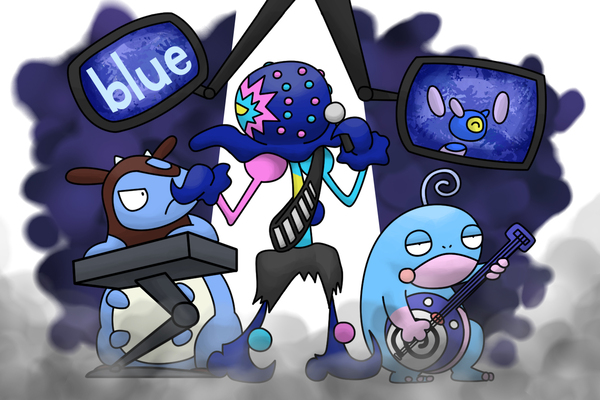
Art by Shadowshocker.
Introduction
Any shiny Pokémon you can get your hands on is definitely something you'd like to treasure forever. However, from time to time, you may get a shiny Pokémon that's not so... aesthetically pleasing. We've already covered pink, green, and red shiny Pokémon in the past, so for this edition, we'll be looking at a few of the best and worst of blue shiny Pokémon. Keep in mind, as always, that these are merely our own opinions, so don't get all blue if we call your favorite shiny Pokémon ugly.
The Best

Galarian Articuno
By Astra
It's understandable if you call this recoloring pretty lazy, but is that even important at all if it works? Galarian Articuno's shiny form is an obvious callback to its Kantonian color scheme, and I'm pretty sold on the fact that it rocks these icy blues a lot better, even. What really makes this shiny form great, in my opinion, is how nicely the accent snow white gives it a very chilling and majestic feeling that Kantonian Articuno sort of lacks. Perhaps Galarian Articuno's shiny form proves that plagiarism can be a good thing sometimes (though I won't be responsible if you take that seriously and your academic future gets ruined because of it).
Gigalith
By deetah
Gigalith's shiny form is a great example of a design that looks even better than its original palette. Most Rock-type Pokémon are given dull and plain colors, but luckily Gigalith's shiny form provides a nice alternative. The bright turquoise in place of the red really emphasizes that those are crystals, not just some sharp red stones, jutting out of its body. This in turn makes Gigalith even more striking and eye catching. Imagine mining in a cave and stumbling upon one of these glittering Gigalith—what a sight to behold!

Emboar
By Astra
I honestly can't think of any Pokémon whose regular form utilizes a blue fire design motif, but Emboar's shiny form definitely is evidence that it should happen someday. The shades of blue chosen alongside hints of purple work incredibly well together in its design. While it could be better if Emboar's upper body wasn't the same orange color as its regular form, it honestly doesn't detract from its shiny form at all. It truly is very unique, especially for a Fire-type, which often sticks with colors on the warmer side of the spectrum.

Suicune
By deetah
The majestic and elegant Suicune sees changes to its mane in its shiny form, now sporting a beautiful royal blue. While a simple change, the royal blue pairs with the light blue of its body amazingly. According to Bulbapedia, Suicune's mane closely resembles the aurora borealis, which makes a lot of sense considering that Suicune is the Aurora Pokémon. I've always wanted to see the aurora borealis in real life; I can only imagine how beautiful it is, just like Suicune's shiny palette.

Blacephalon
By Astra
An interesting and weird shade of blue for an interesting and weird Pokémon, Blacephalon's shiny form is great at capturing the oddity of an Ultra Beast even more than its regular form. While this sort of neon dark blue is usually shunned for being relatively in-your-face, I feel that it's a perfect match for a Pokémon that's already pretty in-your-face design-wise. There's already so much going on with Blacephalon, so why not add to the craziness? I'm glad to see that, as a whole, the Ultra Beasts got treated quite nicely when it comes to their shiny forms. Well, all of them except for Buzzwole. My points on it from long ago still stand.
Honorable Mentions


Braviary: While the change from red wings to blue wings is a pretty simple one, Braviary pulls it off really well. I'm convinced it could pull off multiple different wing colors! Braviary reminds me of the mascot of a sports team, sporting their respective team colors. However, I do wish that Game Freak had made a more noticeable change to the color of its body or even its beak and talons.
Necrozma: Although Necrozma's shiny form is a pretty simple color swap, the blue chosen for it fits well with its design. I'm glad they chose a color that wouldn't detract from its crystalline likeness; the dark sapphire makes it quite the gem of a shiny. However, Game Freak for sure could've chosen something brighter to capture the feeling of a shimmering crystal, but I suppose that would go against Necrozma's lore.
Porygon-Z: White and blue suit Porygon-Z very nicely, adding on to its virtual design. That said, I do think that Porygon-Z could pull off many different colors and still look great while retaining its original design concept. Personally, though, I would've loved to see Porygon-Z sporting a different array of bright and vivid colors for its shiny form, given that it is known to be highly erratic and twitchy.
The Worst

Regice
By deetah
If you've read our past editions, you'd know by now that I really dislike shiny forms that have barely any deviation in color from their original palettes. Regice is no different. Okay, I get that it's literally encased in ice, but that doesn't mean that its shiny form has to have barely any noticeable differences! There are many colors Regice could sport that would look really cool, especially with the glint of its icy body. The entire Regi family has some pretty questionable shiny palettes, but Regice's is by far the least inspiring.

Miltank
By Astra
As we've seen from previous articles, a good majority of older generation shiny forms are cursed with a very ugly and unfitting color scheme for their designs, and Miltank's shiny form happens to be a good example of that. Simply put, the blue chosen just doesn't look good at all; in fact, I highly doubt that any shade of blue would make it look even slightly visually appealing. Changing the darker parts of its regular form's design to a very dark maroon also clashes horribly with the blue and makes it even worse. Would you drink milk from a blue cow? I didn't think so.

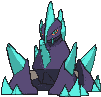
Cobalion
By deetah
If you read the past article on pink shiny Pokémon, you may remember that Astra ranked the watermelon-colored shiny Virizion quite highly! Unfortunately for Cobalion, its shiny is definitely the ugliest of the Swords of Justice trio. Its body has been given a royal blue tint, which would normally be fine, until you see that it's been paired with... lime green horns?? Wait a minute, lime green?! Why, just why, Game Freak? Both of these colors are fine on their own, but together they make for an atrocious combination. Cobalion's design also doesn't seem fitting for bright colors. I wouldn't be surprised if a new leader was elected for the Swords of Justice trio after this abomination.
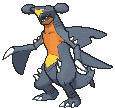
Garchomp
By Astra
Come on now, if we're going to be talking about the worst of blue shiny Pokémon, we certainly couldn't have excluded shiny Garchomp from this list. It's really disappointing and heartbreaking to see such a beloved Pokémon get shafted like this with its shiny form. The irony of a shiny form's color scheme being duller than that of its regular form is comical. It's also pretty hilarious that you really have to squint or look at both forms side by side in order to catch the differences between the two; in fact, the sprite this article uses is actually Garchomp's regular form! Nah, I'm just kidding, but you definitely double checked.

Politoed
By deetah
In place of the original palette's green and yellow, Politoed now looks more like cotton candy than anything else with this pink and blue design. Normally, that wouldn't necessarily be a bad thing, but it just ends up looking really unnatural. I personally would've loved to see Game Freak make Politoed's shiny form into that of a poison dart frog, with a little bit of black and the rest of its body being a really bright vivid red, for example. Even pink and black to mimic one of the poison dart frogs would've looked insanely cool! As it stands currently, though, cotton candy Politoed is a no-go from me.
Dishonorable Mentions


Carracosta: For a Pokémon with a really cool design, Carracosta's shiny form is pretty lackluster. Unfortunately, it appears that it fell victim to the "lower the brightness a little bit" method of designing shiny Pokémon, leaving it rather uninteresting. Regardless, I would still think it's safe to flaunt without getting embarrassed due to its design fitting the color scheme decently well.
Simipour: If you read our article that featured red shiny Pokémon, you'd know that I alluded to Simipour's shiny. Just like its siblings Simisear and Simisage, Simipour suffers from the same terrible fate of having a bland and boring shiny that barely deviates from its normal palette. Sure Simipour's shiny has a slightly darker shade of blue, but that just isn't going to cut it! The only reason Simipour isn't in the "worst" section is because I found three blue shinies that were slightly worse than it.
Alolan Persian: I'm going to be fully honest and say that I just completely hate Alolan Persian. I hate its stupid big oval head and its stupid smirk slapped on it. There's quite literally nothing that would've convinced me to give it even a tiny bit of my love, so I'm glad its shiny form used a shade of blue I wasn't really fond of in the first place.
Conclusion
There you have it, the best and worst of blue shiny Pokémon! Blue as a color tends to represent the emotion of sadness, and I definitely felt sad looking at some of these blue shinies, like Regice and Miltank. Thankfully, we were blessed with some great ones, like Galarian Articuno and Suicune. We hope you enjoyed reading this article, and we'll see you next time!
| « Previous Article | Next Article » |