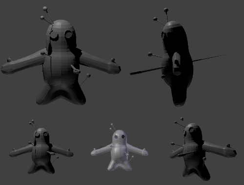
So, I feel horrible for being quiet this long.
As you guys may be aware, I take an inhuman level of pride in making things really really well, or just shy of perfect. I got to sit down after a while and re-evaluate my plan to make Pyroak available for animation ASAP, and decided to start making the best bare-minimum model I can.
The rig is going swimmingly when I have time to polish it. I was playing with using some nDynamics to make a button that controls the movement of his skirt, but other than that he's just missing some buttons to control the arms and clean rig weights.
So far, I think Charmeleon, Rhyperior and Magmortar are the best references for an Idle animation. Thoughts/concerns?
QxC4eva please mail me your Tomohawk model and I will drop everything to sing its praises after an inspection.
noobiess The overall problem is that you lack geometry where you need it most and you've put too much where you need less. You should re-examine the torso and resize the legs, then edit the geometry to give it more of a "bean-bag/plushie" look. I would also recommend just doing some test renders and moving the needles around so you get them at the best angles from that mid-distance (not really near or far) 3/4 view that we'll see in the final gif. For the main needle going through his heart, maybe place a temporary object on the space where you think his heart will be on the texture and move the needle accordingly.
You also need to give the arms just as much geometry as the legs have. Really focus on the shoulder/pit and how that area blends from the main body into the upper arm. You also want to make sure, if we're going to give him fists instead of open palms, that the hands have the available geometry to ball up. Practice just moving the vertices on the hand and contorting them into a fist, and add more divisions when it starts to crash on itself.
The trouble with Voodoom is capturing that raggedy doll-like look, and in the industry it takes a lot of money to make something look really cheap. Good first pass, just keep at it.
EDIT-
QxC4eva I'm kind of afraid to touch Tomohawk at this point, mostly because of the work you've put into the texture map so far, but I only have a few optional nitpicks:
1. The tufts sticking out on his chest are a fabulous addition, I'd love to play around and create a few different versions of that, maybe one where they're a bit bigger, or there are only two tuft/spikes on each side, or maybe another version where he has a tuft in or near the middle of his chest rather than near the sides.
2. The hunchback also looks amazing, I think an extra (but again, unnecessary) bonus would be if it had geometry that helped it blend around the neck with the fur that comes up around his neck and onto the shoulders. They can still remain as separate patches of fur/down, but I think just having a little something that reaches toward the front and turns it more into a poncho of sorts would give it more cohesion.
3. Maybe it's just me, but I think the mohawk looks a little squashed. I bet it makes sense with a full render, but it doesn't look all that dramatic as a .obj
But the tail feathers look good and easy to position, the hands being detached from the wing is a smart move, and I wouldn't reposition the legs on him like we did with Pyroak. I really like your Tomohawk overall.


