Showdown Glassmorphism
By: FireFern
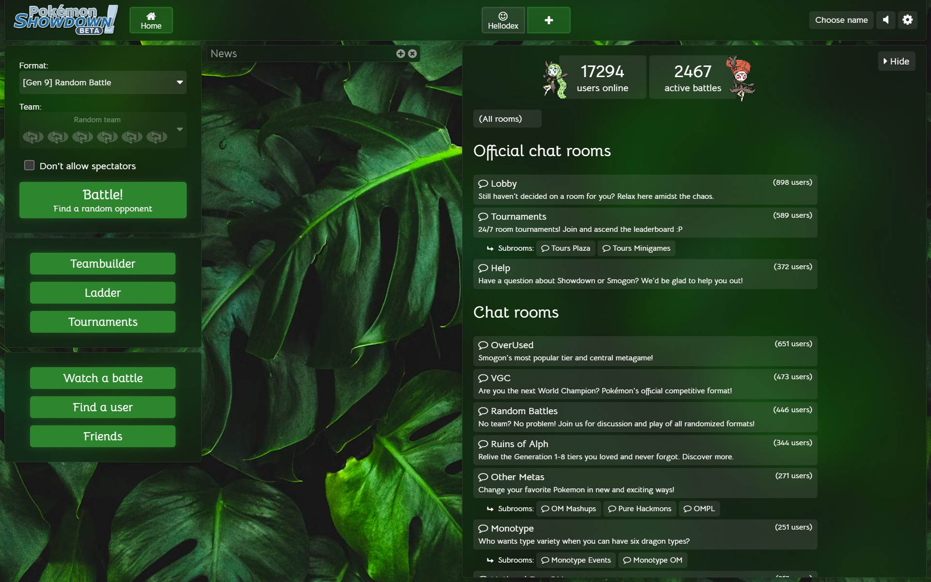
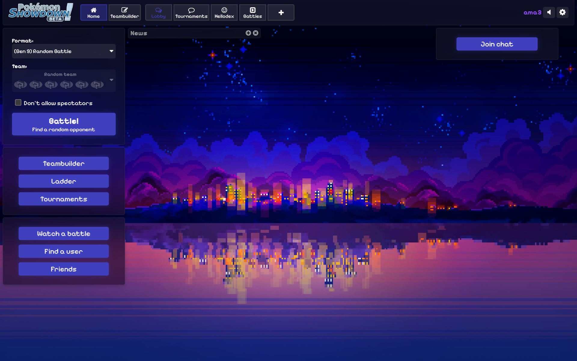
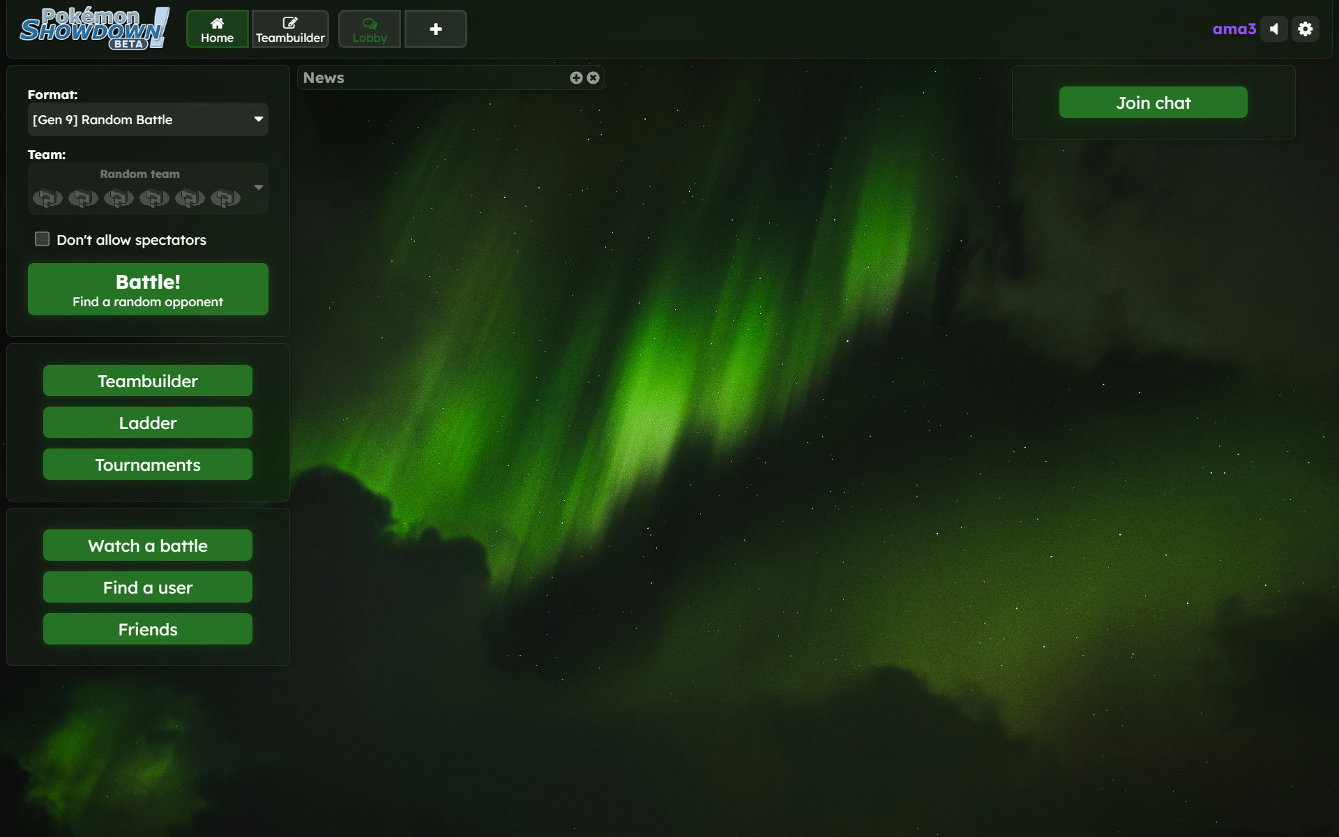
Tired of Showdown's boring look? Want something that can really spice up Showdown's appearance? Want something that can also change to perfectly match whatever wallpaper you set so you'll never get bored? Look no further, cuz this is what you've been waiting for! Gaze at the beautiful glassy room background and Material-You-style elements, enjoy the animations and glowing buttons, and customize colors, fonts, and more with this CSS style!
How To Use
All you need is the Stylus extension and to click a button on some website!
Also, you can basically follow these same steps to get the style on mobile (with Kiwi Browser or Firefox), though I would reccomend using Stylus's "Sync to cloud" feature to do that instead of copying and pasting it.
Notable Features List
After clicking the gear icon, you should be able to modify various things about the style. I'll explain the less self-explanatory ones.
Table Of Contents
This should be useful for anyone who wants to navigate through the code to find things and possibly edit them.
Links
(help me fill this out people)
By: FireFern
Tired of Showdown's boring look? Want something that can really spice up Showdown's appearance? Want something that can also change to perfectly match whatever wallpaper you set so you'll never get bored? Look no further, cuz this is what you've been waiting for! Gaze at the beautiful glassy room background and Material-You-style elements, enjoy the animations and glowing buttons, and customize colors, fonts, and more with this CSS style!
Change colors and fonts! This thing also works with Showdex to make its colors match up!
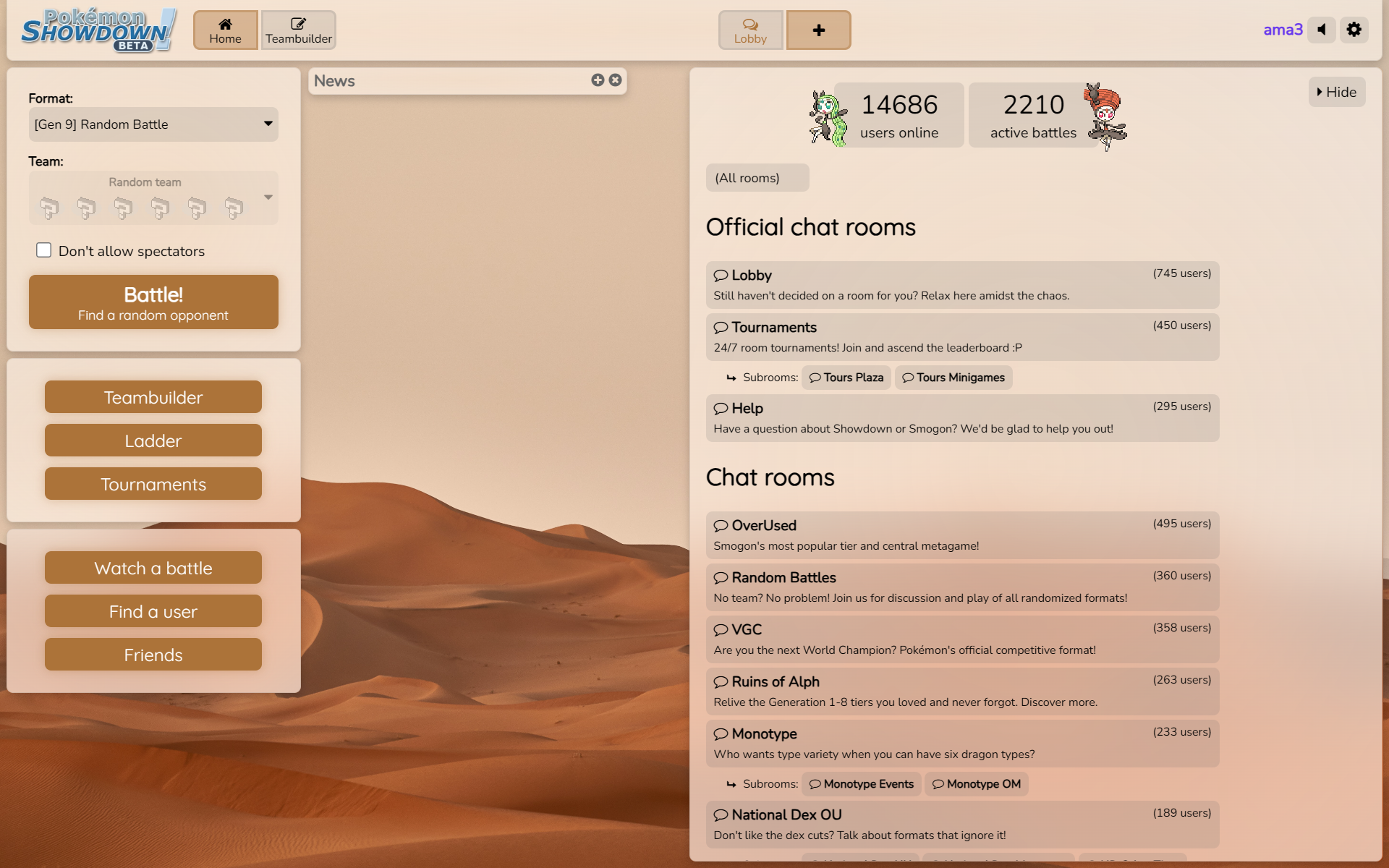
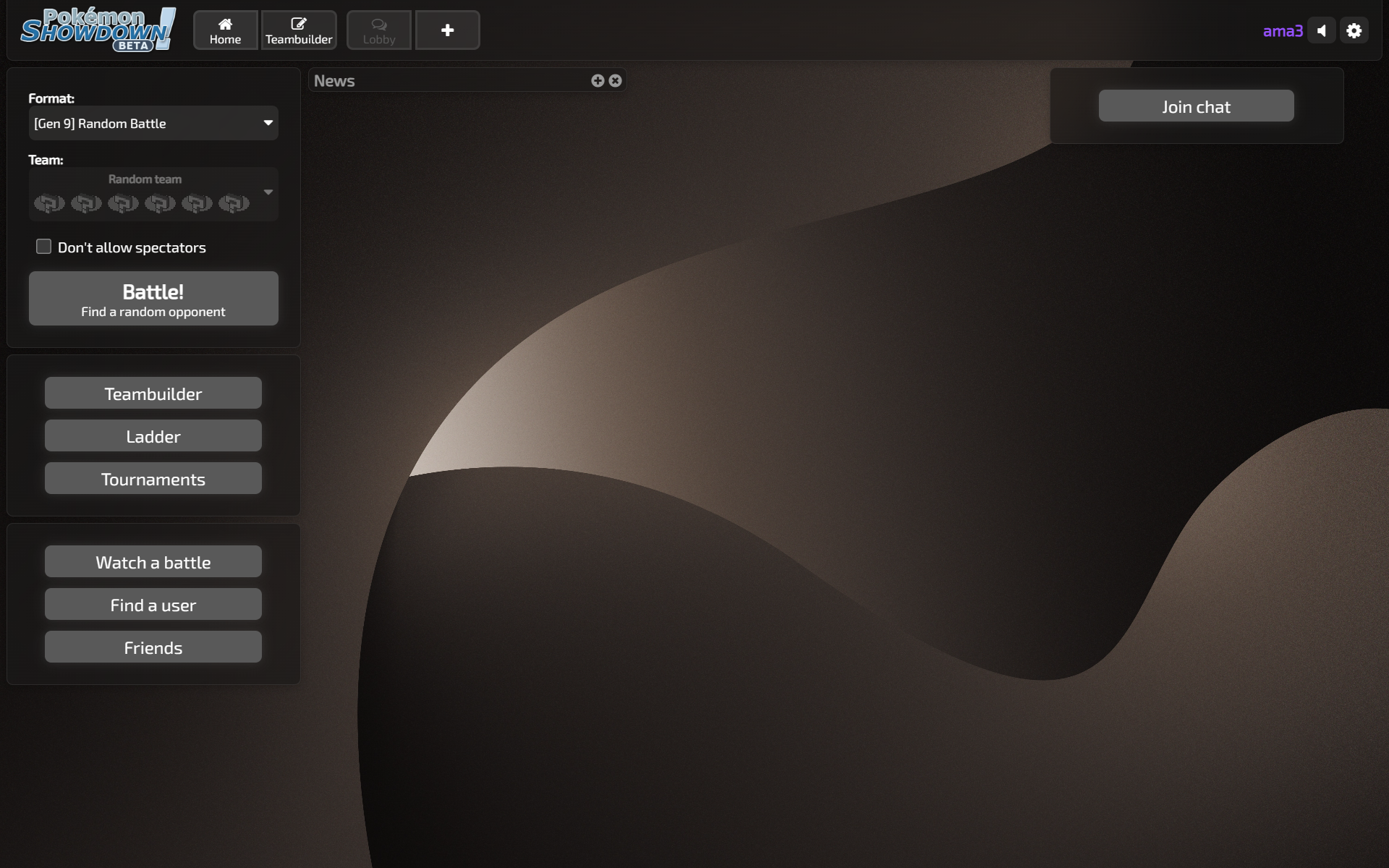
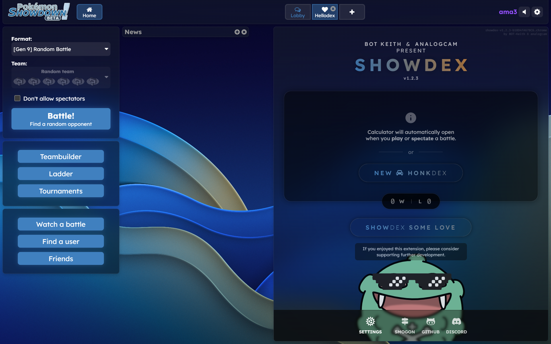
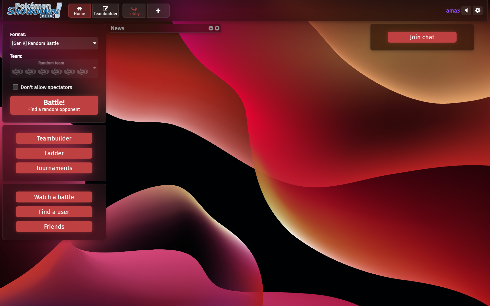

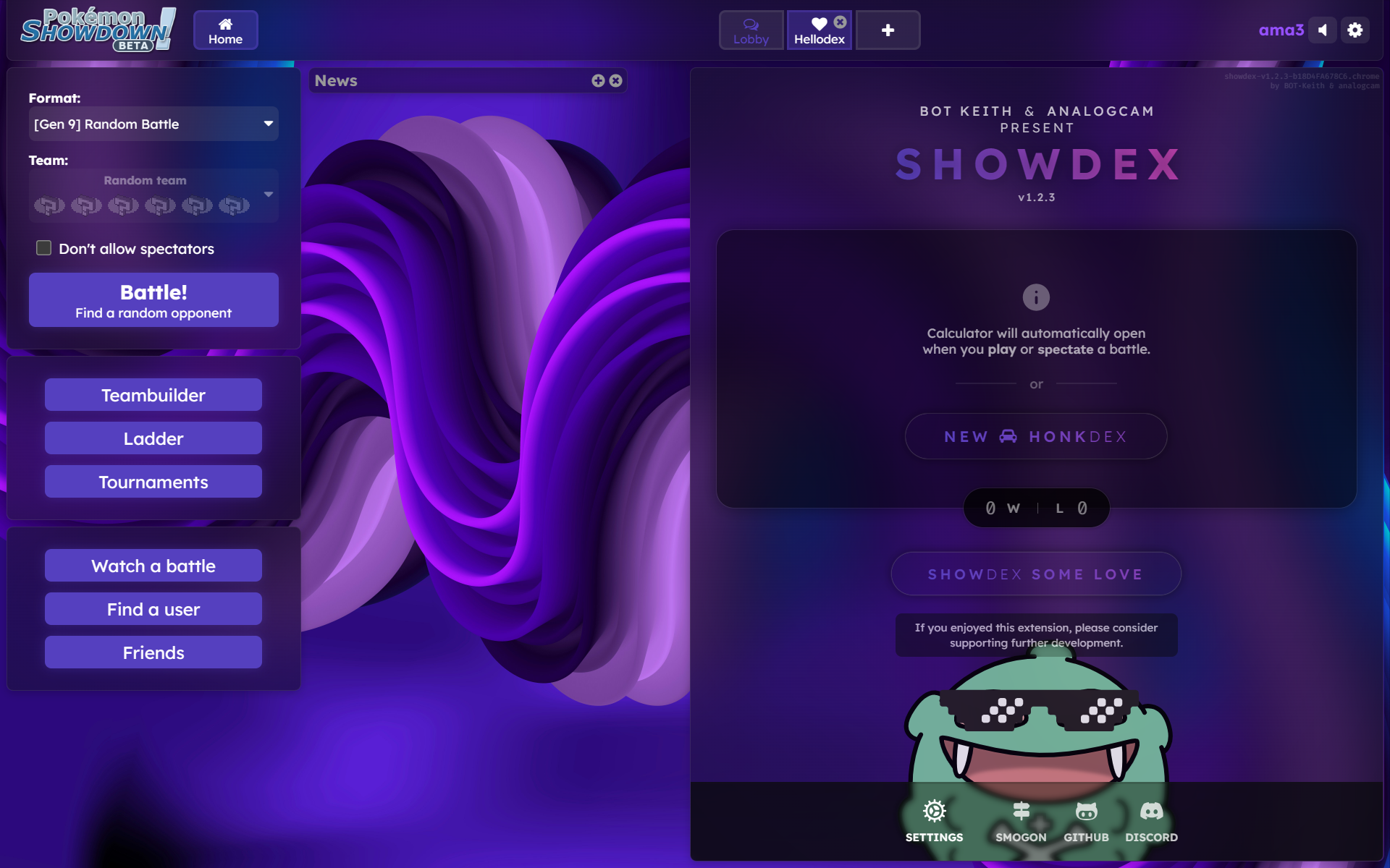
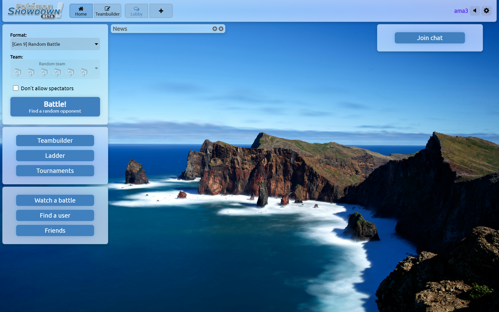
Different battle layout and backgrounds! Also works with Showdown Randbats Tooltip extension! And animated weathers and terrains!


Chatrooms too!

Teambuilder is styled too!


Thicker glass for bright wallpapers!


Blur the main background too!

And you don't need the room blur!


Different battle layout and backgrounds! Also works with Showdown Randbats Tooltip extension! And animated weathers and terrains!
Chatrooms too!
Teambuilder is styled too!
Thicker glass for bright wallpapers!
Blur the main background too!
And you don't need the room blur!
How To Use
All you need is the Stylus extension and to click a button on some website!
- So first, make sure that you download the Stylus extension (Chrome, Firefox).
- Go to this link and click the install button.
- Now you should be good to go!
Also, you can basically follow these same steps to get the style on mobile (with Kiwi Browser or Firefox), though I would reccomend using Stylus's "Sync to cloud" feature to do that instead of copying and pasting it.
Notable Features List
- Change hue, saturation, and lightness of accent colors.
- Works in both light mode and dark mode.
- Lots of fonts to choose from, including a two monospace ones and a pixelated one, and one font for headers and one for body text.
- Customize various things like border-radius, margin, tooltip and popup animations, and more.
- Animated weathers and terrains.
- Different battle backgrounds.
- Fade in animations for rooms.
- Cleaner look (not as many borders and shadows) Also, tab close buttons are hidden until you hover over them.
- Popups and tooltips have animations when they appear.
- Overlays and loading screens have blurs.
- Pixelated image rendering for sprites and battle backgrounds to make them look sharper (optional).
After clicking the gear icon, you should be able to modify various things about the style. I'll explain the less self-explanatory ones.
- The first three options control the hue, saturation, and lightness of the accent color.
- "Room background saturation:" controls how saturated the room backgrounds are (rooms are things like battles and chatrooms). They're all slightly tinted the hue of the accent color, and this controls how tinted they get. Additionally, and importantly, this also controls how saturated the solid, or opaque, colors are. These "solid" colors are in the tournament boxes, user lists, and set charts.
- "Solid background lightness mode:" controls the lightnesss of the aforementioned "solid" colors. Their lightness is calculated by multiplying the accent color's lightness by a factor, and this setting controls what that number is. With this setting, you can make the "solid" background 30% or 50% more or less (more or less for dark and light modes) light. This setting is here because sometimes you might have, for example, a wallpaper where you want a lighter accent color, but with the "solid" background being 50% lighter than the accent color, it becomes pure white (whch doesn't look very good), so you instead make the "solid" background only 30% lighter than the accent color (to make it look better). Vice versa for dark accent colors.
- "Solid background shadow:" controls the strength of the shadow that appears under things with the solid background. These things include userlists, set charts, and tournament boxes.
- "Accent 2's hue is accent 1's plus:" controls the hue of the other accent color. This color is less common, and is present in revealed chat messages (hidden messages that are revealed), error messages, the gradients in Showdex's "Hellodex" page, and a small portion of buttons.
- "Room background style:" controls the style of the room backgrounds. Through this, you can make their backgrouds not blurry (just translucent or opaque), which can help with performance. This also affects turn markers, battle message bars, tooltips, and popups.
- "Border radius (px):" controls the border radius of a ton of different things. The border radius is how rounded the corners are. A higher value makes it more rounded.
- "Room margin (px):" controls how far apart the rooms and tab bar are from each other. It also affects how far battles, userlists, and tournament boxes are from the edges.
- "Popup animation:" and "Tooltip animation:" control the animations of the popups and tooltips when they appear. Popups are the things that popup over other things, like the settings. Tooltips are the things that appear when you hover over Pokemon in battles. The reason why these settings are separate is that for tooltips, there's kind of a weird behavior where the animation will play again when you hover over different parts of the buttons in the battle controls. I don't think I can fix this.
- "Scrollbar style:" controls the style of the scrollbar. "Minimal" makes it a thin line. "Browser With Accent Colors" just uses the browser ones, with with a transparent track and with the accent color for the thumb. This is recommended for people using Firefox or the "Fluent Overlay scrollbars" flags in other browsers, as they give overlay scrollbars (which display over an element's content instead of making the element wider), and this can make the site look really clean.
- "Sharper images:" makes it so that images in the battles (sprites, backgrounds, etc.) and other places (Meloettas, teambuilder sprites, etc.) have pixelated image-rendering. They now look pixelated (and sharper).
- "Battle background overlay" makes it so there is an overlay that goes over the battle background. The darker parts can be at the top or around. The "Radial Shadow (Saturated)" option makes darker parts around the edges, and has those parts be the color of the "solid" background to make it blend in more with the surrounding room background a little.
Table Of Contents
This should be useful for anyone who wants to navigate through the code to find things and possibly edit them.
- VARIABLES
- MISCELLANEOUS STUFF
- FONT
- SCROLLBARS
- TEXT SELECTIONS
- OVERLAYS
- SLIDERS
- CHECKBOXES
- DIVIDERS
- :ACTIVE SCALING ANIMATIONS
- ROOM FADE-IN ANIMATIONS
- ROOM WIDTH ANIMATIONS
- SHOWDEX STUFF
- MOST CLICKABLE ELEMENTS
- UNSTYLED BUTTONS
- MOST BUTTONS & DROP-DOWN MENUS
- TAB BUTTONS
- MAIN MENU BUTTONS
- TEXTBOXES
- TEAM SELECTORS & FORMAT SELECTORS
- BLOCKLINKS
- MOST LINKS
- SUBTLE LINKS
- OPTIONS
- TOP/TAB BAR
- GENERAL APPEARANCE & POSITIONS
- HOME SCREEN
- GENERAL APPEARANCE
- POSITIONS
- NEWS & PM BOX
- MOST ROOMS
- GENERAL APPEARANCE & SPACING
- MISCELLANEOUS
- CHAT ROOMS
- BATTLE CHAT
- CHAT ELEMENTS
- USERLISTS
- TOURNAMENTS
- POPUPS
- GENERAL APPEARANCE
- FORMAT-SELECTING POPUP
- MISCELLANEOUS
- TEAMBUILDER
- SIDEBAR
- SET CHARTS
- UTILICHART
- MISCELLANEOUS
- BATTLEFIELD
- GENERAL APPEARANCE
- BIGGER BATTLE SPACE & TRAINER POSITIONS
- TURN MARKER
- BACKDROP
- WEATHERS & TERRAINS
- HP BARS
- MESSAGE BAR
- RESULTS
- TOOLTIPS
- MISCELLANEOUS
- TEXT & SPRITE THINGS
- BATTLE CONTROLS
- POSITIONS
- MOVE BUTTONS
- SWITCH BUTTONS
- Z-MOVE/TERA/MEGA BUTTON
- OTHER BUTTONS
- MISCELLANEOUS
- Wallpapers used above:
- The links to them are linked in the images (click on them).
- Weather and terrain sources:
- Sand, Desolate Land, Primordial Sea are from this style.
- Terrains, trick room, wonder room, and gravity are from this style (I asked the guy on his Discord server).
- Snow, rain, sun from here.
- Delta Stream from here.
- Battle background sources:
- Unsplash collection of wallpapers I like, if you enjoy my taste in wallpapers.
- Some old style I made. Colors aren't right anymore, but it's there if you're curious. I might fix it up if there' demand.
- Dragging chatrooms to the other side doesn't work. I might come up with something to fix it, but probably not.
- Right-clicking on Showdex's "Hellodex" page with a glassy room background style makes the right-click menu appear way further to the right than it's supposed to. It also makes the settings page scroll more than it should. IDK how to fix this.
- Random weird shadowy lines running horizontally or vertically may appear. I don't know how to fix them. However, in my experience, Edge has less of them, if any.
- I can't make the colors automatically change with the wallpaper.
- There might be browser compatibility issues, probably. Tell me if something's not working.
(help me fill this out people)
- Text size style setting (one for general, one for battles)
- Option to have scale down the size of opposing Pokemon in battles (cuz they're farther away).
Last edited:


