
-
Follow our Instagram!
-
The moderators of this forum can be found in the CAP forum staff directory.
-
Welcome to Smogon! Take a moment to read the Introduction to Smogon for a run-down on everything Smogon, and make sure you take some time to read the global rules.
You are using an out of date browser. It may not display this or other websites correctly.
You should upgrade or use an alternative browser.
You should upgrade or use an alternative browser.
CAP 8 CAP 8 - Art Submissions
- Thread starter CyzirVisheen
- Start date
- Status
- Not open for further replies.


@KOA: That blue doesn't really work, maybe a different shade would work better. Also, I think the eyebrows should be yellow.
@Doomsday: Still looks too much like a hippo, electric guitars come in some pretty weird shapes, I think you could get away with a narrower snout.
@Doomsday: Still looks too much like a hippo, electric guitars come in some pretty weird shapes, I think you could get away with a narrower snout.


Uuh I havn't had much time to be on here or draw, but thanks to everyone who commented!

I felt i had to post a front view, i changed him a bit again too, and did it in a cleaner style (which i dont like doing). I'm not sure if i prefer this to my other version, but what do you guys think?
Also im not that happy with how it came out but i dont have anymore time to modify it more.
I felt i had to post a front view, i changed him a bit again too, and did it in a cleaner style (which i dont like doing). I'm not sure if i prefer this to my other version, but what do you guys think?
Also im not that happy with how it came out but i dont have anymore time to modify it more.

@Cyzir: I back your Hydra, especially with multiple heads. It's the most innovative of all your designs as well, IMO.
And for the people backing his raptor... sad face.
I'd like some feedback on my bulkyraptor.
And for the people backing his raptor... sad face.
I'd like some feedback on my bulkyraptor.

@ Cartoon: I think that's clearly the best one. The Omega (a symbol from electric circuit math for those who don't know) on the head along with where this pokemon is heading (slightly defensive) makes yours fit perfectly.
@InHell: Your redesign is awesome! I expecially like the cloud on the back.

Aw, my design isn't on the compilation either. Sadness. Oh well.

The current state. Played with the markings a little; dunno if it's an improvement upon prior uploads. Need to figure what to do about his haunches. And I really want to be able to know that my design is solid; I wanna get as early a start on the shading as I may.

And, mostly for kicks, I drew a rough prevo. Unless people are largely of the opinion that this design is actually better for the CAP than the big guy, I mainly drew this for fun and to prove to myself that I can draw relatively cute and cartoony proportions.
The current state. Played with the markings a little; dunno if it's an improvement upon prior uploads. Need to figure what to do about his haunches. And I really want to be able to know that my design is solid; I wanna get as early a start on the shading as I may.
And, mostly for kicks, I drew a rough prevo. Unless people are largely of the opinion that this design is actually better for the CAP than the big guy, I mainly drew this for fun and to prove to myself that I can draw relatively cute and cartoony proportions.


Thats extremely awesome Buffalo. I seriously cant understand why people doesnt seem to "find it".
That got my vote no matter what.
That got my vote no matter what.


Uuh I havn't had much time to be on here or draw, but thanks to everyone who commented!
*:[*
I felt i had to post a front view, i changed him a bit again too, and did it in a cleaner style (which i dont like doing). I'm not sure if i prefer this to my other version, but what do you guys think?
Also im not that happy with how it came out but i dont have anymore time to modify it more.
The other one is definitely better, the style, the art itself, everything.
I love your design BTW (Looks like it'd rip apart anything that walked in front of it ._.)

Fuzznip: maybe move the metal thing more centered so they look more like butterfly wings attached at the front.
Buffalo Wings: I prefer the older design, but both are freaking epic. You probably got my vote =D
Thought the cute pink dragon is pretty awesome.
Buffalo Wings: I prefer the older design, but both are freaking epic. You probably got my vote =D
Thought the cute pink dragon is pretty awesome.

TheMutant: I like your design very much, especially the Prevo. However, you should try to make it more "slightly defensive", as that has become the style bias. Also consider how difficult your design would be to sprite!
The markings and patterns I think are fine, and I think that once you start shading it, more people will catch on.
Buffalo Wings: I absolutely love the color palette you've chosen! Just maske it less Fighting-type in the arms, and you're one of my tops. There's not much else I can say except its perfect. =]
Fuzznip: I see where you're trying to get at, with the electron scheme, but a less-than-microscopic Dragon sounds a little frail to me. Also, open its eyes! Make them red with the positive or negative symbol in them... or something. =/
Fuzznip: maybe move the metal thing more centered so they look more like butterfly wings attached at the front.
They're not supposed to be butterfly wings that attach on to it, they're rings that circle around it giving it a somewhat of a protective shield. You know how electrons orbit on a "ring", that's what they are. xD


Ohm-mon ftw! Please continue with this, I like it a lot.


Daisuke
So, I don't have photoshop }: or any other digital edit material, so all my submissions will be pencil (actually pen) and paper.
After a revision I came up with this:
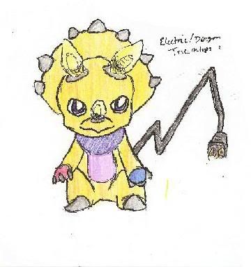
It's basically a triceratops with lightbulb horns. It has a eletrical cord tail, and it's hand/paws are blue and red respectively, to reflect magnetism.
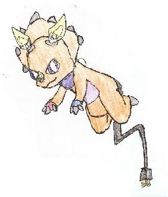
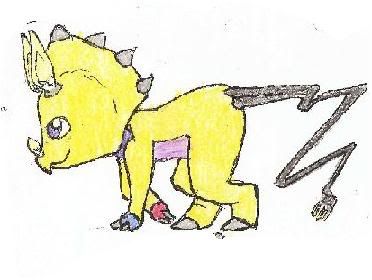
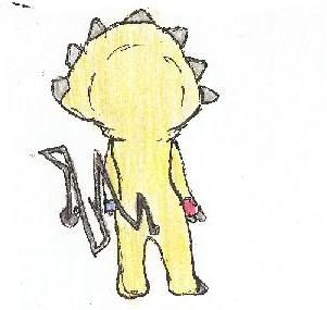
I also did a few other poses, and I colored those differently, so I can see what colors are best. I used the yellow/purple color scheme, except on the one, where I used orange.
Thoughts?
EDIT: Hmm, I can't get the spolier tags to work D:
So, I don't have photoshop }: or any other digital edit material, so all my submissions will be pencil (actually pen) and paper.
After a revision I came up with this:
It's basically a triceratops with lightbulb horns. It has a eletrical cord tail, and it's hand/paws are blue and red respectively, to reflect magnetism.
I also did a few other poses, and I colored those differently, so I can see what colors are best. I used the yellow/purple color scheme, except on the one, where I used orange.
Thoughts?
Code:
Originally, I came up with this:
[spoiler][IMG]http://i113.photobucket.com/albums/n223/aisuke/CAP8version1pose1.jpg[/IMG]
[IMG]http://i113.photobucket.com/albums/n223/aisuke/CAP8version1pose2.jpg[/IMG][/spoiler]
But it didn't turn out right at all, since I didn't use a reference. Really, you can't tell, wtf it is XDOrange one looks best to me, it's a really nice design actually =/
TheMutant: I like your design very much, especially the Prevo. However, you should try to make it more "slightly defensive", as that has become the style bias. Also consider how difficult your design would be to sprite!
The markings and patterns I think are fine, and I think that once you start shading it, more people will catch on.
Hah! The difficulty of spriting has become a concern of mine, but those few who comment inevitably have been choosing the more complex variations that I've worked up, ever since my two initial concepts. S'a bit of a dillema (and ironically, the markings you so approve are my biggest concern on that front; since they're not particulary big, I'm sure they'd be mere distracting dots on a sprite). As for the defensiveness... I'll have to see. The 'fat dragon' ground has been pretty well covered by designers far better than I already, and I think this fellow looks fairly sturdy since he got hind legs, but I'll keep it in mind as I continue. Maybe I'll bulk up the wing somewhat, make it more shieldlike... I really appreciate your critique.
On a more general note, I have a query in general- could any CAPers more experienced than I clarify the 'No props, action effects, move effects' rule a bit? I've seen a fair handful of WIPS here with electricity effects outside the main body of the 'mon or the like, and I confess I'm not sure where the line is drawn. Is it safe to include some sort of lightning effect on, say, my fellow's wing, for example?

I think CAP is really awesome and I decided that when the next cycle came around I would try my hand at the art part. I finished my thing pretty fast and at first it was this super badass cliche chinese myth dragon. So I went on smogon a few days ago and I was like :o whoaaa looking at these submissions. They seriously dwarfed mine in creativity. I felt ashamed to post something so easily thought of when people were coming up with super unique concepts here. So I didn't.
I still want to participate in some way, so I'll just post my little doodle that I made when I saw the 'cute' direction that the thread was initially taking. It's not really creative or electric, but I thought my idea was kind of funny. It's kind of based off of an image on google of a dog dressed in a dragon costume. The dog's head shows through the dragon costume's mouth, so the mouth is like this giant gaping maw. And it's all cute and stubby, because it's a dog.. So I put those things in my drawing. It also his little 'sleeves' on its legs, kind of like the dog costume.

I imagine that if this were a real pokemon, it would be the evolved form of Manectric once you attached 'Halloween Dragon Costume' and leveled it up.. Haha.
I still want to participate in some way, so I'll just post my little doodle that I made when I saw the 'cute' direction that the thread was initially taking. It's not really creative or electric, but I thought my idea was kind of funny. It's kind of based off of an image on google of a dog dressed in a dragon costume. The dog's head shows through the dragon costume's mouth, so the mouth is like this giant gaping maw. And it's all cute and stubby, because it's a dog.. So I put those things in my drawing. It also his little 'sleeves' on its legs, kind of like the dog costume.
I imagine that if this were a real pokemon, it would be the evolved form of Manectric once you attached 'Halloween Dragon Costume' and leveled it up.. Haha.
If mine doesn't win, you have my full support FFS :l


And here we go. I called it Rayogon (Rayo(Lightning in spanish), and the gon for draGON.) Its head is supposed to resemble an outlet and the tail, a lightbulb. I think its a bit too small to fall into being a bulky type, what do you guys think?Code:[IMG]http://img.photobucket.com/albums/v74/Nyaunyau/rayogonstand.jpg[/IMG]
It makes me think of Garchomp. ALOT :S


And here we go. I called it Rayogon (Rayo(Lightning in spanish), and the gon for draGON.) Its head is supposed to resemble an outlet and the tail, a lightbulb. I think its a bit too small to fall into being a bulky type, what do you guys think?
Replace the slots with corresponding horns and I think it would look better.
- Status
- Not open for further replies.