Smeargle's Studio Update
| « Previous Article | Home | Next Article » |
Introduction
We're slowly making our way through November and as the Halloween spirit gets left behind, it's time to look back and revisit the period when artists around the forum were busy drawing and voting for the now-renewed Monthly Art Contest, or MAC for short. It's been a while since we've been able to enjoy the MAC as well as the Studio Update, but in between that silence, our lovely art forum has a lot of talented new artists as well as some exciting new happenings besides the MAC that are definitely worth mentioning. I'll be talking about the "revealing" of the Studio's Hub (even though it has been collecting dust in a forgotten corner for quite a while) and an exciting tutorial mainly focused at mouse-only users, and, of course, I'll be placing our most recently badged artist under the spotlight to showcase their talent. Naturally, you'll be seeing the usual review of the MAC as well, with two fellow artists joining me to share their impressions of the winning entries.
MAC Review
Ah, the MAC. A question that quickly comes to mind when trying to bring a long-standing tradition such as this one back to the table is: how exactly do you decide on the theme that will represent a new beginning for the contest while also keeping in mind the various people that worked hard on the project over the ages? In the spirit of offering a new beginning, we've decided to look back at the very first MAC and acknowledge the old times by reusing the toxic mascot theme along with a small twist. As such, our fellow artists were presented with a very simple, straightforward task: to draw either a Koffing or a Weezing, or both, in all its shiny form's glory. This challenge certainly wasn't one of those that required a lot of thinking regarding what should be in your submission, but rather how you think it is best to present the qualities and characteristics of our dear mascot. The contest received a good number of entries, and—you guessed it—the community voted for the winner afterwards. It narrowed down to a very close race between first and second place, with a good bunch of votes separating the two from the other entries. In the end, it came down to Bummer taking the win next to icepick with his well-deserved second place, and let's not forget SailorCosmos (Joeshome) snatching third place from the others by a mere 1 vote difference.
1st place - Bummer
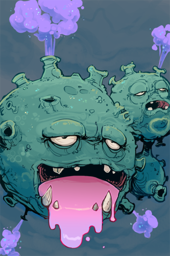

Tikitik
We're all aware of Bummer's unique style at this point—it's very attractive and effective and easily grabs your attention. Right from the start, Bummer has shown that he means serious business when it comes to this MAC, as he posed himself as a big competition to others fairly quickly just with his WIPs. People wished bad luck upon him, and others made terrifying threats along with implications that he should be physically eliminated from the contest, but once the votes came flowing in it became clear that it would be a difficult task catching up to this guy, and as the results show, it turned out to be an impossible one. All jokes aside, Bummer has executed everything needed for his entry to be the winning one. He reflected Weezing's depressing personality rather well in addition to showing great detail when it comes to this Pokémon's skin, with each and every wrinkle contributing to the overall atmosphere of the piece. The curvy, rough skin also offered a great contrast to the slime-drooling action going on in its mouth. Along with the sprinkled gas shooting out of its body, those were the details that made Bummer's take on our mascot the winning one.

Bummer
I probably should have made sure to lose this contest before agreeing to judge the final results, but I suppose I can elaborate on some of the choices I've made with this picture. Anyone who has seen the results of the very first MAC would probably have Rocket Grunt's entry etched into their retina, and while I don't measure up to this level, I certainly wanted to make a nod towards his gritty interpretation of this poisonous balloon. I ended up sticking with a more solid lineart, as I liked how its facial details really stood out, such as its wrinkles, pimples, and just everything that makes its skin uneven. In contrast to that, I gave the slime drooling from its mouth a much smoother touch, as I've always figured that the shiny version could have different traits from the original in more than just color, so I hope the gooey texture made it really seem like sludge slowly leaking out. Lastly, I mixed some shiny sprinkles into its smoke and skin just to give it some additional shine for this particular theme.

brightobject
This MAC's winning entry is drawn in a cartoony, exaggerated style, but it retains the high level of detail typical of Bummer's work. The mottled skin, the glittering fumes, the milky depths of its sludge-filled mouth—it all looks very smooth and natural. Some parts of the mouth and the goop could have been rendered a bit better, but that's really just me being nitpicky.Two thumbs up, Bummer; you've really outdone yourself this time.
2nd place - icepick
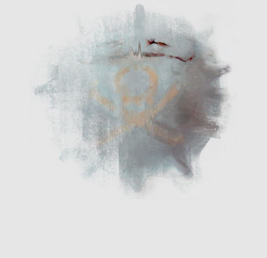
Tikitik
I'm not gonna lie; when I first saw icepick's entry, I was just skimming through the thread, not paying too much attention, and thought it was probably another WIP. Time has passed, and a piece of me still yells that icepick was simply messing with us. On a more serious note, the fact that this piece really makes you think about what's actually going on in the image for a bit is what brought this entry all of its votes. The artist decided to play the creativity card, and having his piece stand out from the rest concept-wise definitely paid off. Anyhow, while it might seem like a last-minute rushed piece at first, not everyone can achieve the atmosphere that icepick offered with his entry, with most of the Koffing's body fading away into the gas with only a well-defined eye and a hint of its vicious grin leaving the viewer stunned.
Bummer
icepick's entry is one of those submissions where you're not entirely sure if he's serious or just trying to screw with us, but one can easily say that his Koffing brought something different to the table. The only thing that's well defined is its closed left eye; the rest of its body is partially lost in a grungy texture of subtle shades and hues. It may be incomplete, but it makes you stop for a moment and give it a closer look. And while it may appear to be some sort of quick speed painting, you still need icepick's honed talents to pull it off right. All in all, icepick's Koffing is unconventional, but the way it fades into our view has won the votes of many, including myself.
brightobject
Renowned Smogon artist icepick has returned from the dead with a captivating minimalist take on Koffing. The muted tones of the painting are given an even more ghostly feel by the amazing brushwork. It's really cool to see people thinking outside the box.
3nd place - SailorCosmos (formerly Joeshome)
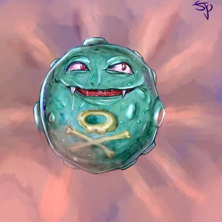
Tikitik
We've seen various approaches to drawing a Koffing among the submissions, such as going for thick, well-defined outlines and even going minimalistic, but the road that SailorCosmos decided to take was to give his Koffing a more realistic feeling, and for the most part, he successfully achieved that. The facial expression would be spot on if it weren't for the rather odd human-like eyes that don't really work with this guy too well. Another thing worth mentioning is that the effect of shooting gas out of Koffing's body could have been executed better, as well as the fact that the artist used blue highlights on Koffing's body, which would be fine if the background's color scheme reflected that, but seeing as the creature is placed in a scenery of red smoke, the viewer could get the feeling that this Koffing had wandered off to a wrong background. Aside from that, SailorCosmos's efforts made for a solid piece overall that rightfully took third place.
Bummer
SailorCosmos chose to take the more realistic route, deploying faint paint strokes and colored lineart to show how a Koffing could look in the 3D realm. That said, there are certain details that prevent his Koffing rendition from going all the way. The two large humanoid eyes can be a bit unsettling on such a bizarre creature as Koffing, and the gas outlets are also rather short, which gives the impression that its surface is too flat for its own good. And despite Koffing being in a primarily red environment, the highlights scattered around its body don't seem to reflect that color, making it seem like the Koffing and the background are unrelated to each other. However, it's no mere fluke that this drawing earned SailorCosmos third place, as he nonetheless put a lot of effort into this piece to give his Koffing a genuine appearance, something the voters in the art poll made sure to acknowledge.
brightobject
The first thing that struck me when I saw SailorCosmos's entry: the texture. Slick and slimy, the almost reptilian skin of this Koffing stood out amongst the drier, more cratered looks of the other entries. It works well with the unsettling face and works really well overall. The background and gas seem a bit underdeveloped, though. Overall, fantastic work!
Recently in Smeargle's Studio
Tikitik
We're all aware of Bummer's unique style at this point—it's very attractive and effective and easily grabs your attention. Right from the start, Bummer has shown that he means serious business when it comes to this MAC, as he posed himself as a big competition to others fairly quickly just with his WIPs. People wished bad luck upon him, and others made terrifying threats along with implications that he should be physically eliminated from the contest, but once the votes came flowing in it became clear that it would be a difficult task catching up to this guy, and as the results show, it turned out to be an impossible one. All jokes aside, Bummer has executed everything needed for his entry to be the winning one. He reflected Weezing's depressing personality rather well in addition to showing great detail when it comes to this Pokémon's skin, with each and every wrinkle contributing to the overall atmosphere of the piece. The curvy, rough skin also offered a great contrast to the slime-drooling action going on in its mouth. Along with the sprinkled gas shooting out of its body, those were the details that made Bummer's take on our mascot the winning one.
Bummer
I probably should have made sure to lose this contest before agreeing to judge the final results, but I suppose I can elaborate on some of the choices I've made with this picture. Anyone who has seen the results of the very first MAC would probably have Rocket Grunt's entry etched into their retina, and while I don't measure up to this level, I certainly wanted to make a nod towards his gritty interpretation of this poisonous balloon. I ended up sticking with a more solid lineart, as I liked how its facial details really stood out, such as its wrinkles, pimples, and just everything that makes its skin uneven. In contrast to that, I gave the slime drooling from its mouth a much smoother touch, as I've always figured that the shiny version could have different traits from the original in more than just color, so I hope the gooey texture made it really seem like sludge slowly leaking out. Lastly, I mixed some shiny sprinkles into its smoke and skin just to give it some additional shine for this particular theme.
brightobject
This MAC's winning entry is drawn in a cartoony, exaggerated style, but it retains the high level of detail typical of Bummer's work. The mottled skin, the glittering fumes, the milky depths of its sludge-filled mouth—it all looks very smooth and natural. Some parts of the mouth and the goop could have been rendered a bit better, but that's really just me being nitpicky.Two thumbs up, Bummer; you've really outdone yourself this time.
Tikitik
I'm not gonna lie; when I first saw icepick's entry, I was just skimming through the thread, not paying too much attention, and thought it was probably another WIP. Time has passed, and a piece of me still yells that icepick was simply messing with us. On a more serious note, the fact that this piece really makes you think about what's actually going on in the image for a bit is what brought this entry all of its votes. The artist decided to play the creativity card, and having his piece stand out from the rest concept-wise definitely paid off. Anyhow, while it might seem like a last-minute rushed piece at first, not everyone can achieve the atmosphere that icepick offered with his entry, with most of the Koffing's body fading away into the gas with only a well-defined eye and a hint of its vicious grin leaving the viewer stunned.
Bummer
icepick's entry is one of those submissions where you're not entirely sure if he's serious or just trying to screw with us, but one can easily say that his Koffing brought something different to the table. The only thing that's well defined is its closed left eye; the rest of its body is partially lost in a grungy texture of subtle shades and hues. It may be incomplete, but it makes you stop for a moment and give it a closer look. And while it may appear to be some sort of quick speed painting, you still need icepick's honed talents to pull it off right. All in all, icepick's Koffing is unconventional, but the way it fades into our view has won the votes of many, including myself.
brightobject
Renowned Smogon artist icepick has returned from the dead with a captivating minimalist take on Koffing. The muted tones of the painting are given an even more ghostly feel by the amazing brushwork. It's really cool to see people thinking outside the box.
Tikitik
We've seen various approaches to drawing a Koffing among the submissions, such as going for thick, well-defined outlines and even going minimalistic, but the road that SailorCosmos decided to take was to give his Koffing a more realistic feeling, and for the most part, he successfully achieved that. The facial expression would be spot on if it weren't for the rather odd human-like eyes that don't really work with this guy too well. Another thing worth mentioning is that the effect of shooting gas out of Koffing's body could have been executed better, as well as the fact that the artist used blue highlights on Koffing's body, which would be fine if the background's color scheme reflected that, but seeing as the creature is placed in a scenery of red smoke, the viewer could get the feeling that this Koffing had wandered off to a wrong background. Aside from that, SailorCosmos's efforts made for a solid piece overall that rightfully took third place.
Bummer
SailorCosmos chose to take the more realistic route, deploying faint paint strokes and colored lineart to show how a Koffing could look in the 3D realm. That said, there are certain details that prevent his Koffing rendition from going all the way. The two large humanoid eyes can be a bit unsettling on such a bizarre creature as Koffing, and the gas outlets are also rather short, which gives the impression that its surface is too flat for its own good. And despite Koffing being in a primarily red environment, the highlights scattered around its body don't seem to reflect that color, making it seem like the Koffing and the background are unrelated to each other. However, it's no mere fluke that this drawing earned SailorCosmos third place, as he nonetheless put a lot of effort into this piece to give his Koffing a genuine appearance, something the voters in the art poll made sure to acknowledge.
brightobject
The first thing that struck me when I saw SailorCosmos's entry: the texture. Slick and slimy, the almost reptilian skin of this Koffing stood out amongst the drier, more cratered looks of the other entries. It works well with the unsettling face and works really well overall. The background and gas seem a bit underdeveloped, though. Overall, fantastic work!
Continuing the work of Alchemator and Birkal, the Smeargle's Studio community started working together again to revive the Smeargle's Studio Hub. Although the majority of the community was unaware of the fact that we actually have an on-site hub, the thread has gotten a surprisingly great response, and at this point, a lot of work has been done fairly quickly. Both old veterans and newer generations of Smogon artists came together to fill out their artist profiles, which are a great way to acknowledge everyone's contributions to various areas of the site. This is by no means a project that only artists can participate in, too; any help from HTMLers and GP checkers is highly appreciated as well. We have just begun and there's a lot of work yet to be done, so if you have the motivation and time to help out, pay the thread a visit. Let's all work together to make an amazing hub that will offer guidance and useful info to all future generations!
Smeargle's Studio community members have created a wide range of tutorials over time, making it really difficult for one not to find useful information on various art programs. It's certainly great to see experienced artists skilled with a certain program selflessly sharing their own technique, tips, and advice for others to learn. There's been a solid wall of silence regarding new guides for quite a while though, but Cretacerus broke that wall with his recent Paint.NET tutorial! He covers all the steps he usually takes when creating illustrations and offers some great tips on making effective background sceneries. The guide specifically targets those who unfortunately aren't able to get a hold of a drawing tablet but still want to get into creating digital art. If that's the case with you, be sure to check this tutorial out.
To finish things off, there's an event you surely don't want to miss out on—it's The Studio's Sixth Annual Secret Santa! By now, you should already know that everyone's welcome to join in on the fun as long as they make sure they get their drawings done so that they don't take away the fun from others.
Featured Artist: 13ulbasaur

13ulbasaur jumped into the art scene a long while back with her well-known Furfrou umbrella, which sadly met a terrible fate later on. It's clear at first sight that she enjoys casually doodling and experimenting with various styles, but don't let this fool you, as her more serious work is truly admirable. She goes from sketchy, thin lineart that gives off a cartoonish vibe to clean and crisp outlines accompanied by vibrant color schemes. It's safe to say that she's capable of presenting the viewer with various styles to pull off the best possible effect. Ever since she's been around, 13ulbasaur has slowly but surely made contributions to various areas of the site, such as a handful of illustrations for The Smog, team logos, and banners for a bunch of projects around Smogon. I've said enough already, and I'm certain that the artist's work will speak for itself once you head over to her art thread.
| « Previous Article | Home | Next Article » |