The Evolution of Pokémon Art over the Years
| « Previous Article | Next Article » |
Art by Kiwi.
Introduction: The Art of Pokémon
Hello there! Welcome to the world of Pokémon! This world is constantly expanding, with each generation pushing Pokémon to new heights. Each region has experienced a major change in its in-game and official Pokémon art during an incredibly short timeframe. It's important to understand where all this change has come from. Learning about the art of Pokémon will allow us to understand more about the world around us. After all, our reality has truly been shaped by the world of Pokémon.
A Brief History on Pokémon Design
There are three major art styles that Pokémon has gone through by the time Scarlet and Violet had released. These eras are divided between Generations 1-2, Generations 3-5 and Generations 6-9. Let's start back in 1981. Satoshi Tajiri, the creator of Pokémon, created the Game Freak magazine. It ran from 1981 to 1986, containing a series of video game strategy magazines. The art was done by Ken Sugimori, the main artist of the original Pokémon games. The business eventually gained enough support to become a video game development company in 1989. It was a year later that Taijiri got the idea to create Pokémon. The idea was sparked by the release of the Game Boy. When Taijiri pitched the game, Nintendo was hesitant at first, but they saw capability in Sugimori and Taijiri. They decided to allow them to create the game. It took six years to design everything, almost bankrupting Game Freak, but they managed to get the game into the world. That begins the first era of Generations 1-2.

The classics: In the period between 1990 and 1996, Sugimori created many sketches to gauge what Pokémon were going to be. Some early sketches display clear similarities to Generation 1's finished Pokédex. However, they lacked the distinguishing features they were later given. The reason many of the early sketches changed is the artistic concept of silhouette. Silhouette involves removing all the features of something and filling in the outline. It's simply the shape of an image. When two objects have a similar silhouette, they become difficult to tell apart. Despite the efforts, many silhouettes of Generation 1 Pokémon sprites still looked very similar, causing them to lack their own identity and memorability.
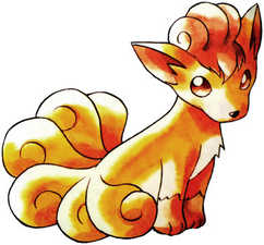
Another recognizable part of this era was the more realistic Pokémon designs. Often, they took inspiration from real life, and put in many details that made every Pokémon unique, even if they had similar silhouettes. Vulpix, for example, is much more detailed than Zorua. If you look at them side by side, the difference is clear; Vulpix has generally realistic proportions, while Zorua enhances certain features such as its large head. It also has simplified legs, with one stubby point instead of toes and curvature. This is because it is much easier to produce merchandise for less detailed things. Large heads are also generally considered to be 'cute' features that grab the attention of kids in particular. Funnily enough, the head sizes of the original sprites were just as big as their bodies! Due to the low-polygon sprites and the black and white sprite limitations, the head sizes used to be exaggerated to capture facial expressions. Sugimori made the official art for Generation 1's Pokémon after the sprites, where he had fewer limitations, allowing him to make features less exaggerated. It's obvious that Pokémon are simple nowadays, and it's likely that they were more detailed back then, because Pokémon was yet to be established as a franchise. Yet, when the games finally became popular, the future direction became clear. This can be seen in the Johto, where the designs gradually started to simplify and diversify their silhouettes. With Johto, sprites also began to have strong colors, albeit with a limitation of 2. By the time the Hoenn region came around, color was no longer a limitation, and Pokémon could use it to their advantage. It allowed sprites and official art to be more straightforward. They were becoming cuter, simpler, and easier to sell. They were becoming more memorable; Pokémon was growing.

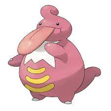
Establishing a design: Pokémon had already become established, and now it was growing. Now that the previous games had already captured the hearts of the masses, experimentation was the key to growth. Eccentric designs began to appear, with strong focus points and caricature to make them stand out from a growing crowd. If you've ever seen Exploud or Tinkaton, you'd be pretty aware of what their focal points are. Exploud's large mouth literally screams loud. Tinkaton's massive hammer whacks fans with a massive blow of surprise. Many other additions to the game are starting to have exaggerated or unique features that let them stand out among the growing crowd. Look back at old designs like Rhydon, and you'll find a lot of smaller details spread all across the design. There's no particular exaggerated feature, and its silhouette can easily be misconstrued with other Pokémon like Kangaskhan. Now that Pokémon had increased to over 1000 species, they could no longer be realistic, but the focus was to create simple exaggerated features to make them easy to remember and recognize. Additionally, the move to a digital art era, supported by stronger gaming devices, let colors have more variety. Although this was great for Game Freak, many Pokémon designs suffered. Take Lickilicky and find the focal point. Most would say that it's the tongue, since its name has 'lick' in it. However, it's also got a pretty big stomach with yellow lines that contrast all the pink.
Did the artists want fans to pay so much attention to that? No, not at all; it's simply a flaw in the design that complicated it so much that it's not highly regarded among fans. Perhaps the sudden access to colors and digital art meant that they had to adapt to something new, but adaptation comes with many failures. Despite these failures, there were still many successes. Generation 4 introduced many details to Pokémon despite simplified forms. Generation 5 started animated sprites, which gave more detail and personality to Pokémon, like Cofagrigus, which moves in and out of its sarcophagus. Patterns also began to become much more abundant, and while some weren't suitable, many like Sigilyph's were successful. These failures and successes allowed the company to learn from their mistakes, to not make them again. Hence, it was another phase of experimentation. Improvement can be seen from Generations 3-5, which would eventually lead to the 3D era.
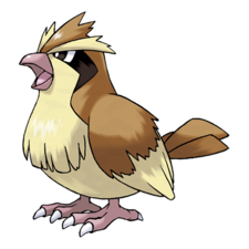
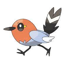
Moving to 3D with practice: Pokémon design in X and Y was a culmination of the knowledge of the previous three generations. As artists practice, they develop limitations to improve their art. These limitations can be construed as style. Style seemed to have been found. New Pokémon were made up of simple, abstract shapes, that made even concept art seem very 3D. The perspective had become stronger with the official art seeming to fit within the space it was in. This change and the increase in round, soft Pokémon are a recognition that the fans of generations 1-5 had grown up. Design was now appealing to the upcoming generations. Game Freak seems to be approaching their target audience with appealing designs, to sell more TCG cards, plushes, and figures. The simplification of Pokémon for the sake of merchandising is much clearer when assessing the difference between some of the old and new Pokémon. Pidgey has a variety of shapes and lines that add a lot of detail to it. The fluff sitting across its chest is much harder to draw than a single line. In comparison, Fletchling barely has any puffy feathers at all. At most, two feathers can be seen at the end of its wing. It's even easier to see the difference between their feet. Pidgey's feet have a large amount of detail, whereas Fletchling's are just sticks. This makes it much easier to draw, create plushes for, and even makes it seem cuter and softer. Despite all of these changes, they haven't forgotten their old fans either. Generation 6 and 7 aimed to increase the complexity of Pokémon animation to meet changing standards, especially with the many unique Mega Evolutions. Dripping goo on Goodra and moving flames on Mega Blaziken really began to capture technological advancements in generating models. Generation 8 furthered this, while Generation 9 has shown a development in textures in art. Gholdengo and Rabsca really bring out their metal and shiny texture respectively. Generation 9 has also displayed an understanding of changing world cultures. Consider Lechonk, which became a worldwide meme immediately. Pokémon is a franchise after all, which means its goal is to make money. All the changes that have happened until now were driven by that. Yet, the development of art is still just as interesting.
Art by Kiwi.
An Important Artist: Ken Sugimori
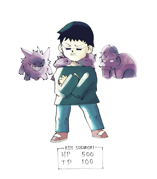
"Who's Ken Sugimori?" is a larger question than it seems to be. He's the man behind the first 151 Pokémon's official art, the origin of it all. Born in 1966, Sugimori would work on the Game Freak magazine where he'd work with Satoshi Taijiri. Eventually, when Pokémon was approved by Nintendo, Sugimori created the first real Pokémon: Rhydon. By 1996, the 30th year of Sugimori's life, the first official Pokémon games of Red and Green were released to the Japanese public. You'll notice on the box art and official art of the games that Ken was a watercolor artist. Unlike now, traditional art was the main art form that was taken on to make early Pokémon. Sugimori's traditional style and techniques inspired the main art direction for all of the designers to follow. While digital art is extremely accessible now, it was extremely expensive and primitive when Generation 1 was made. Luckily, the limitations didn't hold the series back. The art for Generation 1 and 2 is now strongly regarded by fans, with many feeling nostalgic for it. Many feel a sense of nostalgia for the strangely low quality scans. Ironically, until April of 2023, the official scans for Generation 1 designs were the incorrect images! The new April 2023 scans have much clearer lines and colors. One reason for the several decades-long confusion was that the low-quality scans had become so embedded in the Western world that they'd quickly been incorporated into official Pokémon media. By now, there's a sense of nostalgia attached to the low-quality scans, which keep their grasp on the hearts of many. However, the official scans truly highlight the artist's skilled usage of watercolor. They capture a strong understanding of lighting and color and have clean, beautiful linework. After Generation 1, Sugimori still took major direction in all the Pokémon games through to Generation 7. Yet, it cannot be denied that Ken, his pens, and his watercolors were the origin of Pokémon art.
How Pokémon Art Has Influenced Artists and the World
Artists, audiences and the world are an interconnected web. As the world changes, art reflects it, and the audience's perceptions and beliefs follow closely behind. With the three best-selling game franchises in the world being Mario, Tetris, and Pokémon, it isn't hard to tell which takes on the most artistic liberty. Pokémon TCG, fanart, CAP and a complete 1000+ episode anime are a massive collection attributed to Pokémon. Plushes, mini-figures, and posters are all part of this too. There's a massive scope to the creativity Pokémon bring. With 1000 of them and growing, new art is made by fans every single day. Pikachu itself is one of the most recognizable artworks of all time. Anyone with the internet has likely seen the yellow mouse with red cheeks and a tail that zaps right up. The former anime mascot and the Generation 1 Pokédex were originally made of black and white pixels, yet they're still incredibly recognizable. At its core, the massive Pokémon fan base would not exist if it weren't for all the art that draws them in. As little as 8-bit creations to 3D models make up everything from art to competitions and tournaments.
Conclusion: Is the change a good thing?
Paper, pen, watercolor, and nostalgic low-quality scans have a special place in the hearts of many Pokémon fans. Often, when viewing traditional art, there's a powerful connection to the process. Traditional art gives off the impression that an artist truly cared for the pieces they created, with every individual line stroke. Ken Sugimori is a testament to this feeling. Although the first two generations were a profound artistic era, Pokémon has moved on for the better. Within this new time, digital art has become the most accessible art form for professional game design. This does not mean digital art is any worse; it is simply much less tedious for the artists. It also creates uniformity, so that the style of official art has become more consistent. Furthermore, the simplification of Pokémon designs is simply a reflection of changing times. While they were once strange beasts, Pokémon's branding has expanded to unimaginable scopes. The simplification of design, larger heads, and smoother lines all create unique creatures that stretch the imagination of artists. It is an innovation—from simple Magikarps to the streamlined Arrokuda—so that what's new stands out from what's old. While anyone can have a preference for old or new, it is important to remember that change is inevitable, because art is a reflection of the world around it.
| « Previous Article | Next Article » |