Radical and Repulsive: The Best and Worst of Red Shiny Pokémon
| « Previous Article | Next Article » |
Art by Zephyr2007.
Introduction
With over 800 Pokémon in existence, there's bound to be a huge variety in the color palettes and designs of their shiny forms, and red shinies are no exception to this. From one of the most iconic shinies to the shinies that barely have any variation in color, let's take an in-depth look at the best and worst of red shiny Pokémon. Keep in mind that these are solely our opinions and you are welcome to make your own list to share!
The Best
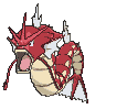
Gyarados
By deetah
An absolute classic, Gyarados is the one that started it all, way back in Gen 2. The monstrous kraken is a prime example of a fantastic red shiny. I mean, just imagine being on a boat, minding your own business, and then one of these pops out of the water. Non-shiny Gyarados is scary enough, but the shiny palette's deep red makes it look a lot more menacing and intimidating. Not only does it look good, but shiny Gyarados even has a story behind it as well. As stated in the anime, the rare red Gyarados is a product of forced evolution caused by Team Rocket, meaning that the Magikarp living in Lake of Rage had no time to change their scale color to blue. Its Mega Evolution looks just as good, maintaining practically the same color palette, just a few shades lighter. Shiny Gyarados was likely the first shiny that many of you caught, and thus it would be a crime not to include the colossal beast on this list!
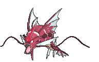
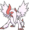
Lunala
By Estronic
The blood moon rises to the top as Lunala shows off how great its shiny form is. Although the red is a pretty sharp contrast to its original deep purple, the color fits the legendary incredibly well. The purple highlights on its wings and face leftover from its regular form also give it a surprisingly nice touch, helping Lunala retain its lunar feel. The yellow edges of its wings also have a pretty shocking effect on its enjoyableness; had they also been red, Lunala's shiny form might not even be on this list. The small things always matter when it comes to design! Overall, I'm glad Lunala has a great shiny form to go with its unique design and complement its great regular form. I'm sure its counterpart will have a shiny form just as great as this, right? Right???

Clawitzer
By deetah
Clawitzer's shiny form deviates from the typical blue palette that most Water-types have and instead boasts a reddish orange. It also features light blue stripes taken from its regular form on its body and the back of its gigantic pincer, which pairs with the red quite nicely. Red complements Clawitzer's design amazingly, making it look so much more realistic as a crustacean. I truly believe that Clawitzer's shiny palette is superior to its regular one, solely because of how realistically pleasing it is.

Genesect
By Estronic
I'm really fond of Genesect's shiny form, even if anyone who knows how to use the paint bucket tool in Microsoft Paint could make it themselves with about two clicks. The shade of red chosen makes for a nice replacement of the original purple, and, in all honesty, I just really enjoy Genesect's design. It doesn't really get any simpler than that. If you put two things that I like together, you'll probably end up with something that I still like. Apples and peanut butter are amazing, for example. Anyways, there really isn't much else to say about Genesect's shiny form. Even if it's rather simple, it gets the job done extremely well.

Honedge
By deetah
Honedge's shiny form has received a ravishing makeover from its normal form, with its medieval blade and cloth transforming from a plain gray and blue into a shiny scarlet red. The eye on its hilt along with the end of the cloth features a lovely iris color that pairs with the red very nicely. Overall, Honedge's shiny palette complements its design amazingly. The owner of a shiny Honedge would certainly feel like a character straight out of a classic RPG game, slicing through enemies without fear! Game Freak certainly outdid themselves with this one.
Honorable Mentions


Breloom: The reddish orange used in Breloom's shiny palette is a great choice, as it still looks realistic when paired with its design. The colors are close to that of the iconic toadstool mushroom! I appreciate Game Freak heading in that direction with Breloom's shiny form; it definitely worked out for them.
Absol: Absol looks as menacing as ever with the rich red on its face, sharp claws, and scythe-shaped crescent and tail. While Absol is definitely still intimidating in its non-shiny form, the deep red really helps get the point of it being the "Disaster Pokémon" across even further. Also, the choice that Game Freak made to only change the parts that were originally black to red was definitely the right one.
Heliolisk: Lizards are cold-blooded reptiles and Heliolisk is no exception, so I agree with the use of a rich red on parts of its body; personally I think it makes Heliolisk look like it got burned from staying out in the sun too long for warmth! Also, the red pairs well with the shades of yellow and black on the rest of its body.
The Worst
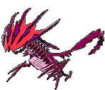
Eternatus
By Estronic
Eternatus in general is just a pretty ugly Pokémon; it's hard to tell what it's actually based off of in the first place. Yeah, I GUESS it looks like a dragon, but it seems that they only designed its skeleton rather than an actual, well, body. We're not here to bash Eternatus, though. We're here to bash on its shiny form. Simply put, the choice to have its design consist of only two similar colors was a pretty poor one. Not only does it make it uglier than before, but it's genuinely hard to make out what exactly it looks like. There's just so much going on in Eternatus's design, and when the unfortunate color combination makes it difficult to pinpoint certain design choices, Eternatus's shiny form ends up looking like a fairly ugly blob of red.

Heatran
By deetah
Heatran's shiny form looks as if Game Freak slapped a brightness filter on top of it and called it a day. While bright colors are definitely more exciting than dull ones, its shiny palette is not that different at all from its normal one, automatically earning it a spot on this list. The shade of magenta in its eyes definitely doesn't pair well with its lava-colored body either. I think it would have been really cool if Game Freak had used shades of blue or green in place of the red, perhaps a glowing hue of cobalt or seafoam. Not only would this have paired nicely with its magenta eyes, but it would also have given Heatran an alienlike complexion. Heatran's design could definitely pull off that look in my eyes, and it would have gained bonus points for creativity, but as it stands currently, Heatran's shiny is a no-go.

Bruxish
By Estronic
It's really hard to keep myself motivated during times like this. Over time, though, I've realized that one's purpose in life is to become successful, so I've told myself that I must never give up. Unfortunately, all of my motivation diminished quickly upon looking at this abomination of a shiny. It already hurt my eyes in its regular form, so what does it have against me that makes it want to torment me with a horrible fashion sense? I wouldn't be surprised if I saw this as a Christmas ornament in a Walmart clearance bin. Red and green aren't the worst combination of colors, but when those colors are also lipstick red and neon lime green, I can't help but envy those who are colorblind. Bruxish has nothing to smile about when its shiny form is that much of an abomination.

Simisear
By deetah
Just like Heatran, Simisear is another red shiny that has had barely any changes at all made to its palette. All Game Freak did was slightly adjust the hue of each color to make it appear more saturated. That's it. Talk about boring! I understand the fact that fire is red and maybe they wanted to go for a more realistic look, but seriously? Unfortunately, Simisear's siblings Simisage and Simipour suffer from the same fate, but those two are topics for another article. I personally would have loved to see Game Freak incorporate maybe a light shade of caramel brown on its chest and a darker burgundy or crimson on the rest of its body; it would have made for a much more exciting shiny while still keeping some of the realism.

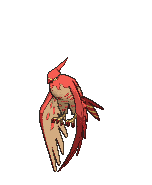
Solgaleo
By Estronic
Why did Game Freak think they were obligated to make Solgaleo's and Lunala's shinies the same color? The choice definitely works with Lunala, but why did they have to do my man Solgaleo like that? Imagine if its shiny form was literally any other color; if Lunala's shiny form can represent a blood moon, why can't Solgaleo's be a deep blue to represent how other stars other than the sun look throughout the universe? Instead, we get stuck with what appears to be a lion that was dropped into a huge tub of tomato sauce. Okay, well, I know red dwarf stars exist, but I must add that those types of stars don't produce as much light, so at least Game Freak emulated that in Solgaleo's shiny form by making it incredibly dull.
Dishonorable Mentions


Rotom: I feel like there was a lot of potential wasted making all of its formes the same color for their shinies. I don't really know anyone who has a red refrigerator, red washing machine, or red microwave oven anyways. Plus, even though the color palette isn't that horrible, going from a fairly tame orange to a chaotic and radiant red gave me a bit of whiplash.
Sandslash: Sandslash's shiny form is incredibly jarring with its seemingly blood-covered spikes, and it's hard to enjoy when the rest of its design barely compensates for it. Looking at it feels like I have sand in my eyes.
Talonflame: I wonder if the person who designed Talonflame's shiny form did anything else that day. Getting a day's pay for only placing a slight gradient on something to make it "special" is the luxury I want to have.
Conclusion
Red as a color is a tool not to be thrown around carelessly. It can make any design a top-tier one, but if used carelessly, you may as well just use black and white. I hope this article helped you realize the power red can hold, as well as what happens when that power is used seemingly without thinking, and I hope you also enjoyed how we felt about some shiny Pokémon that feature the color. Until next time!
| « Previous Article | Next Article » |