Gorgeous and Gross: The Best and Worst of Green Shiny Pokémon
| « Previous Article | Next Article » |

Art by Spook.
Introduction
With over 800 Pokémon, there's a wide variety of shiny Pokémon, some better-looking than others. This also includes the color green, which has a wide range of Pokémon. In this article Estronic and I will give our opinions on the best and worst shiny Pokémon to wear a green color. Keep in mind that these are our personal opinions, and feel free to disagree. With that said, here are the best and worst green shiny Pokémon!
The Best


Salamence and Mega Salamence
By Jordy
Although Salamence's regular color palette is already great, Game Freak did an amazing job designing its shiny. The green on regular Salamence really complements the shade of orange that its wings took on, making it an intriguing although relaxing sprite to look at. Furthermore, I believe that its color palette complements the design quite well, putting emphasis on its wings and canards. There's also its Mega Evolution, which maintains roughly the same color palette but a bit more saturated. Similarly, I truly like that Game Freak put emphasis on its wings and canards through its color while managing to not distract you from the fact that Salamence has Mega Evolved and the changes that come with that.

Decidueye
By Jordy
Hooded figures are usually suspicious, but Decidueye's shiny form is suspiciously stylish. In particular, its dark moss-green hoodie pairs well with the nighttime black of its cape topped with a sharp red upon its dark face. Flavor-wise, I believe that this shiny form is better than the original form. Decidueye's shiny form gives off a more mysterious vibe, as if it's lurking in the shadows, waiting to shoot its prey. Speaking of shooting, archery is portrayed as a very cool weapon of choice in most media. Such a cool weapon of choice pairs well with a cool costume, and Decidueye easily got that down pat with its shiny form. Just don't look too hard into it and call the design emo, please. You'll be missing the point.
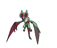
Noivern
By Jordy
Noivern's shiny palette takes a pretty unique approach with the way it looks, with a heavy contrast between the color of its general body, ears, and wings. Although this tends to look bad on a lot of Pokémon, Noivern really rocks it well, with a nice fern green and deep, dark red. Personally, I believe that Noivern's shiny colors complement its design better than its regular palette through highlighting its ears and wings. Designs like this that put emphasis on what makes a Pokémon different and unique are something I tend to appreciate, and Noivern just pulls it off so well.

Muk
By Estronic
Muk's shiny form (and Muk in general, for that matter) isn't something you would call aesthetically pleasing, I'll admit. It, however, does set a high bar for being realistically pleasing, if that's a thing. I get how the purple of its normal form is the representation of toxic waste, but, from a realistic standpoint, how many piles of toxic waste are purple? Hopefully not a lot in your parts. Enter Muk's shiny form, where the new sage green, a more realistic color for a pile of waste than purple, helps to make Muk more appealing in terms of concept or aesthetics for, like, four people. While it might not be the best sight to see, at least you would acknowledge the realism of Muk's shiny form before turning away in disgust.

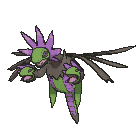
Zygarde-50%
By Estronic
Zygarde's shiny form is an interesting take on it, but I do quite like it. The minty green complements the pure snow white extremely well, and its hexagonal patterns tagged along with the fading of the colors improves its looks even further. It's also one of the only shinies where bright colors look good on a Pokémon with primarily dark colors, which is quite the difficult thing to pull off. Overall, Zygarde's shiny form really conveys the malleability of its badass design, and the minty pallete to complement it really stimulates my senses.


Keldeo and Keldeo-Resolute
By Estronic
Keldeo has always been one of my favorite Pokémon, so perhaps this may seem biased. Then again, this is an opinion-based list, so does it really matter? Probably not. Anyway, while Keldeo's shiny form isn't anything too special, it's the simplicity that really sets it off. Its new Paris green along with a more lighter and soothing coloring overall assists in creating a very aesthetically pleasing design. The reason why Keldeo's shiny is so good is that it stills retains that Keldeo feel. For most shinies, the majority of the time the different coloring of the Pokémon gives you a different mood than that of the original. However, with Keldeo's, the coloring can be considered "similar," and this gives both Keldeo forms the same moods. So, what are those moods? Well, moods are subjective, so that's up to you to decide. Regardless, even if the changes to it are somewhat minuscule, Keldeo's shiny form still ends up being great for the colors maintaining what makes Keldeo Keldeo.

Male Jellicent
By Jordy
Jellicent's shiny looks great. It fits the general design of Jellicent quite well, highlighting its tentacles and top, with its crown in particular standing out. To add onto that, I feel like it massively improves the aquatic vibe that Jellicent exudes over its regular palette, almost like it is something that you could realistically find in the ocean.

Lurantis
By Jordy
Although most shiny Pokémon with a weak shade of green don't look too good with it, Lurantis pulls it off amazingly. The shade of green really fits with the shade of yellow and complements the design quite well, pointing the spotlight to its antennae, its scythes, and the stripes on its legs. Furthermore, it fits Lurantis's concept as a praying mantis very well, too, closely matching the colors of a real mantis. All in all, though shiny palettes like Lurantis's tend to not look great, Lurantis is one of the few Pokémon where it does look good and fits well with its concept.
Hydreigon
By Jordy
Hydreigon's shiny takes a unique approach at its already great design and makes it even better. The change from blue to green on its heads and body, as well as the brightening of the purple bands, puts more emphasis on the important parts of Hydreigon's design: its three heads. Unlike its regular color palette, which makes its heads blend into the background more, the green contrasts really nicely with the black and brighter purple of Hydreigon's body. The heads really pop out of the rest of the design, even though the colors don't actually jump at you. However, what I truly like about it is that the color palette doesn't just neglect the rest of Hydreigon's design even though it does make its heads stand out more; its wings and tail aren't pushed into the background despite the heads being highlighted.
The Worst


Beedrill (Mega Beedrill is cool, though)
By Estronic
Beedrill's shiny form, for some reason, reminds me of the 80s. I don't know, something about it screams "slicked back mullet" to me. One thing's for certain, though: both the Pokémon and the haircut might've looked cool in their time of origin, but in these days, both of them fail to appeal to the crowd due to their outdated styles. Beedrill's shiny form just feels like a product that's trying to appeal to kids. Bright green and deep blue together with Beedrill's design? Reminds me of those little monster toys children collect. Unfortunately, I take Pokémon more seriously than I'd like to, and Beedrill just doesn't hit the mark to please me. It's way too jarring for me in terms of color choice and design in general, but hey, at least Mega Beedrill is pretty dope, since its complex design helps it pull off these colors, unlike the simplicity of its pre-Mega forme.


Scizor and Mega Scizor
By Estronic
Gold and Silver mark the introduction of shiny forms, and given the limit of color they had, some Pokémon got unlucky. Scizor is one example of the Pokémon that got shafted, replacing its reds for lawn and mantis greens, shown more clearly on its back sprite. Its design in general just doesn't pair well with these greens. Yeah, it is supposed to be a bug, and greens typically look good on bugs; however, this is a metal bug we're talking about. Red just fits the tone of "metal bug" better than these greens do. Why? I wouldn't look into it too much. Additionally, I'm saddened that the coloring transferred to Mega Scizor's shiny form as well. It's not like it was forced to have it; Gengar's poor shiny form was redeemed by the badass shiny form of Mega Gengar. Overall, Scizor's shiny form is a tragedy of the genesis of shinies, and Mega Scizor is a bigger tragedy of retaining the color scheme after a decade.

Ursaring
By Jordy
Ursaring looks quite intimidating with its regular color palette; however, with the shade of green that was chosen for its shiny, it just looks silly, and the color genuinely takes away from the intimidating factor that Ursaring otherwise has. Although I realize that the color palette for shiny Pokémon was severely limited in GSC, and even though shiny palettes used to be automatically generated, almost any other color like a dark blue or grey would've made it look much better.

Buzzwole
By Estronic
Do I really need to explain what's wrong with this? Buzzwole's shiny form is both underwhelming and ugly, with only one color out of its entire body changing and that color becoming the cursed neon green. It's almost as if Game Freak made it ugly on purpose; however, given its nature as an Ultra Beast, I suppose it can slide, since it's practically an alien Pokémon. Even then so, compared to the other Ultra Beasts, Buzzwole sticks out like a sore, green thumb. The ones that only have one color change pull it off really well; for example, Pheromosa gets a cool new pair of black pants, and Xurkitree goes crazy AND stupid at the same time (which is practically illegal) with slick sky-blue wires. Other Ultra Beasts such as Kartana and Celesteela have more than one color change but still pull it off so well. So, why does Buzzwole's shiny form get the extremely short end of the stick with this pathetic, lazy, and ugly neon green? I bet it was to tone down the sexiness of its summer-ready body; no one likes a hunk.
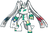
Zygarde-100%
By Estronic
Since Zygarde-50% has a fittingly designed shiny form, you would think putting two of them together would make for double the amazement. Zygarde-C, unfortunately, falls flat in the attempt to accomplish this. It has the same color palette as before, plus hints of solid blue and red, but it just doesn't work on a Pokémon with this design. It just becomes quite the mess; the pure white fails to have the same impact with the scarcity of green, the introduced colors are too jarring, and the Pokémon's design just doesn't feel like Pokémon. Like seriously, am I playing Digimon now? An utter disappointment as a shiny and Pokémon in general, the only thing Zygarde-C does is be a complete failure.

Crustle
By Jordy
The way Crustle looks in general is quite underwhelming already, though it fits its concept as a crustacean with a block of sediment on its back. However, with its shiny, they turned away from its concept and managed make it look significantly worse while doing so. I mean, the green just makes no sense here. Not only are crustaceans almost never green, the realistic-looking block of layered earth turned into some moldy dirt. Really, it kinda looks like layers of earth with puke between them.

Tranquill
By Estronic
I mean, come on. Really? I wouldn't be exaggerating saying that Tranquill's shiny form can easily be made in Photoshop in, like, 3 minutes. All this person did was slightly change the hue of Tranquill's normal form into a green, and everywhere, for that matter. Hell, even the red highlights on its head are tinted green. Now, this isn't really a problem with a Pokémon like Lurantis, as that shiny form's green tint is varied all around and reasonable (because, you know, it's a plant). Unlike Lurantis, however, it seems there was no effort put into Tranquill's shiny form; it's like they chose a random color on the color wheel and used it as a layer on top of the regular form. I'm so awed at the laziness of this that I can't even think of a proper joke for this. My day is ruined.
Conclusion
There you have it, the best and worst of green shiny Pokémon! Just like any other color, there are a bunch of different green shiny Pokémon, with great shiny Pokémon like Noivern and Zygarde and not-so-great shiny Pokémon like Crustle and Tranquil. We hope that you enjoyed reading this article. See you next time!
| « Previous Article | Next Article » |