Sticky Sun/Moon Sprite Project

Layell

Alas poor Yorick!
is a Social Media Contributor Alumnusis a Top Artist Alumnusis a Community Leader Alumnusis a Community Contributor Alumnusis a Researcher Alumnusis a Top Smogon Media Contributor Alumnusis a Battle Simulator Moderator Alumnus
In this thread, we'll be creating BW-styled sprites for all the Generation 7 Pokemon, which will be used in Pokemon Showdown should players choose the BW Sprite option. These sprites are also free for use as long as the spriter or the project itself is credited.

If you are looking for other Generations, you can find them as follows:
Generation 6
Generation 8 Onwards

Applications for spriters are currently closed. Applications for animators are open, to apply please DM either Grand Emperor of Zelron or Antiant. Sprites from non-approved users will be deleted.

Here is a spreadsheet of the finished sprites.
Here is a download link for all currently finished sprites.
The file sizes of the sprites have been reduced in the download.
For GBA-sized sprites with the same style, check the Gen VII+ DS-Style Sprite Project.

For the sake of transparency, these sprites are free for non-profit use.
 
Last edited by a moderator:
Applications are now open, in one week from today I'll send out the first round of reservations. Hope to see some folks offer their skills for the next big sprite project. I'll keep this thread open for any general questions that you may have!

The applications will remain open until I say the project is finished.
 
Last edited:
Well I had been hoping to send out all the acceptances yesterday, but the site blackout didn't agree with that.


So here are the current Sun/Moon spriters, and the mons they will be starting out on:

Sunfished will be spriting Bruxish
Espeon Scientist will be spriting the Pikachu rip-off Togedemaru (please don't let that be his English name)
leparagon will be spriting Bewear!!!
princessofmusic will be spriting Bounsweet
aXl will be spriting Tapu Koko

and HeaLnDeaL will do something eventually

in addition to this I have already accepted leparagon's Magearna sprite

gen_7_magearna_sprite_by_leparagon-d9rfpg1.png


leparagon has a few other gen 7 fronts on his DA account, but I'll leave it to everyone here to determine if they feel up to spriting a full front/back for those mons.

As a reminder, I plan to only have people who formally apply be active spriters and QC people, but I'll leave it up to accepted spriters if they want outside help. Personally I will refrain from any edits until I see released shinies, but if people want to edit they should talk to the main spriter here.

Here is a chart
 
Last edited:
Here's diaper fruit

bounsweet.png


I wasn't planning to do any Sun/Moon sprites initially (from Hawaiian garlands to ugly tropical fish, it seems kind of corny how they're all so "themed". Gen VI overall had solid concepts and designs without going "zis is FREENCH!!") until Layell persuaded me to try one. I picked Bounsweet because it's (1) adorable and (2) easy.

I'll return once we have back references and shiny models available to do any necessary QC.


EDIT: revamp
 
Last edited:
Tried Bruxish
9498d84605.png

However, after making the backsprite I realized how awkward it looks.
Still wip, but would like ideas on how to improve.

Also, before anyone says anything about the size, it's real size is small than that of basculin, but right now the sprite is exceeding it. I think making it larger would kinda ruin that relationship
 
Here's diaper fruit

View attachment 66262

I wasn't planning to do any Sun/Moon sprites initially (from Hawaiian garlands to ugly tropical fish, it seems kind of corny how they're all so "themed". Gen VI overall had solid concepts and designs without going "zis is FREENCH!!") until Layell persuaded me to try one. I picked Bounsweet because it's (1) adorable and (2) easy.

I'll return once we have back references and shiny models available to do any necessary QC.

It looks cute but I think it's way too big, it's even smaller than cherubi as far as I can remember.
 
It looks cute but I think it's way too big, it's even smaller than cherubi as far as I can remember.

I kind of wanted to show how plump and juicy Bounsweet was and felt that a smaller sprite wouldn't give it enough "presence".

Also, size is pretty much relative. For example, Roselia and Eevee are 1'00" tall, but their BW sprites both are more than 40 pixels in height.

Sunfished I think Bruxish could stand to be somewhat larger, actually (it looks small compared to some fish mons like Goldeen and Feebas). Enlarging it would give you more room to bring out its detailed pattern.
 
If I recall, there was already an exception in B2W2, that being White Kyurem's sprite of 111x111. Perhaps there's a different limit for backsprites, but it'd be extremely useful to upscale the canvas, unless that'd be too complicated to program.
I believe showdown crops the sprites to 96/96 in the system.

Aside from that, I'd be willing to sprite snowshrews after finishing Tapu Koko. (Will post the frontsprite to thread when I get home tonight.)
EDIT: At home. Based the size of the head off of Scizor, who is the same size as Tapu Koko, and went from there. Turns out he just barely fits in 96x96 width without any further editing on my part. Who knew?
Tapu Koko solo.png
 
Last edited:
Back Tapioka
tapu_koko_solo1_by_falgaia-dacqh8f.png

It was really hard to find the back reference, but Tapu spins around for like a split frame in his reveal trailer and you can like just see the white triangle on his back. So here it is!

Also updated the shield wings a bit. +)

edit shit i forgot to do the shield beak on the back brb fixed
 
Last edited:
Old
oialETB.png
New
hv6epmS.png

Old
uTCAfIw.png
New
abLfJ3q.png


Layell noted issues with the outline and I made edits accordingly along with some overall polishing here and there. Hopefully, this is a step in the right direction. :)

Also, moved on to my next mon, Lurantis. Here it is so far.
MZmXpzv.png


My first draft had her "arms" spread out but I ultimately decided to just go with the pose in the original artwork lol.
 
Old
oialETB.png
New
hv6epmS.png

Old
uTCAfIw.png
New
abLfJ3q.png


Layell noted issues with the outline and I made edits accordingly along with some overall polishing here and there. Hopefully, this is a step in the right direction. :)

Also, moved on to my next mon, Lurantis. Here it is so far.
MZmXpzv.png


My first draft had her "arms" spread out but I ultimately decided to just go with the pose in the original artwork lol.
Amazing work on your sprites, as always. Lurantis in particular already looks great for a first attempt. While I do like your Solgaleo's sprite a lot and the touchups definitely improve it further, I can't help but feel the sprite is overall too small. It seems smaller than sprites like Entei's, while Solgaleo is a huge lion that stands taller than Reshiram. I hope it's not nitpicking; I just thought I'd share my sentiments there.

In any case, keep up the good work.

Oh, I didn't bother to check the heights, my bad. And wtf, Solgaleo measures up to more than 3 meters (@_@") Anyways, the sprite is actually taller than Entei, but that's manely because of its mane. When you compare the head and the body, the sprite as a whole does looks smaller.

And so, I present to ya'll a bigger fire lion.

Old
hv6epmS.png
New
UyWMLjv.png


Spr_5b_059.png
hv6epmS.png
Spr_5b_244.png

Spr_5b_059.png
UyWMLjv.png
Spr_5b_244.png
Also finished Lurantis' back sprite!

4Hhml6u.png
bCx9eNO.png
 
Some feedback for peeps

Wobblebuns The position of Lurantis's legs on the back sprite doesn't match the front. Based on the front pose, the left leg should be behind the right one. Not a big deal but worthy of a quick fix. Otherwise, she looks very lovely.

aXl The only thing that bothers me about Tapu is how one of its claws on the front sprite is bigger than the other. Unless they're intended to be asymmetrical, the one on its right/our left should shrink a bit.

I prefer something like Elazulmax's right-hand Exeggutor the most, shortening the neck and managing to fit the whole body in the canvas.
 
Last edited:
pikipek.png


I decided to sprite Pikipek after seeing that its in-game model is grounded, as flying sprites can be a bother. I think I'll reserve Cutiefly.

Also updated my first post with a small Bounsweet edit.


EDIT: Altered the shading on the front sprite and rounded out the tail on the back sprite.
 
Last edited:
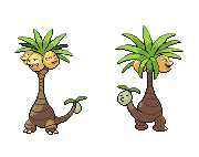
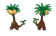
I've decided to join the crew again. I've been working on the Alolan Exeggutor - there are two different versions that I've worked on:
Alolan%20Exeggutor_zpsysfwapwn.png

This is the original version, with a stiff neck and the original pallet from Exeggutor.
Alolan%20Exeggutor%202_zpsyzwq3mks.png

This is the second version, with a more bent neck and uses the pallet that FishBowlSoul's Exeggutor uses. I'll leave it up to you guys to decide which one should be used - or if pallets need to be swapped. The back coconut head is purely a placeholder until I can make one that actually looks decent.

Additionally, I've been working on the Alolan Ninetales (oh - if I could reserve Ninetales, that'd be cool):
Alolan%20Ninetales%202_zps8nzlhk6k.png

I love how the Alolan Ninetales came out, and the back sprite is in the process of being made as well.
 
The Cynical Poet Nice sprites! I liked your curved version of tall darker exeggutor better. The straight eggy looked too stiff while the heads were still tilted from its original sprite (if that makes sense). The curve does look more natural and makes it look a bit taller than it would have been. My biggest issue though with the sprite are the short palm leaves. Maybe thats because of how tall it is but it looks a bit short on the front sprite. Try making those leaves longer on it. Also the tail coconut could use a little shading since it looks flat for the back sprite...unless thats the placeholder you was talking about. Finally, the stem gets thicker when it reaches the top. This is seen on the front sprite but not the back.

Ill post stuff about ninetales later. Keep up the good work though!
 
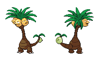
Thank you for the feedback on Exeggutor, Typhlito! I definitely tried to take it into consideration with him, and so far this is what I've got:
Alolan%20Exeggutor%202_zps7d1mfulq.png

While tinkering with Exeggutor's leaves, I took the time to try and polish up his long neck some - fixed up some shading, and extended everything as much as I could within the 96x96 limit. I think this is about as much of a compromise we're going to get with Alolan Exeggutor's proportions without sacrificing any more details for the sake of accuracy.
Additionally, I fixed up the tail and the tail's head, which looks kind of derpy, but I think I've gotten it to a nice starting place, at the very least.
 
I think eggy looks great now. Might still need a little more tinkering with them at tail coconut. The coconut heads on the back sprite also look slightly off as well. Finally, you prob should change the expressions the heads are making to match the model. Their faces are slightly different.

As for ninetales, its pretty nice but try fixing up the outlining to make it match the bw sprites. Also the head is a bit off. Btw, did you try using a sitting pose similar to regular ninetales? That sitting pose could really show off that fancy tail if done right. Anyway, hopefully that helps.
 
aww, i wanted to make the Solgaleo and Lunala backsprites :bloblul:

actually Layell, can i post the other sprites here on the thread? so that other users can see if they wanna do theirs from scratch or just help out with the ones i made already?

also, here's Bewear front:
bewear.png
 
IekCSKu.png

So this is still very much a WIP, I'm just posting now for the two-week progress update. I'm thinking rn that the legs are a tiny bit too long, but it's a give and take with trying to get the curves on the mud within the allotted pixels. The shading so far is loosely based on Rapidash's, but I could see more of the right half of the sprite being in shadow as well. Sorry I'm not further along, but CAP's been very hectic these last two weeks.

aXl this might just me be, but I feel like the right shield on your backsprite looks a tiny bit shorter than the left shield (or perhaps it's because in the front sprite, the two shields look equidistant from the body, but on the back the left shield looks a tiny bit further away? I realize that the angle can naturally create this effect, but it seems just a tad too much). Great line work though and props for fitting all that detail into the space.
 
Last edited:
Back
Top