Smeargle's Studio Update 3
| « Previous Article | Next Article » |
It's time for another Smeargle's Studio Update! By the time you're reading this, it's been almost one full year since the release of the previous one. During that time, we've experienced yet another round of the MAC as well as the long-awaited Smeargle's Studio Seventh Annual Secret Santa. Today's installment will include the usual review of MAC's winning entries (and a honorable mention!), along with a look at some of the notable gifts from this year's Secret Santa. We've also expanded our usual set of panelists, as Bummer and brightobject are joined by aXl and FellFromtheSky.
MAC Review
There's been quite the waiting period before finally getting to this round of the MAC, but during that silence the entirety of Smogon had their hands full with the arrival of Pokémon Sun and Pokémon Moon. This MAC tried to acknowledge the new games and their ever-present contrast between light and darkness with the theme "Day and Night." As the contest came to an end, h_n_g_m_n ultimately took the win with 48 votes, leaving behind a massive vote difference separating him from the other entries. With that said the true race for second and third place was narrowed down to Cretacerus grabbing second with 19 votes and FellFromtheSky ending up as third with 18 votes.
First place: h_n_g_m_n
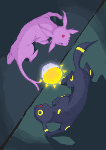
Art by h_n_g_m_n.

Bummer
h_n_g_m_n went with a rather classic approach in this contest, using Espeon and Umbreon as sun and moon representatives while also incorporating something similar to the ying yang symbol most people already are familiar with. Granted, this image could have been polished further to get rid of all minor flaws, such as the parts of the sketch layer still being visible, along with minor details such as positioning Espeon's tail further away from the center. That said, the anatomy is on point, and the angle he chose couldn't had been more fitting, so it's not hard to see why so many voters were swayed by this image.

brightobject
h_n_g_m_n's rendering of Espeon and Umbreon is sketchy and cartoonish in just the right way, giving his drawings a sense of understated personality that slowly but surely wins me over every time. His choice of a visual arrangement reminiscent of the yin-yang is both aesthetically appealing and thematically relevant, and his great sense of lighting only further compliments this. There are some areas where h_n_g_m_n could have improved on—for example, his leaving in of some of his gestural lines and structural sketch lines, revealing the visual skeletons of Espeon and Umbreon, makes the piece seem a tad too rough and unfinished, as do the rather spartan background, but overall it was well done as always and deserving of first place.
Second place: Cretacerus
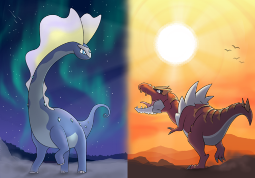
Art by Cretacerus.

aXl
I've always had an interest in diptychs such as this, as they often convey a sense of duality that a lot of other mediums can't really grasp. While true for this piece, I feel the diptych fails slightly in how its two elements don't feed into each other notably well with their colors or subjects, making it feel very much like two separate pieces rather than one cohesive project. The positioning of the composition helps to remedy this, with the two creatures seemingly peering at one another and drawing the viewer's eye across the piece nicely, while the sun's place in the negative space helps make up for the size difference between the two subjects. However, this can really only go so far, as the diptych still feels somewhat unbalanced due to the massive size difference between the two subjects as they're presented here. That said, the shading is effective in both pieces, and although the background has sort of a hard division going on, the elements that make it up are well rendered and add to the composition nicely. A solid piece overall.

FellFromtheSky
Cretacerus is famous among those who frequent Smeargle's Studio for his ability to create stunning pieces with only a scanner, a mouse, and Paint.NET. This one, in particular, is no exception to Creta's usual level of quality and also displays Creta's other claim to fame—that is, his love of (read: "obsession with") dinosaurs. Where other contestants chose to depict the classic Umbreon and Espeon duo to represent night and day, or used the much newer Lycanroc duo for the same purpose, Creta chose to express this MAC's theme with a rather unconventional pair in Aurorus and Tyrantrum. Creta certainly pulled off his unconventional choice well, though. Aurorus stands serenely in a night-cloaked tundra, contrasted with the belligerent Tyrantrum standing in a sun-scorched desert. The contrast and simplicity of this piece is lovely and I honestly can't find anything negative to say about it. My only complaint is that I think that the piece could have been much stronger if Creta had emphasized eye contact between his two subjects. Either way, however, the piece is still lovely to look at, and it's no wonder it took home second place in the most recent MAC.
Third place: FellFromtheSky
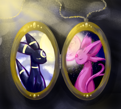
Art by FellFromtheSky.
brightobject
FellFromtheSky took an interesting approach to the MAC theme, using a two-sided locket to represent the day/night duality presented, and it worked out pretty damn well! The texturing of the cloth background is eye catchin', and the portraits of Espeon and Umbreon within the two sides of the locket are cleanly drawn and beautifully colored (I especially love the fluffy quality of Espeon's fur and the subtle blues in the night sky behind it). However, I am still a little confused by the thematic elements of this piece, like the way the light source is positioned closer to Umbreon and Umbreon being in the sunlight and Espeon being in the moonlight. Probably a purposeful subversion and I'm not giving the artist enough credit, but regardless those aspects left me feeling a little unsure about this piece. Still, a great piece of work all around and just another example of FellFromtheSky's rapid improvement as an artist.
aXl
Another diptych! These seem to be fairly popular this MAC, which makes sense given the theme. I feel this one conveys a much more balanced aspect of the day/night relationship than many of the entries trended towards, although it is notable as well that in this case, the symbolisms for Espeon and Umbreon are swapped for their backgrounds creating a sort of yin and yang vibe, which is effective in creating a nice contrast between the subjects and the backgrounds in each piece. Using the locket as a framing device sets the piece nicely and grounds the piece as something that can actually exist, which is a nice touch. Really, I can't find any flaws in the piece that wouldn't cross over into the realm of nitpicking, other than that as a whole, it comes across as being somewhat simple. But there’s nothing wrong with a simple piece that is executed well, so nice job, Fell.
Honorable mention: Ssensenh
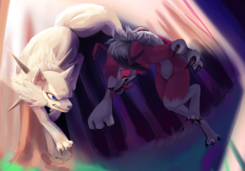
Art by Ssensenh.
FellFromtheSky
If I am to be perfectly honest, Ssensenh's piece should have claimed first; and, had Ssensenh finished the wonderfully dynamic work by the deadline, I think it is safe to say that she would have. No other entry was as dynamic and as beautifully rendered (well, the parts of the entry that were completely rendered, anyway). I particularly love her unique take on this MAC's prompt—"Day and Night." Ssensenh elegantly weaves together day and night by using Lycanroc-D's torso and tail, as well as Lycanroc-N's back, to section the image into two parts (that, it is worth mentioning, fit seamlessly together as one whole). The light source is located in the upper left, illuminating the forest and Lycanroc-D, which casts a shadow that reveals Lycanroc-N preparing to strike its sunnier alter ego from the dark and eerie woods. Aside from the elegantly executed dynamism and stunning contrast of night and day, perhaps what strikes me most about Ssensenh's entry are the two subjects's eyes. The subjects make eye contact—one set of striking blue eyes meets another set of wild and luminescent red ones—effectively communicating the tension and power in and between the wolves.
Bummer
I'm thankful that Tikitik chose to include this piece as an honorable mention, because it most definitely deserves some extra exposure. Utilizing the latest duo that embodies the sun and moon, Ssensenh created a most colorful scenery where both creatures and day phases meet each other, and their dynamic poses and lively expressions are just two main reasons why viewers would return to the image to take a closer look. Granted, it's both figuratively and literally rough around the edges, particularly the bottom right corner, where the dark background could have covered altogether, but what's already there is definitely enough to leave a strong impression.
Secret Santa Review
We were a bit late to the party with starting to organize this year's Secret Santa, but the end product was certainly something every participant as well as a random viewer could enjoy, and we got a fair share of both your usual generic gift requests as well as some of the more... unusual ones. Below we've picked out some of the notable images representative of the spirit this Secret Santa had. It's only a teeny tiny bit of the full experience though, so you might want to take a closer look at the whole thing.
From: monomite, to: Most
Anything involving charmeleon and tulips.
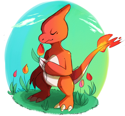
Art by monomite.
FellFromtheSky
monomite's work always has a lovely air of simplicity and minimalism about it. Nothing is unnecessary. Each stroke is purposeful and contributes to the overall composition of the piece. Monomite's choice of color palette is also worth mentioning. The reds and oranges of the subject are complemented nicely by the greens and blues of the backdrop, and the transitions between colors give the piece a lovely warm atmosphere. I honestly cannot say anything bad about this piece. The texture Mono overlayed the piece with works wonderfully, reminiscent of cold-pressed watercolor paper, and the flame-like flower heads of the tulips echo the fiery nature of the subject, Charmeleon, very nicely. All in all, you have my kudos mono!
Bummer
This drawing only serves to remind me to stop and smell the flowers more often. It's a simple premise perfected with vivid colors, and given how fiercely Charmeleon is usually depicted, seeing it in such a serene state also makes for a lasting memory to whoever's beholding it.
From: Cretacerus, to: Hulavuta
Can you draw a recreation of Michelangelo's David but with David as a Pokémon Trainer, with a partner Pokémon of the artists' choice. The Pokémon should be in a pre-battle contemplative pose similar to David himself. David's penis can be covered up if that is not appropriate. MAKE SURE IT'S BASED ON MICHELANGELO'S DAVID AND NOT SOMEONE ELSE'S BTW THERE ARE A LOT OF SCULPTURES OF DAVID HE IS A REALLY POPULAR GUY.
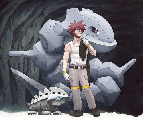
Art by Cretacerus.
brightobject
Cretacerus's humorous homage to the old masters had me chuckling when I first saw it, but that definitely doesn't mean this Smogon resident's art skills are a laughing matter. Although in my eyes Byron's anime appearance doesn't translate too well onto the real-life proportions of Michelangelo's David (uncanny valley, anyone?), I can't deny the beautifully detailed background, the subtle lighting, and faithful representations of the Steelix and Lairon beside the Steel-type Gym Leader. Cretacerus's depiction of Byron's musculature, especially his use of softer shadows, shows a strong understanding of the human figure and drawing from observation. Overall, hilarious allusion and really well-done, if mildly unsettling. o.o
aXl
The lighting in this piece seemed a little off to me at first, but upon looking up the source material, a lot of the forms made a lot more sense to me and I could better understand how the light worked on the form. One of the bigger hurdles that caused this disconnect for me came from how Byron's pants are rendered, as they lack distinct folds or ripples bar the shading itself, making his legs appear more noodle-like than they probably should. That said, Steelix and Lairon are well rendered in the piece, with Steelix's body doing a nice job of keeping the composition centered on Byron. In addition, using Byron's cloak to give some context to David's arm placement was a nice detail and works well in the piece. Overall the image has a few issues that hold it back, but the solid rendering, composition, and textures more than make up for it.
Kudos to Cretacerus for going above and beyond the prompt's request in this one, including not one but TWO partner Pokémon to be accompanying our proverbial David. It's always a pleasure to see an artist take extra steps to create a better community experience in these Secret Santas.
From: Nerina, to: Jackii
could i have an alolan vulpix playing with an alolan sandshrew in the snow? kinda random but it's themey -v-)b
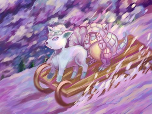
Art by Nerina.
aXl
All right, fair warning: Alolan Sandslash is my favorite Pokémon from Gen 7, so I may be a little biased here, but I'll try to keep it to a minimum.
Overall, Nerina's constructed a fairly enjoyable scene here, giving the two Pokémon some nice context for the prompt assigned. The colors and brushstrokes are well executed as well, with the pinks and yellows giving off the vibe that everything is happening at an early sunset, which is cool to see in a piece that could have been just as easily filled with whites and blues. That said, I do think there are some layering issues with the piece, such as how Alolan Sandshrew's arm and body are oddly in front of Alolan Vulpix's tail and how the Pokémon don't really look very connected to the sled they're on, but those details aside, it is a solid piece that is a pleasure to look at. And again, Sandshrew is too adorable for me not to like it.
FellFromtheSky
Nerina's work is always vibrant and beautiful, a pleasure to look at. This piece is no exception. The color palette is certainly to my liking. I particularly love the inclusion of lively purples. The only issues I have with this piece lie in the odd spacial issues with the two subjects. For instance, judging by its position on the sled, Vulpix's tails ought to be in front of Sandshrew's face, yet Sandshrew's face is in front of the tails. Even with such issues, however, the piece is still lovely and dynamic and—most importantly—super adorable. Nice job Neri! <3
From: aXl and Typhlito, to: FellFromtheSky
onto my request. I think I'd like to see... well... hmm... I don't want to limit someone's creativity, so can I give a theme? If so, I think I'd like to see a piece with the theme warm candlelight. Glowing embers. A soft golden glow. Warm golds and oranges. Snowy-Thomas-Kinkade-house. That sort of thing. As long as it's lovely and warm, I think I'll love it. :>
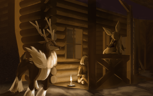
Bummer
You'd think that making the theme of the request "lovely and warm" would be counterproductive to a season where Ice-types are commonly depicted, but aXl and Typhlito thankfully didn't let that stop them from illustrating these Ice Pokémon in such a cozy scenery. Only thing I'd add would be some gentle snowfall so that all of the empty space around them becomes less empty, but it works fine as is.
brightobject
Fantastic atmospheric lighting by aXl and Typhlito on this Secret Santa gift, and a truly phenomenal choice of colors gives this muted winter scene a real sense of tranquility. I do wonder about the rather ambiguously posed Sawsbuck in the foreground (is it just beginning to take a stride? leaning on one leg?) as well as the inconsistent levels of detail and sharpness around the painting, but perhaps these visual glitches are inevitable when such high teamwork is required. Conclusion: great work by these two talented individuals.
| « Previous Article | Next Article » |