Judge a Pokémon Express: Solgaleo and Lunala: Old vs. New
| « Previous Article | Next Article » |
 |
 |
Alola! We're journeying back to the Alola region with a brand new JAPE: Armored Solgaleo and Lunala vs Classic Solgaleo and Lunala. We've brought back our panelists to discuss the age-old question: if it's not broken, does it really need fixing?
| brightobject | GatoDelFuego | Pikachu315111 |
| Pilo | heritage | {Pokemon_Vigilante} |
| Click on the images to read their thoughts! | ||

brightobject
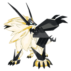
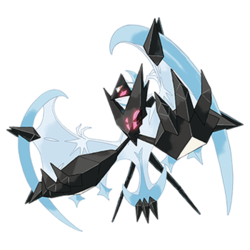
Oh, joy! Ultra Solgaleo and Ultra Lunala... where to begin? These new formes are really, REALLY bad—a mutated, crusty, polygonal stain on the good Pokémon name, enjoying the company of other such stinkers such as Meowstic (in my book), Garbodor, and Vanillish. They are so badly designed that the polygon brawlers in old Virtua Fighter games look more polished, more dynamic, more visually interesting than these horrific amalgams of insanity. My only guess is that Nintendo executives poured thousands of snail shells into a bingo machine attached to a random coordinate generator, which they used to design these horrific aberrations. The sharp angles of the armor, the chunky, unwieldy, blocky, plain hideous plate that now covers the previously pretty-good-looking (or at the very least okay-ish) cover legends of Sun and Moon, ruin their aesthetics, mangle their visual motifs and spit upon the good intentions of their original designers (because I pray to god I hope the same people who created Solgaleo and Lunala were not the same people who trampled upon the integrity of said 'mons' designs with these new Ultra formes).
First off: The masks. Solgaleo's isn't too bad—the mask has some semblance of actual form to it, wow! The sharply branching antennae make it seem like some kind of exotic lynx, which is pretty dope. Too bad it's all ruined by the awkward beard (fangs? stubby trio of arms? tentacles? who knows?) of black spikes jutting from its chin. And Jesus H. Christ those chin spikes somehow become even more awful and even more out of place on the in-game model. Lunala's is even worse—the disclike shape of its head, with all its sloping curves and elegant lines, has been smashed by a massive blocky triangle. Literally just a straight-up triangle. I'm shaking my head in disbelief, ladies and gentlemen.
The tables turn with regards to the body armor: this time it's Lunala that has a relatively cool torso covering only to have it crippled by some unnecessary spikes seemingly placed at random, while Solgaleo's body is the one to be just plain bung. God... honestly I'm just done talking about these guys, it's almost painful.
Yeah, so all in all: these designs are AWFUL. They are not even lazy, the reason why most bad Pokémon designs are bad. They are actively ugly. You can't ignore it. They just are awful and hideous and frightening and grotesque, and it's honestly mildly disquieting to know that a professional design team worked long hours to develop something as shoddy as this. You'd have thunk at least there must have been some sort of revision process? Like someone should have put their foot down and said 'this has gotta go back to the cutting board.' Maybe it's time to put Sugimori out to pasture, if this was indeed him... maybe they're outsourcing now or something?

GatoDelFuego
It's really hard to talk about these formes. The screenshots we were given certainly don't portray them in a very positive angle, and we got about five seconds of video footage. But I'll do my best. The real problem with these new formes is they just look BORING. They're basically random bunches of ice cream in animal shapes with black armor attached. Or are they floating bits of black armor shooting out ectoplasm? The color choice is absolutely horrid, especially in the official art. Solgaleo's pose is particularly awful—if I didn't know what Solgaleo was beforehand, it'd be tough to answer what it is I was looking at.
But the more I look at the designs, the more I like about them. The antennae on Solgaleo and added helmet are really cool and give it a unique feature of Necrozma to stand out. Its paws have been changed from zebra hooves to actual lion claws, and it has a spiky tail to make sure you know this Pokémon is dangerous™. Lunala looks like it's gained a pair of hands, finally giving it something to attack with instead of flapping around. The "are you not entertained?" pose has claimed another Pokémon design victim. Solgaleo reminds me of an armored samurai version of itself, but Lunala looks like it really has evolved into a new design, which I like.
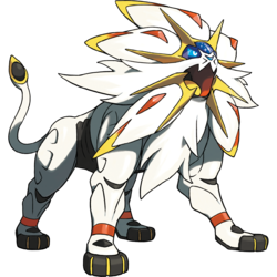
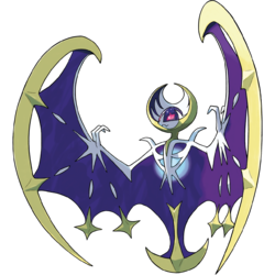
The real problem here is that we're going to inevitably compare these designs to the originals. And when you put them side by side... they just don't capture me as well. Solgaleo was fresh and full of energy, with a colorful crest and flowing mane. Lunala was a graceful beast adorned with crescent shapes and solar imagery. The new "Ultra" designs are flashy but ultimately super generic. It's definitely trying to spring off of the success of Black and White 2 with similarities to Kyurem-B and Kyurem-W, with Necrozma this time around. Seeing these two Pokémon really hasn't excited me at all for Ultra Sun and Moon the way a legendary reveal should. Given that, as well as the lack of Galvantula in Alola, I don't see much to look forward to in the Pokémon world at all this year :(

Pikachu315111
The announcement trailer of Ultra Sun and Ultra Moon (henceforth abbreviated to USM) may not have shown us much, but it did show us new formes for Solgaleo and Lunala, ones wearing armor that looks to be parts of Necrozma! With nothing to go on except design, let's compare the regular and armored formes to see if Digi-Armor Energizing improved on their design or overcomplicated it.
Since the original reveal of Solgaleo and Lunala, I liked their designs (even if I did feel the sun lion/white big cat motif a bit played out). With their celestial body theme and the space dome part of their face, they gave a mystical vibe that I didn't feel from the previous gen mascot legendaries, Xerneas and Yveltal. Their designs show both simplicity and detail to it that makes them appealing to look at, not to mention the color palettes chosen blend nicely together. These designs are hard to follow up on, since any tweak to simplify or add more detail could throw it off. Even their "phase" formes they go into during their signature attacks fall victim to this; while still looking good, they don't compare to the originals due to color simplification.
The Armored formes aren't just Solgaleo and Lunala wearing Necrozma armor, they're in their "phase" formes too. It could be they were going the route of simplifying the base body while adding a lot more detail via the armor, but it ends up looking like the armor is just slapped on. Solgaleo I feel comes out the best looking; the only goofy-looking parts are the long Batman ears and the arms sticking from its back. It fares better than Lunala, which just has the arms sticking out from its body while at the same time retaining its normal hands attached to the wings (not to mention the large chest plate, which looks a bit too big). I feel these formes needed some more cycles of development to better attach onto the Gen VII mascot Legendaries.
So for me the winners are the regular formes. Maybe when we see the Armored formes in action I'll warm up to them; right now they just look thrown together.

Pilo
In the past, many people have complained that Pokémon's designs have been slowly declining in quality, but in my opinion, Sun and Moon were all but confirmation that these claims are false. Sun and Moon gave us a plethora of fantastic designs, and among them were Solgaleo and Lunala. Although I've always been more of a Lunala person myself, that hasn't stopped me from admiring Solgaleo in all its glory. In fact, even despite its rather interesting lack of Fire typing, I'd consider myself to be a fan of it posing confidently in all its elegant splendor. As I mentioned though, Lunala is easily my favorite of the two. Beautiful design aside, Lunala's flavor text is just straight up awesome. From the information available, we know that Lunala is able to consume light, transforming it into destructive energy capable of wiping out almost anything in its path. Finally, if we could return to the design aspect for just a second, it's easy to tell from just a glance that Solgaleo and Lunala are meant to represent the sun and the moon, respectively, which is the true genius of their designs and something I consider to be mandatory in any good cover legendary. Although it's mostly in their color schemes (yellow and orange for Solgaleo and midnight blue for Lunala), it's also present in their body shapes; you don't need to look too closely to realize Solgaleo's mane is supposed to be the sun and Lunala's entire body is shaped like the moon.
So what about their armored formes then? Well I could make the obvious observation that both look ridiculously clunky and awkward, but instead of doing that, I've decided to don my conspiracy cap and bestow upon you, oh humble reader, my latest theory:
Disregarding any of the finer details of each armored Pokémon, both of them have a very Necrozma-esque aesthetic. Perhaps they're fusions like Kyurem-B and Kyurem-W; it would certainly make sense given the nature of Ultra Sun and Ultra Moon, which are both sequels like Black 2 and White 2. Will these two formidable (yet somewhat ugly) new formes be obtained by means similar to the aforementioned Generation 5 legendaries, which used the DNA Splicer? Could Pokémon fusion really be making a comeback in these new games? Only time will tell.

heritage
Solgaleo and Lunala's regular formes are probably some of the best box legendaries we've ever received. In the beginning, while neither really stood out to me, they've grown on me, Lunala especially. Their mystical feel and awesome synergy together pulled me in after some time. I even have a Lunala pin on my purse, above stuff like Absol; I ended up liking it that much. So "Why fix what isn't broken?", you must be asking Game Freak. Yeah, I'm not sure either. I don't want to run around screaming "They ruined all these awesome designs!!!", but they sort of did, haha. There was so much to enjoy about the original designs, and one of the big ones was the color. The Radiant Sun and Full Moon phases were pretty neat during an attack, but they drained out a lot of that unique color. Having them stay in that form? Seems questionable...
I was never really a fan of Kyurem-W and Kyurem-B (easy comparisons) until many years after Black and White 2, and I want to assume that these new formes will grow on me as well. Lunala has a lot of potential to look cool. I adore the light shade of blue that it remains in but... I don't feel like it really fits Lunala. The execution is all wrong. On the in-game model, that weird chestplate is much too wide for my liking, while the official box art has a very awkward composition. It has to be the arms. In fact, both of the designs have Necrozma's arms sticking out in all these crazy directions that make no sense, but Lunala took the worst of the punishment. Solgaleo is certainly the more stable of the two designs. I think the darker shades of Necrozma's armor truly complement the natural light yellow of Solgaleo without being too overwhelming, unlike with the unfortunate Lunala. The blue eyes illuminating from the pretty cool helmet are honestly mesmerizing to look at but, sadly, that's about it. There's just... not a lot to go off of just yet. The art for both of these Pokémon really rubs me the wrong way, and we don't know anything about the lore yet, so I can't enjoy that. I guess I like the concept? Eh, whatever. This was the first Pokémon game reveal I simply didn't care about, so that's gotta mean something.

{Pokemon_Vigilante}
Solgaleo and Lunala wowed players of all kinds last year with their sheer size and fluid designs. They look like rock-solid powerhouses from the start, and they didn't disappoint in my opinion. The gold and white of Solgaleo gleams right off the screen and conveys his bright and brilliant magnificence. The blue and purple of Lunala showed the power of the dark of the moon, and thus we saw some very beautiful Pokémon that appeared to have all the right pieces to be everything a legendary Pokémon should be. But apparently, Nintendo thought they needed to add something to them for Ultra Sun and Ultra Moon.
The raw and real reality is that we had two legendary Pokémon that had style and grace turned into something that looks like a cross between aliens and Transformers. If I had to guess, I'm thinking that the armor is a result of fusion with either Zygarde or Necrozma, though the pointed turns and claw-like shapes remind me more of an Yveltal type deal. The real question to be asked here is, does the armor truly benefit them in some way, or was it just a cheap ploy to sell us based on the fact that many players couldn't appreciate the quality of Lunala and Solgaleo? A lot of the threads I have read had players clamoring in a very negative way about how bland the color schemes were last year when Solgaleo and Lunala were revealed. I'm interested to see if these new formes will be met with praise, especially among the veteran players, or if the concept of yet another fusion style storyline makes this one of the worst installments yet according to the players. One thing is for sure, we'll know by the end of November.
What do you guys think? Share your thoughts via social media!
If you're interested in writing for us, please write up a small sample on this topic, and if we love what you write we'll be in touch!
 |
 |
| « Previous Article | Next Article » |